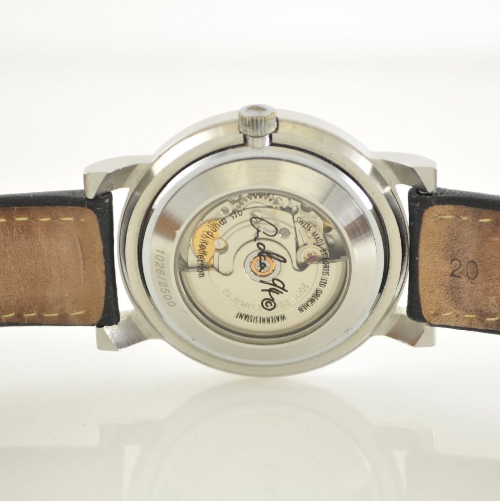
Fortis is a funny brand.
Following their bankruptcy in 2017, signficant attempts have been made to undergo a facelift both in aesthetics and reputation–efforts spearheaded by dual Owner/CEO Jupp Phillip. He’s got his work cut out for him.

Despite being the first company to produce the automatic wristwatch, Fortis always seems to be the proverbial last player picked on recess dodgeball teams. It may be difficult to find a reason to fault them for why, but we’re not really surprised either. Looking back on marketing choices, some of their fumbles included the following:
In the process of affiliating with Russian space programs, was there some unspoken association made by folks who felt Fortis was now related to “scrappy” watch companies like Raketa and Vostok? Who’s to say. Perhaps the reason for why they were never fully embraced came down to a simple lack of je ne sais quoi.

Don’t mind me. Just charting out a little last minute flight plan with some archaic instruments because ain’t no computer’s gonna tell me what I can and can’t do.

…which includes synchronized cloud fuckin’ with the ‘ol F-4 Phantom crew: Spanky, Boozer, Noodle, Slam-pig, Pup-tent, Fartlick, and Bambi.
Thank Christ I got my Aviatis Daybreaker Stealth Chronograph with alarm, GMT, two power reserve indicators, am/pm, and tachymeter scale. It really frees up the cockpit.
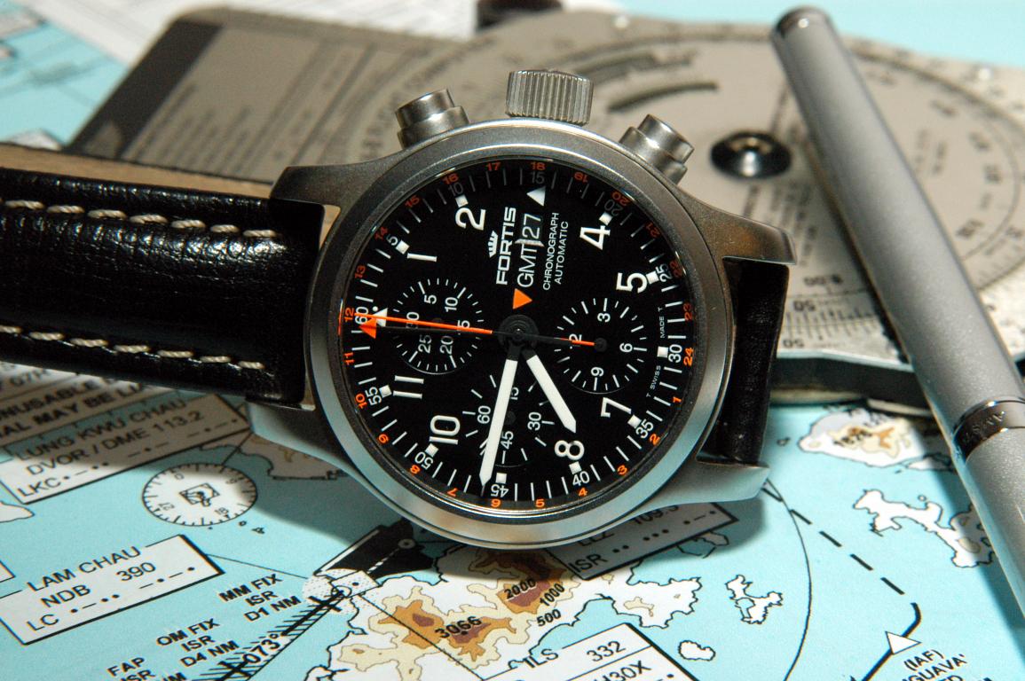
Fan or not, there was some success worth noting here. Consumers seemed to be unanimous in agreement that Fortis’ identity had become synonymous with “tool watch”—in some cases, the “working man’s IWC Pilot.” Their aviation watches were especially geared toward hypermasculine, blunt appearances, where the slightest consideration for flair could have posed a reckless distraction. A distraction that could have threatened a theoretical mission… any arbitrary mission that men might encounter on the daily (please interpret that facetiously).
But none of this is what makes Fortis particularly “funny.”
What makes Fortis so funny is that, after decades of laboring toward a tool watch image (with craftsmanship ethically living up to their Latin namesake), they’d be willing to risk it all with artsy statement pieces that would compromise their efforts again and again. And again.
This is your brain
This is your brain on drugs.
While it would have been simplest to hang their hat on the fact that they’d produced a mission-capable watch for handling outerspace, Fortis continued to hunt for what would separate them from the rest of the tool watch competition. “Seriously guys, we need a differentiating factor. What if we simply made artsy versions of our existing tool watches?” Whereas Movado’s identity and end-state couldn’t have been farther from each other in appearance, Fortis reattempted the integration several times—all without compromising their rugged capability. These attempts became known as the Fortis Artist Series.
Fortis Artist Series: Tool Watches Crossdressing in Black Turtlenecks.
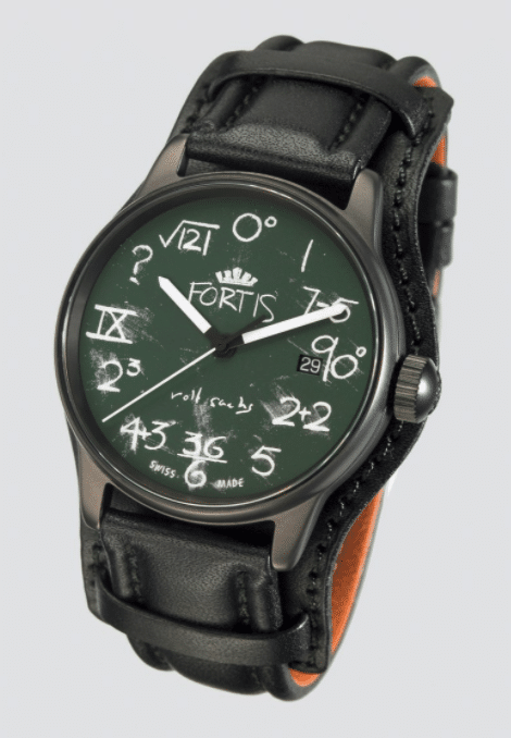
Rolf Sachs – Frisson
200m Automatic/ 150 pieces
While one could make the argument, “Lange and Sohne’s artistry is second to none,” the validity in the statement falls victim to simple word choice. Yes, they make very well-crafted, beautiful watches that tell the time in a very pretty way, but the way in which they tell it is both practical and purposeful because, like any good product that comes out of Germany, form follows function. We don’t care about function here. Art is only concerned with form, even if it means it comes at the total expense of functionality. Rolf Sachs’ Frisson gets that.
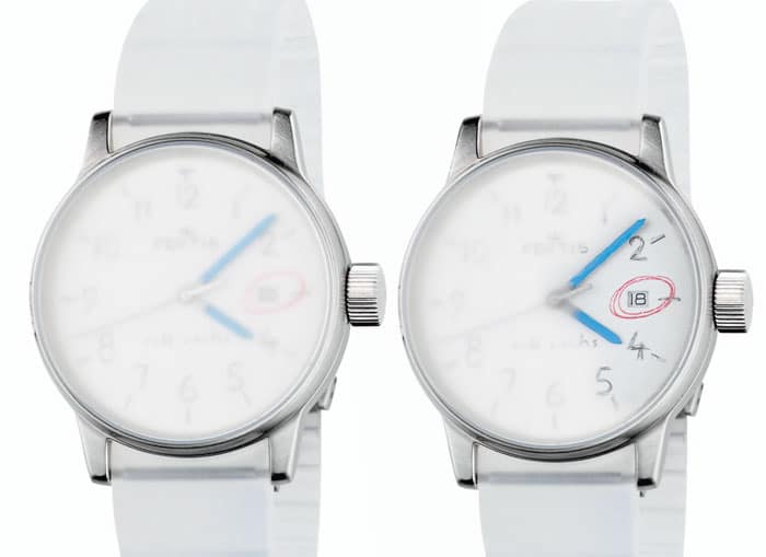
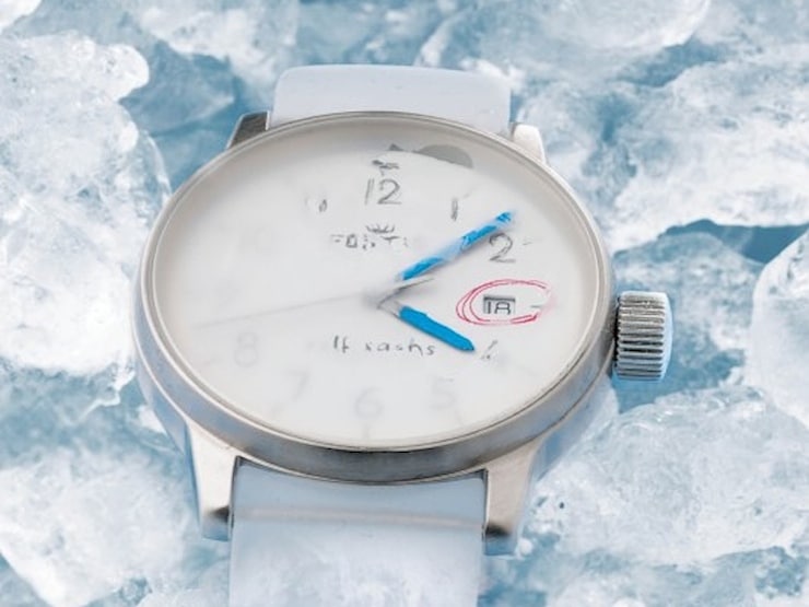
The word “frisson” is borrowed from the French to describe the complexity of psychophysiological responses to pleasurable stimuli—often in the form of goosebumps—nicknamed, “the chills.” Meant to be a play on the words, the dial is permanently fogged to mimic the appearance of a frozen vodka bottle exposed at room temperature. This effect temporarily subsides and clears up if the wearer breathes or smudges a finger across the dial (thanks to a special coating applied to the crystal). The look is completed with a transparent silicon strap. Is this practical? Far from it, but it successfully challenges the wearer to understand the timepiece in a context other than a tool that tells time.

The Frisson is uncompromisingly in vein with conceptual artist and designer Rolf Sachs’, typical oeuvre.
His multi-disciplinary background ranges from photography to sculpture, commonly using mathematics for inspiration. Often, his concepts are derived from re-contextualizing meaning, resulting in a novel play on ideas—flippant expressions of the Dadaism art movement. His installation, “Intoxi-lab,” looks like a chemist’s work station (and it technically is) however everything you see now has the practical application as a cocktail bar cart.
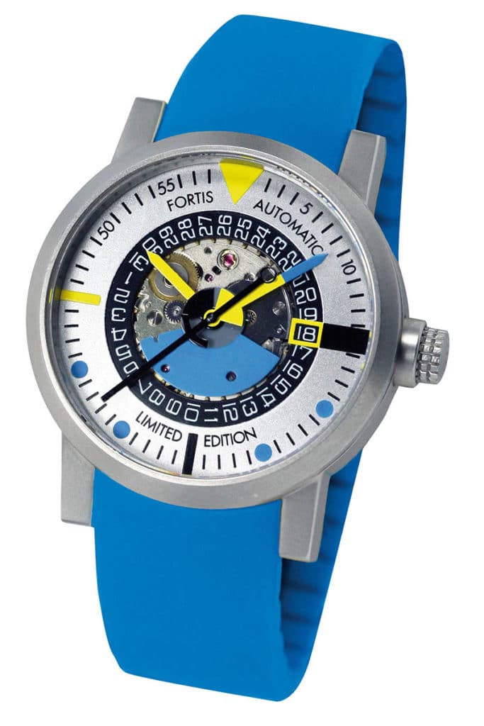
Rolf Sachs’ Terrestis 2pi and IQ
200m automatic, titanium/ 999 peices
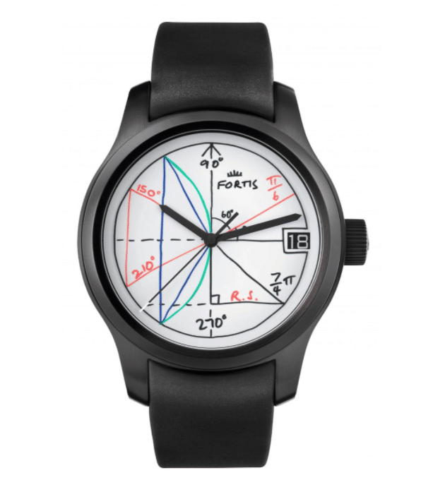
Fortis Terrestis 2pi
There’s some comical irony here (almost too on-the-nose to realize) where beneath the haphazard numerical scribble on a dial is a finely-tuned engine of calculated considerations. Sure, the same idea could have been communicated without it needing to look like a whiteboard or chalkboard, but it would have omitted the feeling of impermanence. Something as negligible as notes scrawled across aboard are never intended to have lasting significance.
Sachs’ choice use for chalk appearance on the IQ’s dial was meant to evoke nostalgia of childhood classrooms… conceptual play on emotions and remembering another time (pun intended). Both watches’ theme for “impermanence,” itself, is not only reflective of time, but the exact opposite of what you’d expect to be associated with the engineering behind a quality product… much less a tool watch made of titanium.
Fortis IQ
Fortis Mattern
40mm, 200m, 2012 peices
If Rolf Sachs was Fortis’ take for creating watches that address conceptual art, think of their collaboration with Michael Mattern as their attempt highlight the “abstract”—specifically Neo-Constructivism.
Constructivism’s roots were kickstarted in 1915 Russia, born out of a modern reflection for industrialization and expansion of urban space. As a movement, it rejected decorative stylization in favor of the industrial assembly of materials… ultimately taking on the literal appearance of “stacking structurally significant shapes.” Naturally, it had a huge influence on Soviet propaganda.
Mattern aims to depict the reality of the times using Neo-Constructivism without falling into mainstream contemporary art, and he transfers this philosophy to the Art Edition Mattern. “Experts have argued that my work must be seen as the renewal of constructivism,” he says. “I am led to agree, as the basis for my work—geometry—has been the driving force of the great Constructivists of the past, while being the core element of all technical renderings we find determining our life today.”

A partial skeleton dial compliments Mattern’s watch and, considering much of his work looks like nineties-era abstract clipart standard with Microsoft Word, the end state here could have been worse.
LE Frank Burmann

Second to “I don’t get it,” the most common phrase probably heard in galleries might be, “my kid could paint that.” It’s here where art gets really divisive. For German artist Frank Burmann, that’s kind of the point.
His renderings are characterized by, to put it warmly, “child-like impressions”—doodles or finger paintings that would be just at home taped to your fridge as they would be crumpled in the trash. This is because their mission is to shed light on the social causes meant to promote the well-being of children—campaigns like the aptly named, “Celebrities paint for children with AIDS” and “Children paint a world.” For Burmann, a common motif was pushing beyond the limitations of a canvas in the same way no wall or surface might be safe from a toddler with permanent ink.
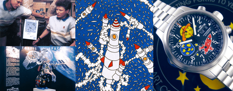
His causes gained so much traction that the Russian government sent some of his original art to outer space where it was stamped and signed by cosmonauts aboard the Mir Space station. This would make it the first “fine art” to hover in orbit. Naturally, Fortis needed to make several watches to commemorate the occasion.
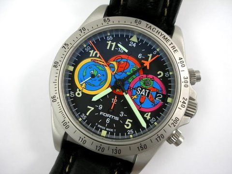
Fortis Andora
- Limited to 100 pieces
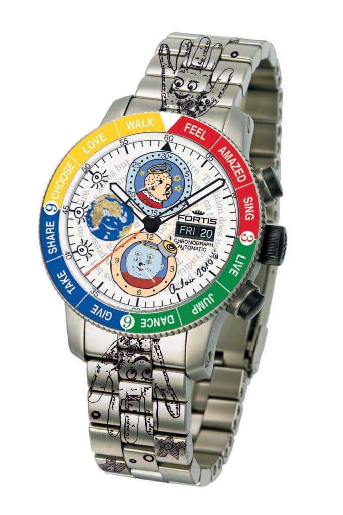
Without squinting, it’s almost impossible to identify the differences between Burmann’s watches and those designed by German pop artist, Andora. Both corner that “refrigerator art-aesthetic,” but while one’s inspired by children, the other’s motivations are about as confusing as his sketches.
Looking at Andora’s, one can’t help but recall that those oddball entries that would find their way into the margins of used text books from middle school—four eyed mutant monsters or meth-addicted Pokémon from beyond the cosmos.
Beyond imagery, his thematic approach to bezel design would probably make navigator Phillip Von Weems cringe. Rather than counting down time, it suggests its wearer observe arbitrary cues for “choosing,” “jumping,” “singing,” or “walking” in whatever way they might they deem fit as the Hamburger Helper glove from hell looks on, judgingly.
But hey, it’s on a titanium bracelet.
Wrapped around the dial reads, “Tradition does not mean preserving the ashes but passing on the fire,” a rather awkward appropriation of Sir Thomas More’s words—legibly obscured by floating aliens. Perhaps the main takeaway here is in understanding the simplicity behind how to enjoy one’s time.

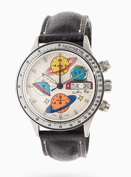
To his credit, Andora one-upped Burmann by being the first artist to paint the side of a rocket destined for outer space in 1992 (of Russian ownership, of course). You better believe Fortis was there to cover down on further commemorative watch opportunities as well. As a participant of his PR cosmonaut training, Andora was more than enthusiastic to lend his input for several more collaborations throughout the nineties.
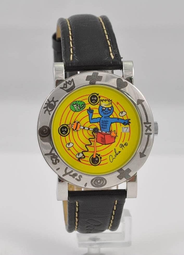
Functional Fashion with the Fortis Flipper Series
For some time it would appear as though Andora had found a welcome home among Fortis’ design department, building on a product to compete for the attention of a younger, consumerist fashion-forward market with “the Flipper.”
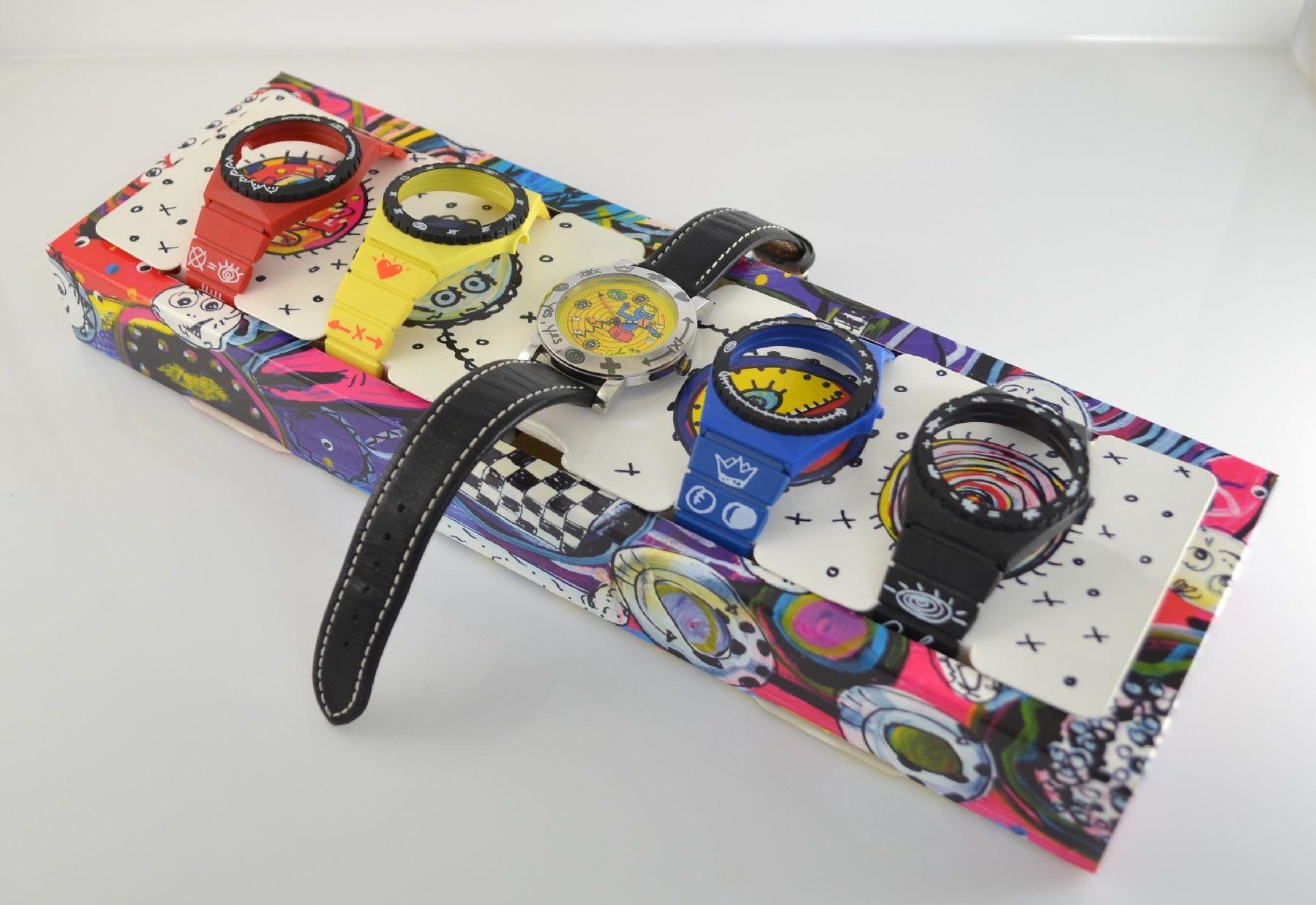
Marketed in the early seventies as “the world’s first fashion watch,” the Fortis Flipper allowed its wearer to “flip” their watch in and out of different rubber bezels and straps with a multitude of color options… a concept that pre-dated the first Swatch watches to be sold ten years later. While the novelty was extended to both mechanical and quartz, the latter proved to be massive hit with circulation in over forty countries. Horology now had a new vehicle for expression, recognizing owners with the opportunity for choice.
The Flipper’s infiltration of pop culture was tailored for so many tastes, the Republican National Committee had its very own “Reagan Time” edition. Thine eyes don’t deceive you. The very same company that would go on to champion Russia’s Space program was former party to fist pumping alongside Communism’s fiercest critic.
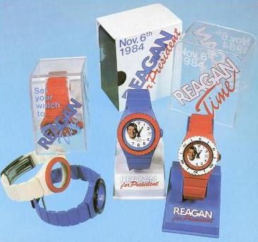
At twenty dollars a watch, the Flipper demonstrated the global market was primed to modify its appetite for what communicated “individuality,” while—albeit in plastic—was still undeniably Swiss.
For a while there, it looked like Fortis had things figured out… that is… until Swatch came along.
(to be concluded in Part 3: Haters Gonna Hate)

Damon is based out of the Bay Area, where he’s a black sheep among Apple Watch loyalists. Having served as a Combat Engineer with the USMC, he believes a true field watch’s success is measured by how closely it compares to a “G-Shock.” Nonsensically, a background in design has guided his preference toward higher craft, as he struggles to become the lifestyle his watch tastes more closely reflect.