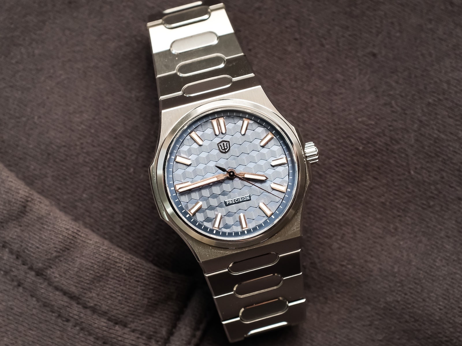
I’ve reached a point in my collecting where I don’t buy a watch simply because it’s well made. There has to be something about the design that keeps pulling me back after the novelty wears off. Every now and then, though, I spend time with a watch that reminds me those two things don’t always have to go hand in hand. The Watchdives Premier WD0016B is one of those watches.
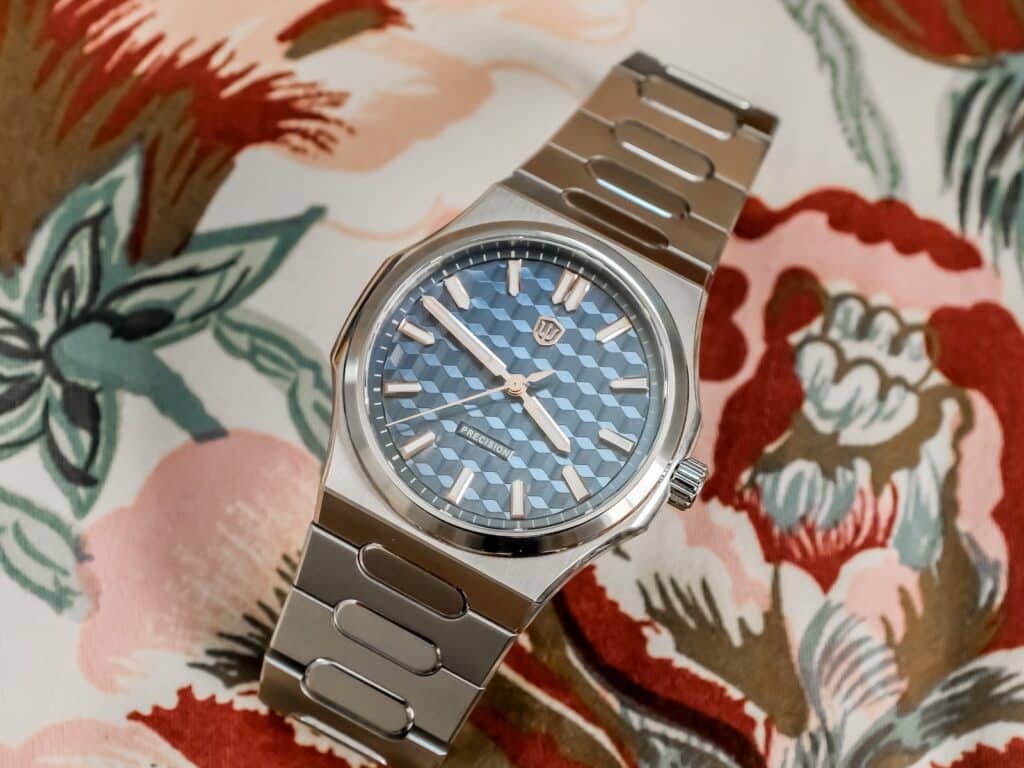
Before I ever put it on my wrist, I could already tell it wasn’t something I’d normally gravitate toward. The integrated bracelet, the bold textured blue dial, and the overall styling sit outside what I typically enjoy wearing. Even so, I was curious because Watchdives has steadily improved its watches, and this Premier line felt like the company trying something different.
After spending time with it, my opinion became more nuanced. I never completely connected with the design, but I found myself appreciating the level of execution far more than I expected. That point followed me through the rest of my time with the watch.
A Different Direction
The Premier occupies an interesting place in the Watchdives catalog. The brand has become exceptionally good at producing homage watches, and that’s largely what collectors expect from it. The Premier feels different. It doesn’t abandon what Watchdives already does well, but it shows the company trying to establish something it can call its own.
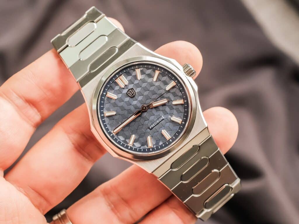
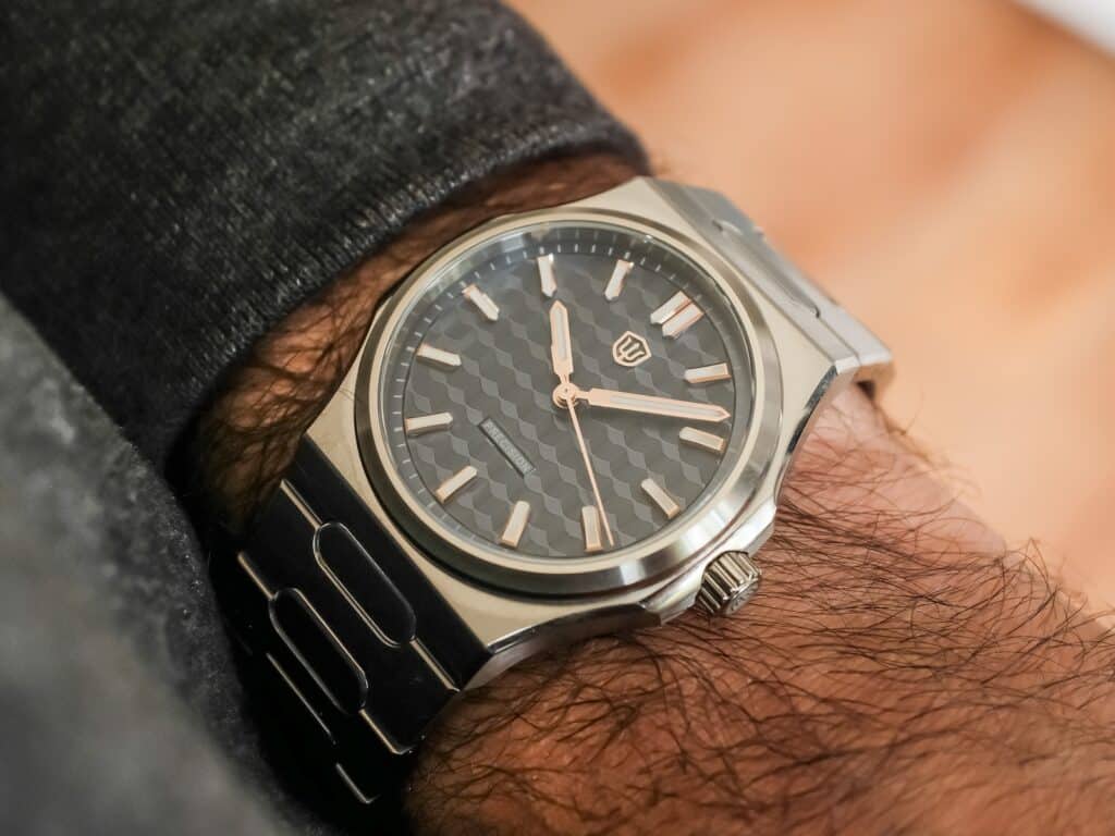
The watch measures 39mm across without the crown, roughly 9.9mm thick including the crystal, and carries 100 meters of water resistance thanks to a screw-down crown and screw-down case back. Those dimensions suggest a compact sports watch, but the integrated bracelet gives it a broader stance than a typical 39mm case. The 36mm bezel also leaves the textured dial with plenty of room to dominate the front of the watch.
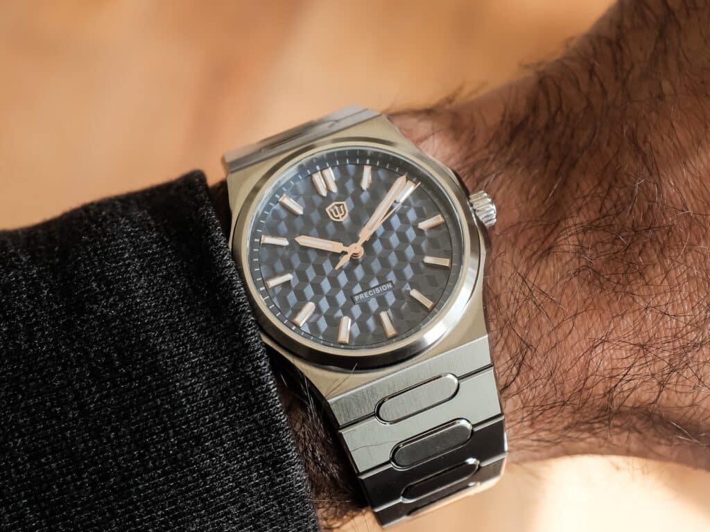
On my 6.75-inch wrist, I would’ve preferred just a little more size. Even so, the watch never felt too small. It sat flat, remained balanced throughout the day, and was comfortable from the moment I sized the bracelet. After a few hours, I stopped thinking about the fit entirely. I expected to spend most of my time talking about the dial. Instead, I kept coming back to the case.
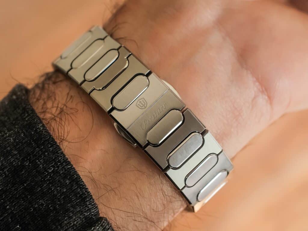
The brushing is consistent. The polished chamfers are crisp. Every transition feels intentional. Watchdives describes this as a higher level of finishing than its previous models, and after living with the watch, I don’t think that’s an unreasonable claim. At $219, I found myself appreciating the machining every time I picked it up.
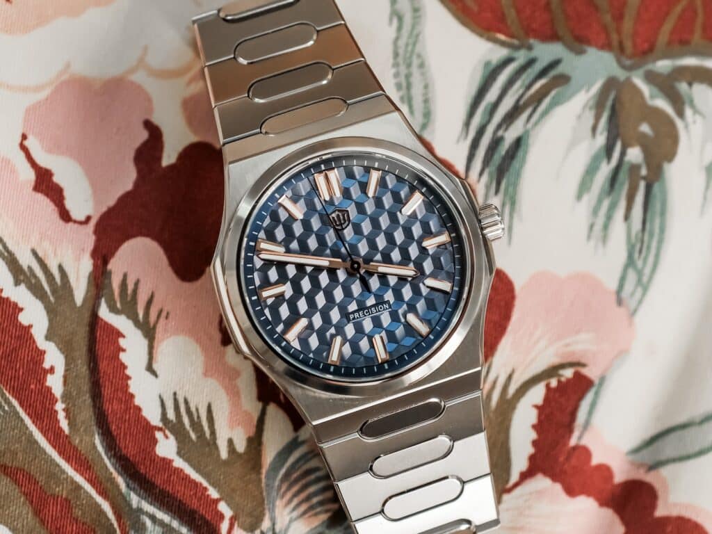
What really sold me wasn’t how it looked under bright light. It was how it felt. The softened edges and careful shaping give the case a smoothness that comes across immediately on the wrist. It simply feels like more time was spent refining the details than I expected.
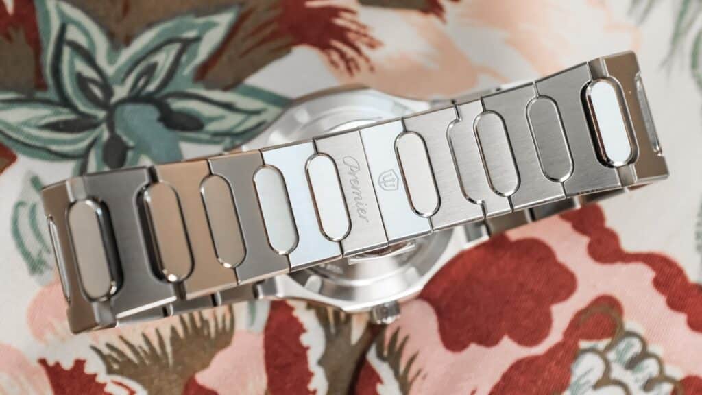
The crown remains one of the few areas I’d like to see improved. It protrudes farther than I think it needs to, and while it never became uncomfortable, it slightly interrupts an otherwise clean case profile. I’d also love to see the signed crown align once it’s fully tightened. That’s a small detail, but it’s one that becomes more noticeable when the rest of the watch is executed this well.
The flat sapphire crystal uses a five-layer high-clear anti-reflective coating. It performs well overall, although the textured dial below it creates plenty of reflections of its own. I don’t think the crystal is the limiting factor here.
A Dial That Never Won Me Over
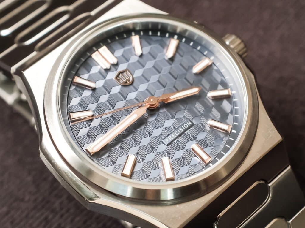
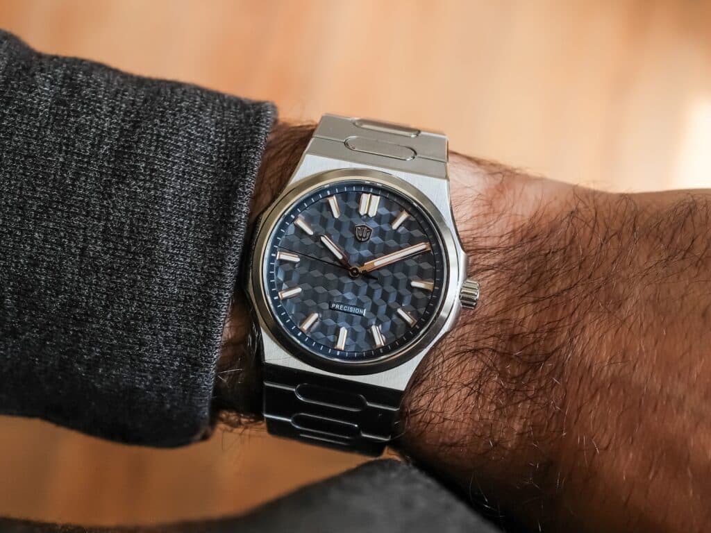
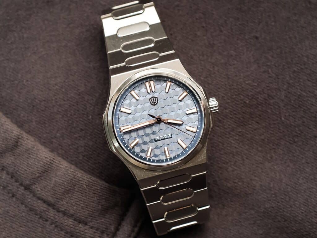
The dial ended up becoming the most interesting part of this review because it never stopped challenging my opinion. Objectively, there’s a lot to admire. The textured blue surface shifts dramatically as light moves across it. The applied gold-tone markers and hands are finished beautifully, with brushed centers and polished facets that add another layer of depth. Nothing about the dial feels inexpensive. I just never got there.
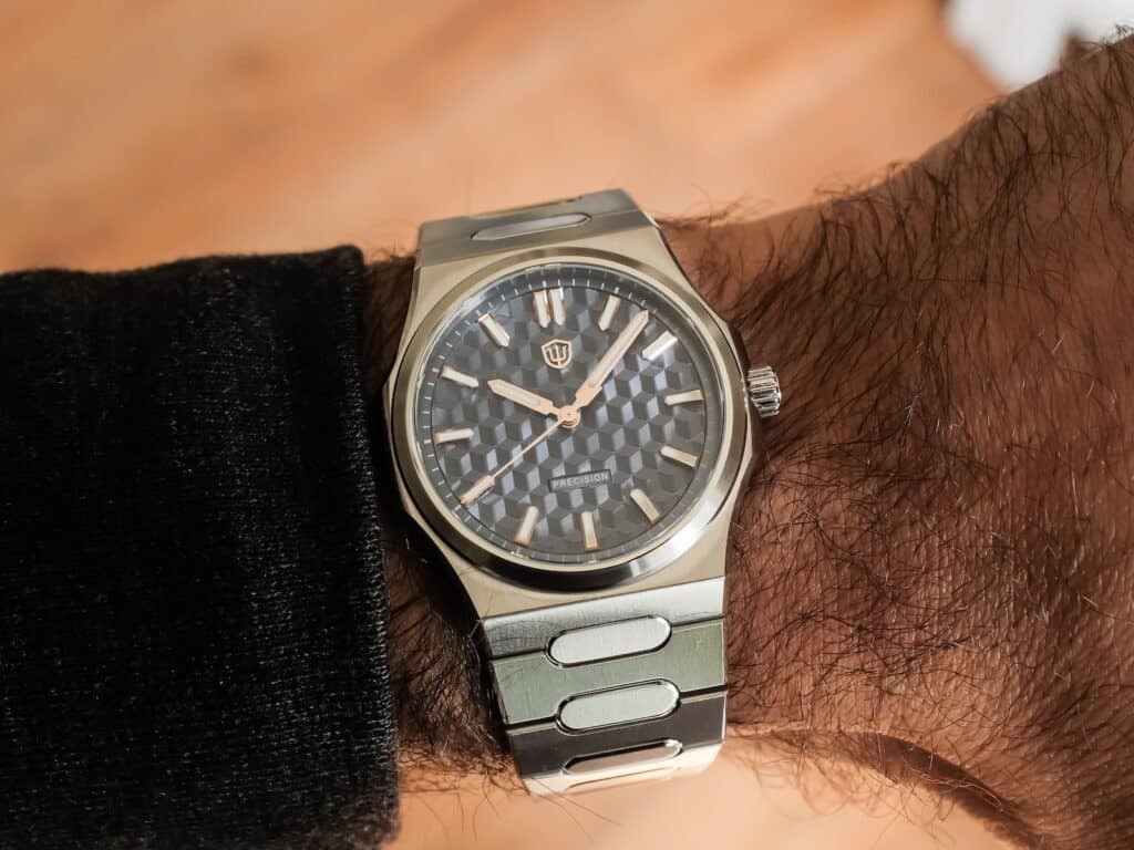
Every time I put the watch on, I’d admire the case finishing, the bracelet, and the overall build quality. Then I’d look down at the dial and realize I still wasn’t connecting with it. The texture, the polished hands, and the reflective markers create a lot of visual activity, and for me that came at the expense of legibility. I found myself searching for the hands more often than I wanted, particularly outdoors where the dial becomes its most dynamic.
That’s entirely personal. I don’t think the dial is poorly executed. I simply don’t think it aligns with what I enjoy looking at every day.
The rest of the execution remained strong. The applied markers are cleanly finished, the proportions of the handset feel right, and the BGW9 Super-LumiNova lasted through the night without issue. If I were making one design change, I’d remove the text above six o’clock. The dial has enough personality without it.
Living With It
I’ve owned enough watches with the Seiko VH31 sweeping quartz movement to know exactly what I’m getting. These days, I’ve actually come to appreciate it more than I used to.
I don’t wear the same watch every day anymore, so quartz has become easier to appreciate than it once was. I can pick the Premier up after it’s been sitting for a few days, and head out the door. The smoother sweep gives it a little more visual character than a conventional quartz movement, while the three-year battery life means it’s happy sitting in the watch box until it’s called back into rotation.
This example behaved exactly as I’d hoped. The seconds hand tracked well, there was no ghost date position when setting the time, and the crown worked smoothly every time. I never found myself thinking about the movement, and for a watch like this, that’s exactly what I want. The bracelet deserves just as much credit as the case. When the bracelet can’t be swapped, it has to be good. Thankfully, this one is.
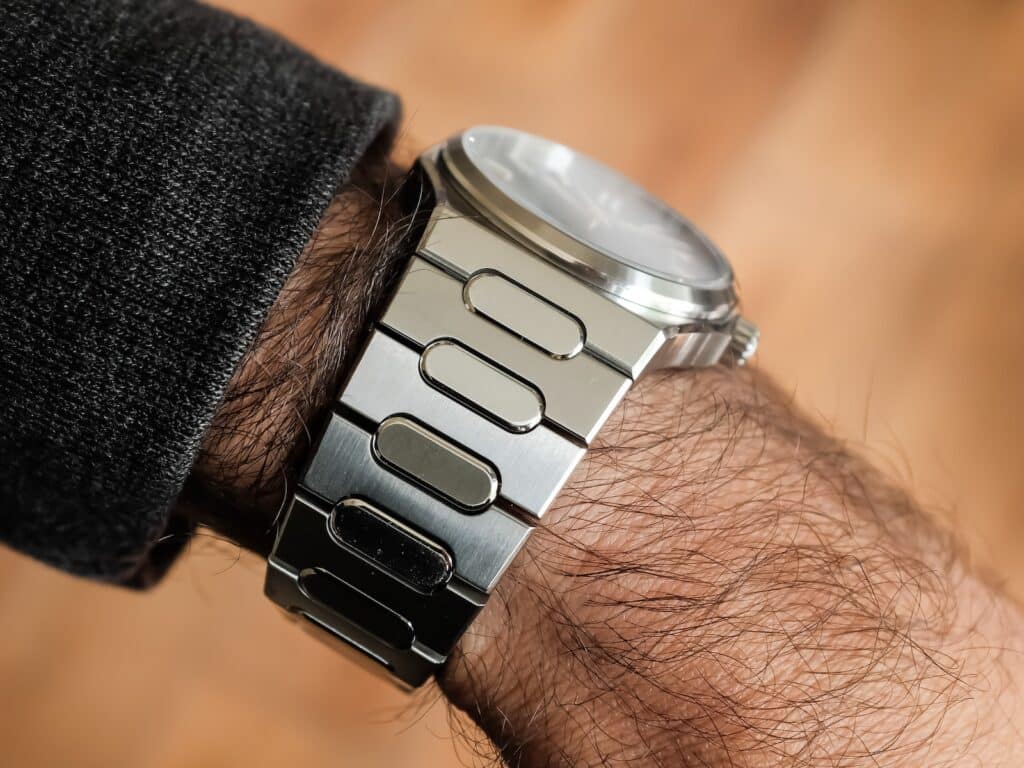
The solid stainless steel bracelet uses screw-link construction, tapers from 25mm to 18mm, and includes quick-release spring bars for future dedicated straps. More importantly, it’s exceptionally comfortable. The articulation is fluid, the underside has been softened everywhere it contacts the wrist, and the brushing stays remarkably consistent from end link to clasp.
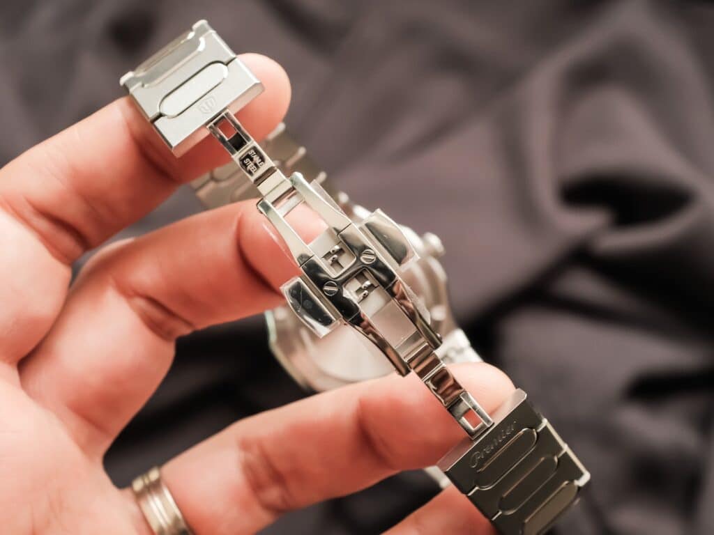
I’m still not a fan of butterfly clasps, and this one didn’t change my mind. It also never gave me a reason to complain. Once the bracelet was sized, I stopped thinking about it altogether. That’s usually the highest compliment I can give a bracelet.
Wrapping Things Up
After spending time with the Watchdives WD Premier WD0016B, I came away with the feeling that Watchdives is onto something.
The company has become very good at building homage watches, but this feels like an attempt to establish a collection it can continue refining over time. I don’t think it’s completely there yet. I’d still like to see a little more refinement in the dial, a few ergonomic tweaks, and more attention paid to details like the crown. None of those feel fundamental. They feel like the natural next steps in developing a platform.
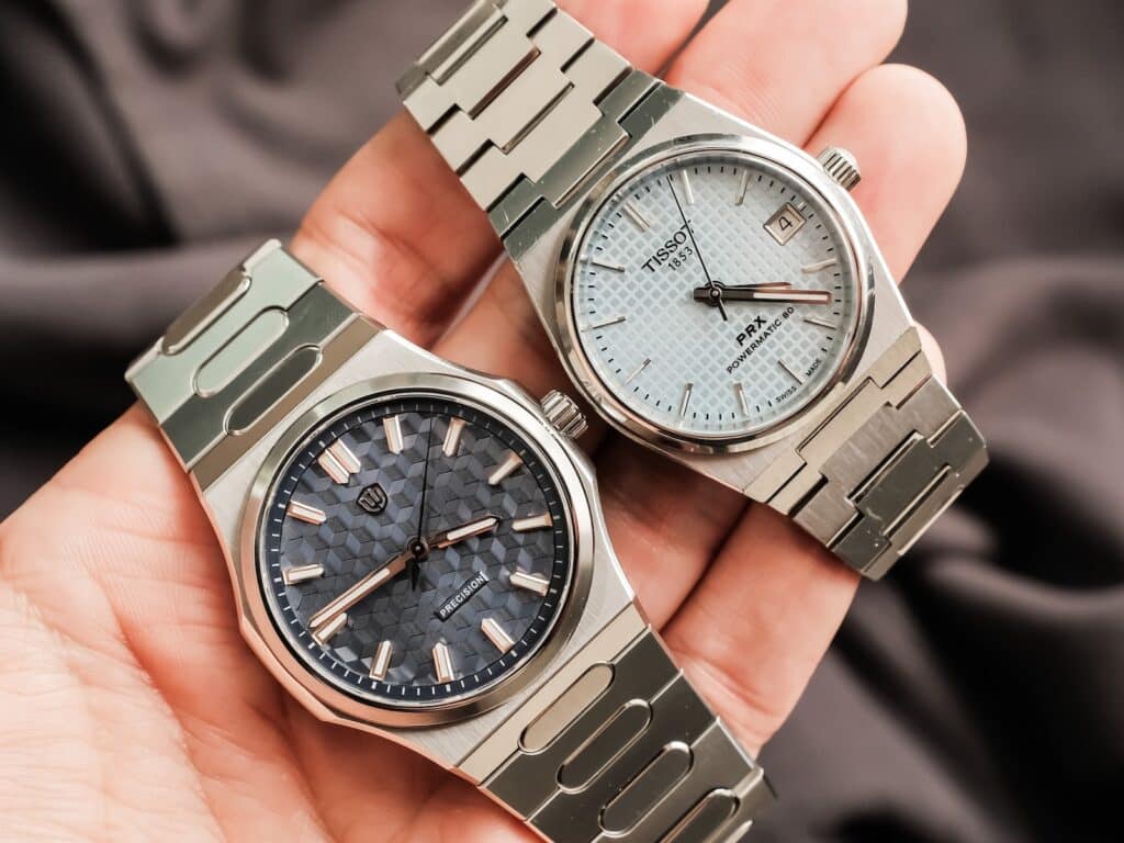
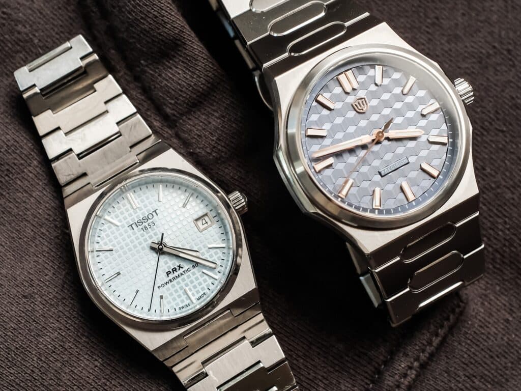
At around $219, it’s difficult not to think about where the Premier fits in the broader integrated sports watch market. The Tissot PRX remains the obvious point of comparison, but the Premier comes in well below that price while delivering a level of case and bracelet finishing that never left me feeling shortchanged.
At the end of the day, the WD Premier is simply a nice watch. I don’t mean that as faint praise. I mean it as someone who genuinely enjoyed wearing it even though I never completely connected with the design. Since I finished my time with this watch, Watchdives has already introduced natural stone dial versions, which tells me the company is committed to exploring where the Premier can go next. That’s the part I’m most interested in.
I can easily imagine future versions with different dial treatments, alternative metals, and new bracelet or strap combinations. If this first generation is any indication, I think the most interesting Premier probably hasn’t been built yet.

Co-Founder & Senior Editor
Michael Peñate is an American writer, photographer, and podcaster based in Seattle, Washington. His work typically focuses on the passage of time and the tools we use to connect with that very journey. From aviation to music and travel, his interests span a multitude of disciplines that often intersect with the world of watches – and the obsessive culture behind collecting them.
This Watchdives Premier is a homage of the Atelier Wen Perception. The case shape and bracelet designs are lifted directly from the Atelier Wen watch. No, it is not an exact 1:1 copy. But, it is pretty darn similar.
That’s it! I knew it kinda reminded me of something.