Field watches are rapidly becoming as ubiquitous as dive watches. Most of the major brands have them in some variation from Rolex and Omega to Seiko and Hamilton. Independent brands have also embraced them and it makes sense. Unlike a dive watch, the field watch holds the promise of activities that are accessible to all of us. Hiking, swimming, urban exploration, hunting or even mowing the grass are popular pastimes that offer some combination of solitude, adventure, exercise and mental decompression (Oh, you don’t think mowing the grass is a pastime? Then you have never driven a zero-turn lawn mower!).
Vaer Watches is an independent brand founded in 2015 by Ryan Torres and Reagan Cook. Their current offerings are assembled in Los Angeles, California and the Vaer website is quite transparent about how and where they source their component parts. Vaer has been producing quartz-powered field watches for the past few years and TBWS was fortunate enough to secure a prototype of their first automatic watch, which is about to launch on Kickstarter.
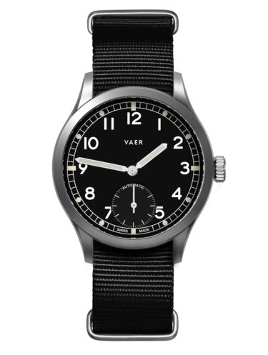
This new line of watches is being offered in multiple dial designs as well as three different movement options at varying price points. Depending on the version, these watches will either be American Assembled or Swiss Made. The specific watch that I reviewed, the Vaer Field Black with Miyota 9015 movement, will initially be available at an Early Bird price of $299 before it ultimately settles at $449 retail.
The Case
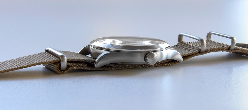
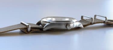
It’s nice to see a case that was the product of a thought process as opposed to a generic lump that fell out of a parts bin. The 316L stainless steel case of the Vaer Automatic is softly brushed on the sides, bezel, and lugs but there are tasteful, polished chamfers around the base of the bezel and along the outer curvature of the lugs. These chamfers offer a visual softening of the case geometry that is pleasing to the eye and allows the lugs to better flow onto your wrist.
Vaer Automatic Specs
- Case Width: 40mm
- Case Length: 48mm
- Thickness: 10.5mm
- Lug Width: 20mm
- Case Weight: 55g
- Water Resistance: 100m
Speaking of lugs, they are a real highlight of this piece as they offer generous clearance for thicker nylon and leather NATO straps. This was achieved with spring bars that reside at the outermost tip of the lugs, which are gracefully arched to position those spring bars almost even with the bottom of the case back. I really like this arrangement because it pulls the watch onto my wrist and helps to overcome any excess bulk created by straps that pass beneath the case.
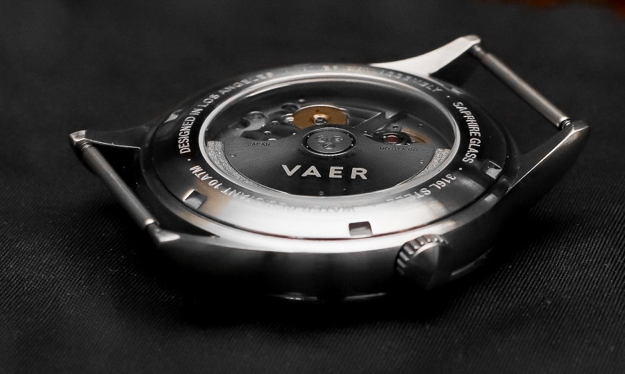
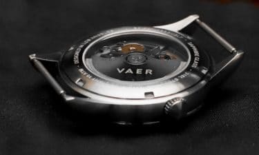
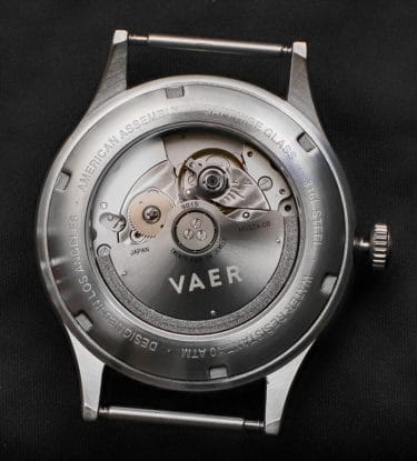
The case is topped by a modestly domed, sapphire crystal with anti-reflective coating (note: the crystal on the prototype that I reviewed did not have A/R coating). The case back is screwed down and provides a display of the Miyota automatic movement through a mineral crystal.

The Dial & Hands
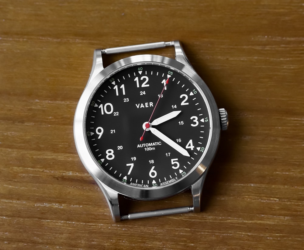
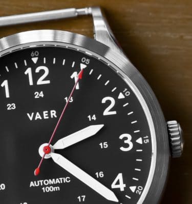
The dial on the Vaer Field Black is a tasteful blend of vintage military and modern color splash. Highly legible at a quick glance, the black dial, white sword hands and inner ring of white numerals are all well matched. There is also an outer ring of yellow numerals at five minute intervals and, of course, you can’t miss the red lacquered second hand that is glossy without being gaudy. Wisely, Vaer has not burdened the dial with excess nomenclature. In addition to the Vaer logo, the movement type and water resistance are highlighted. The lume is BGW9 Super-LumiNova and glows aqua on the hour and minute hands as well the numerals and hour markers.
 I wasn’t overly impressed by the lume at first glance but I did a comparison with a direct competitor, the Hemel Track. After many hours in a darkened room, the Vaer’s hands were easily seen with the numerals being somewhat less noticeable (the Hemel’s hands were almost invisible).
The Movement & Crown
The Miyota 9015 has become a popular movement (especially with independent brands) and with good reason. It offers a cost-effective alternative to the ETA 2824 and generally eclipses peer Seiko movements in features and with more consistent performance. The 9015 hacks and hand winds and also provides mild entertainment in the form of a rotor that winds the watch only in a clockwise direction. The entertainment arrives when certain hand motions cause the rotor to freewheel at impressive RPMs. When that happens, you will hear some rotor noise.
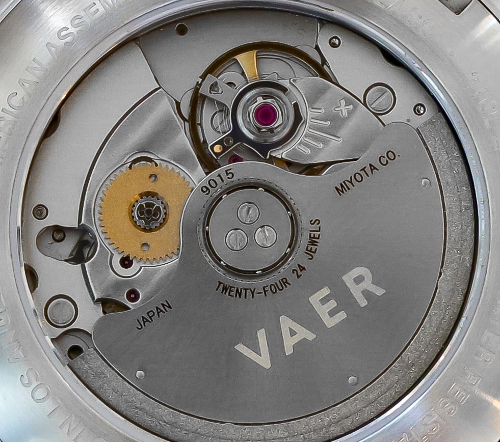
Miyota rates the accuracy of the 9015 at between -10 and +30 seconds per day. Many owners of watches with this movement report better than advertised accuracy and Vaer indicates that their watches will be checked and regulated to factory specifications. If you choose a Vaer Automatic without a date window, there will be a phantom crown position because the 9015 is equipped with a date wheel. Not a big deal but something to be aware of if that’s important to you.

The screw-down crown is rather diminutive for a 40mm case and makes unscrewing more challenging than it needs to be. It would benefit from a little more depth and girth. Both the crown and the movement’s rotor are signed with the Vaer logo.
On the Wrist
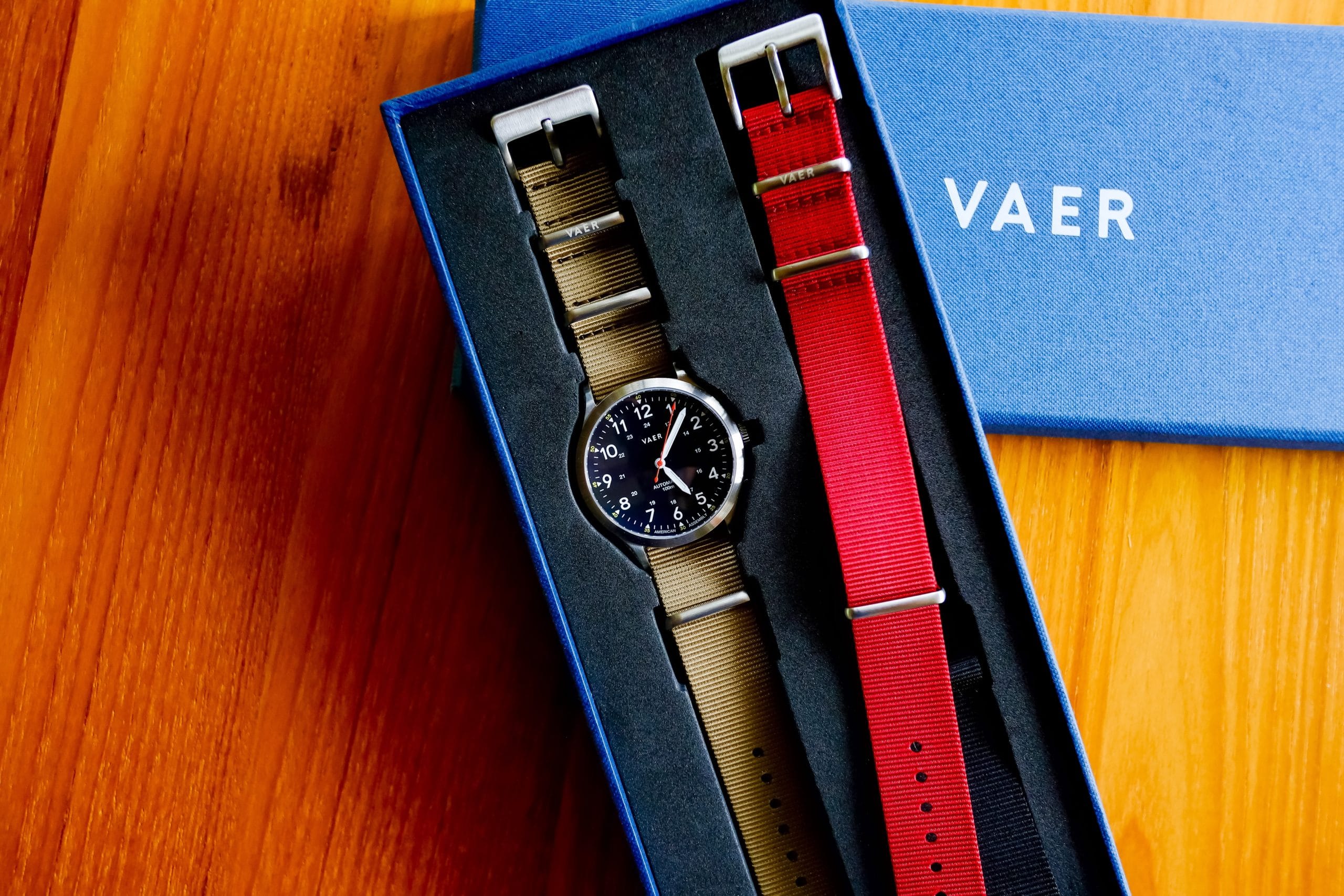
It’s all about the lugs. By simply adding some extra lug curvature, Vaer has created a case that should appeal to many wrist shapes and sizes. It’s not just the curvature that works so well on this watch. The extra clearance provided by the spring bars allows the watch to hug the wrist for a more streamlined look when using single piece straps. With regard to straps, each Vaer Automatic comes with two straps of your choice.
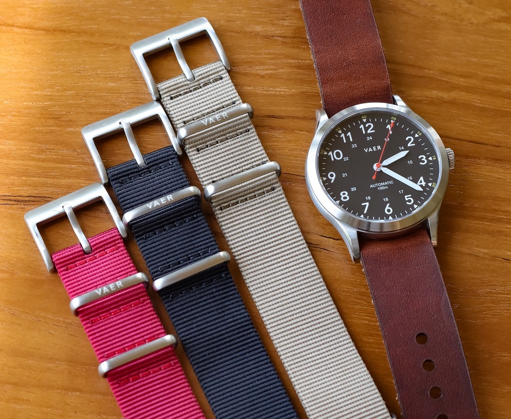
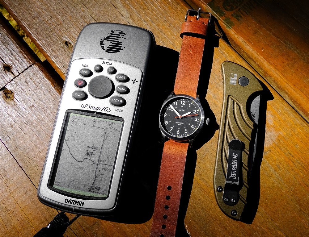
I was able to sample their NATO straps in black, red and khaki. All of them look good and the red is a particularly attractive color for summer. Buyers will also be able to choose from single pass or two-piece Horween leather straps. Vaer sources Horween leather hides and their own team in Los Angeles does the final cutting and assembly. The leather underside is stamped with the Vaer logo (as is the hardware on all of their straps). The single pass leather strap that I sampled was comfortable and immediately conformed to my wrist.

Obviously, a field watch has to be legible and the Vaer Field Black did not disappoint in that regard. I’m not a fan of distracting dial fluff and each of the dial options offered by Vaer allows for the quick reading of time at a glance.
Final Thoughts
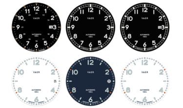
By carefully sourcing key components, independent brands like Vaer can provide significant value at modest cost to the watch buyer. The Vaer Automatic line is a prime example of that type of approach to watch making. When the Kickstarter portal opens on July 9, 2019, program backers will be able to choose from three automatic movements and multiple dial designs as follows:
- Miyota 9015 – Offered in four dial options including date and no-date variants. These will be hand assembled in Los Angeles. $299 Early Bird ($449 retail)
- ETA 2824 – Also offered in four dial options including date and no-date. These will be Swiss Made. $449 Early Bird ($599 retail)
- ETA 2895 – This is the Vaer Heritage “Dirty Dozen” with small seconds subdial. These will be Swiss Made with one dial option. $599 Early Bird ($849 retail)
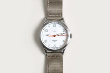
Note: As the Kickstarter campaign unfolds (and depending on demand), there may be minor changes to some of the available options. Also, two of the dial choices (known as “Design Light” and “Design Dark”) offer stylish interpretations of the field watch aesthetic by using less traditional white and slate blue dials that are nicely complemented by syringe hands. As a bonus, these versions have a really well integrated date window.
I wasn’t familiar with the Vaer brand until a few months ago but two other things impressed me about this company. They are pushing to source as much of their labor and parts within the USA as is economically practical and I wouldn’t be surprised to see this become an even stronger hallmark of Vaer down the line. In addition, I found the owners to be incredibly accessible and responsive to my inquiries, even before they knew I would be reviewing their wristwatch. That’s not a bad hallmark to have either.


Mark retired in 2018 after 37 years in the financial services industry. He “Discovered” watches in 2015 after seeing a photo of a Steinhart OVM1 in a car forum. Ever since then he’s filled two watch boxes (and is trying to decide between buying a third one or thinning the herd). His additional pastimes include hiking, working on cars, exploring and photographing abandoned military bases.
The spacing in the wordmark would drive me crazy. Looks like VA ER. The number one needs kerning throughout as well (especially 100, 17, 11 10, etc). Makes an otherwise nice looking watch look cheap. Don’t skimp on the graphic design/typography…!
A shithole company buyer beware
i wasn’t familiar with the word “kerning”. Thank you for that! With respect to the wordmark, I guess I’m not seeing what you are seeing. Would your solution be to just reduce the spacing between the A and E on the dial?
Granted, it’s something that is likely only going to be noticed by people who work with type. However, it’s also the type (haha) of thing that once you see you can’t unsee. Most major brands (watches or otherwise) have that sort of thing perfected. But to answer your question, the ‘A’ and the ‘E’ do need to be closer, but the spacing of the other letters in VAER would need to be adjusted as well to create the proper sense of balance and spacing between the letters.
Regarding the 1s: the number 1 in most fonts has too much space between it and the number that comes before and after it. It’s a holdover from typewriters, where each letter and number had the same amount of space between it. Some newer fonts adjust for this, but the vast majority need someone to kern it manually. If you start looking around, you’ll see it all time where a number like 100 will be more like 1 00. The space here is too large, but you get the idea.
A side note, and another recent typographic blunder, was in the recent Omega 50th anniversary release where the apostrophe in the quote on the back was a foot mark, and not an actual apostrophe. Oops 🙂
Thanks Stereo. Fascinating perspective. One more question. Take a look at the dial of the Timex Weekender in my previous review on TBWS. Do you believe that the letter ‘O’ in INDIGLO should be closer to the ‘L’?
Hi Mark, capital letters can be quite difficult to kern. For instance, with INDIGLO, the O can’t get closer to L without touching it, But, the negative space in the L gives the illusion that it is farther away from the O than it is. When I look at INDIGLO, the space between the IND seems seems more problematic to me.
One interesting thing to note is that the 1s are kerned very well on the Timex. If we compare the numbers on it to the VAER (17, 11) the difference is notable.
Thanks for the article. I didn’t know about this brand before and these look like nice watches and good value. I particularly like the model with the small seconds.
I also appreciate the comments on typography from Stereo. Maybe that is why I often prefer watches with index markers to ones with numerals.
Thanks SMB for your comment. The Black Heritage dial is really attractive as well, similar to the “Dirty Dozen” w/small seconds, but without the subdial.
I just ordered the A5 Design Navy. It’s gorgeous in its simplicity. I hope it hits the mark for a field watch!
Cool, dial looks clean and attractive. Let us know how you like it.
Yeah that kerning would drive me nuts too—now that I’m aware of it.