
Seiko has an enduring lineup of “greatest hits” dive watches—from the rugged Turtle and Tuna to the angular Samurai. Yet with the release of these new Seiko Prospex models (SPB481, SPB483, and SPB485), Seiko introduces an eye-catching design that’s distinctly different from anything we’ve seen in its catalog, while still staying true to its tool-watch roots. I’m still not sure how I feel about these but I like that Seiko took a significant design leap with these new divers.
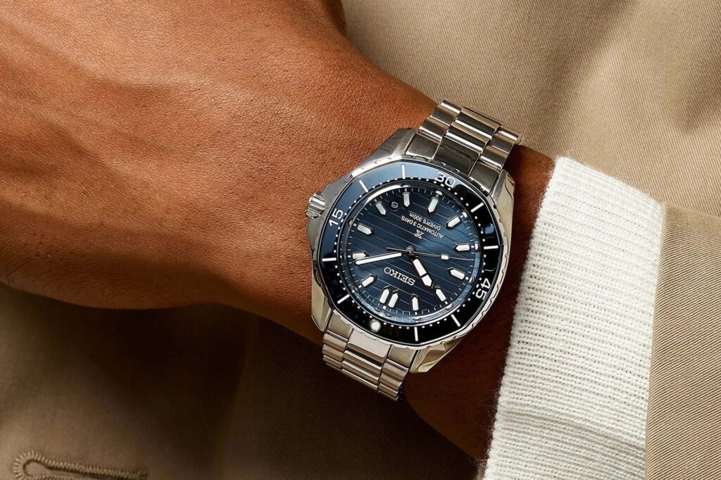
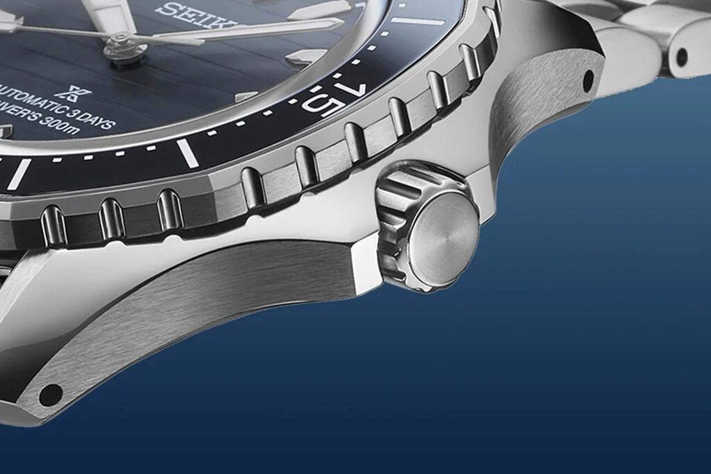
The immediate standout on these new models? That bezel. With its softened, octagonal shape, the bezel echoes the iconic look of a Royal Oak but keeps the classic functionality of a Seiko dive watch with a unidirectional mechanism, dive-time markings, and a lumed pip. There’s a familiarity here that’s offset by Seiko’s own angular approach—no visible screws or fancy brushing—making for a sporty, Seiko-centric look.
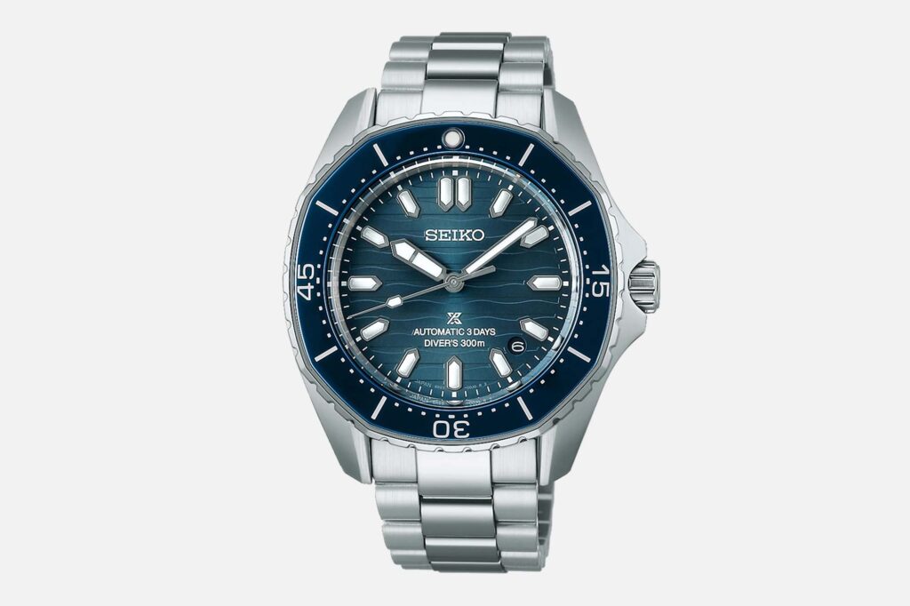
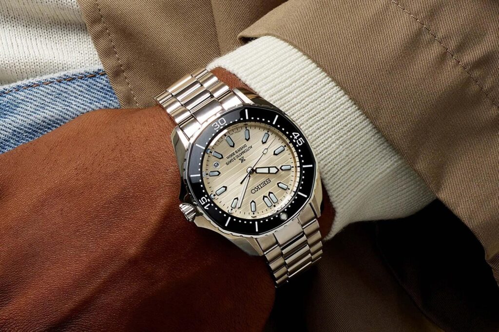
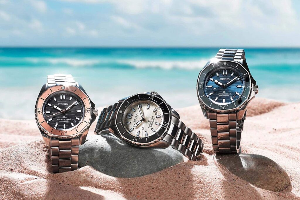
Then there’s the “Coastal” dial, with horizontally engraved wave patterns that offer a refined contrast between the curvy base and flat top. It’s a design direction Seiko aptly describes as carrying “resort-scene looks,” elevating it above the purely utilitarian and grounding it in a touch of elegance. The dial options—blue on the SPB483, beige with a black bezel on the SPB481, and a black-and-bronze on the SPB485—showcase Seiko’s ability to balance high-design with practical dive-watch elements.
Specs-wise, these Prospex models bring a lot to the table. Case diameter is 41.3mm with a water resistance rating of 300m. They run on Seiko’s 6R55 automatic movement, offering a solid 72-hour power reserve. An anti-reflective sapphire crystal and a stainless steel case coated in Seiko’s signature hardening treatment round out the build quality.
Add in the AR coating, and you’re looking at a $1,100 dive watch that lines up with Seiko’s recent trend in pricing but still offers a premium feel, especially with finishing touches like full mirror polishing on the top case and bracelet.
Available starting next month, these models start a compelling new chapter in Seiko’s catalog of dive watches. They seem to combine aesthetic nods to high-end design with Seiko’s own reliable engineering and tool watch charm. While the bezel design is cool, my favorite part has to be the dial. It just seems to really shine on that blue version and that would be the one I actually pick up.

Co-Founder & Senior Editor
Michael Peñate is an American writer, photographer, and podcaster based in Seattle, Washington. His work typically focuses on the passage of time and the tools we use to connect with that very journey. From aviation to music and travel, his interests span a multitude of disciplines that often intersect with the world of watches – and the obsessive culture behind collecting them.
It looks nothing – I mean literally nothing – like a sodding iconic (it says here) Royal Oak. No “echoes”, nothing. It’s like saying a beach ball has echoes of a Rolex-whatever because they are both round. This does, though share a general silhouette with a few Astrons given the slightly TV-ish overall shape. Seiko going for a house look, I guess, and people just go “well there’s kind of some squared off bits so will go with our limited viewpoint and call it inspired by an Apro”. Jeez.
Don’t get me wrong, I like the black/white (beige/bone?) and blue versions. HOWEVER, from an explicitly critical POV, I’d say that the bezel compares more towards the sportiness of the Tag Aquaracer as it’s not trying to confuse/compare itself with/to a $25k+ watch. Meanwhile, the horizontal etching of the dial (as with any dive/water-focused watch) reminds me too much of (or homage to?) the Omega Aqua Terra. Further, the circular date window and the slightly rounded indices evoke the women’s version of the AT, i.e. the 220.10.38.20.03.002.