Rado Captain Cook MkII Review: Revisiting The Original MkII
By: Damon Bailey
Part 1:
When it makes sense to reject “the new and improved”
By now, I think you’d be pressed to find a watch enthusiast that doesn’t get excited over a “reissue.” Capitalizing on this, it seems every brand has been reaching through the dark corners of their archives to see which of their forgotten references are worth reissuing. It’s a winning formula that has tested its limits to the points of desperation … to continue remarking on the popularity of “new vintage” would be beyond cliché.
I’d like to think that there is goodness behind a company’s decision to look backward and make available to the masses what has become so impossibly difficult to source on the vintage market. Sporty antiquated time pieces have become the new posh . In response to this, skyrocketing prices of an original Hamilton Chrono-matic or a Heuer Autavia makes me appreciate the “more accessible” recent re-issues. It kind of reminds me of reprints in the comic book world… Is there a small part of Marvel that feels any kid who wants one should be able to hold an issue of Amazing Fantasy #1? Similarly, I love Target mostly because they allow me to buy retro AC/DC band tees that I’d otherwise never be able to source or afford. I feel from a business standpoint, there’s tremendous sense to this, and the watch world has a lot to gain from this approach.

But how do you explain when the exact opposite happens? What if a vintage sport watch that’s relatively easy-to-source is followed up with a modern-day re-release that is literally ten times the price without any attempts to update appearance?
Wouldn’t you want to know what the hell they were thinking? You can pay an arm and a leg for something that re-creates (through painstaking detail and reverse engineering) it’s direct inspiration, or you can opt for authenticity and get the real deal for less than the tax you’d pay on the new one. Think “pet rock” or “designer water”—arrant marketing nonsense. I’ll cut to the chase here:
Only in a world where I’d try to sell you Banksy’s fart as an installation art piece would I endorse Rado’s latest Captain Cook MkII replica as a fundamental improvement over its humble predecessor. And to you, Rado, “What the fuck were you thinking ?”
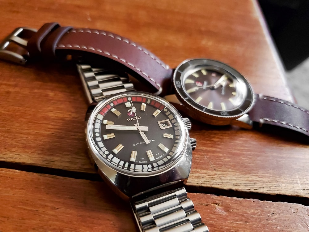
I won’t waste your time with speaking to the merits of the re-release; other online reviews have already done this. To its greatest credit, I’d commend the new watch on its faithful and uncompromising reproduction of the original MkII. You are, quite literally, looking at the exact same dial features and case dimensions between each example.
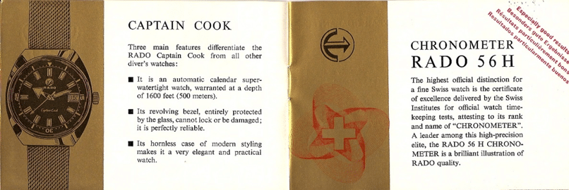
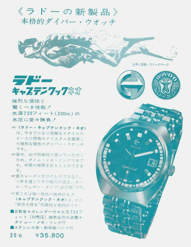
That said, focusing on reviewing the original release with respect to greater ease for obtainability (50,000 more were produced) will provide more valuable insight. In a nutshell, the upgrades for the newer reissue include the modified ETA 2824 (akin to a Powermatic 80) and a sapphire crystal. For the purposes of further discussion, we’ll be taking a look at the Captain Cook Mark II ref. 117733.
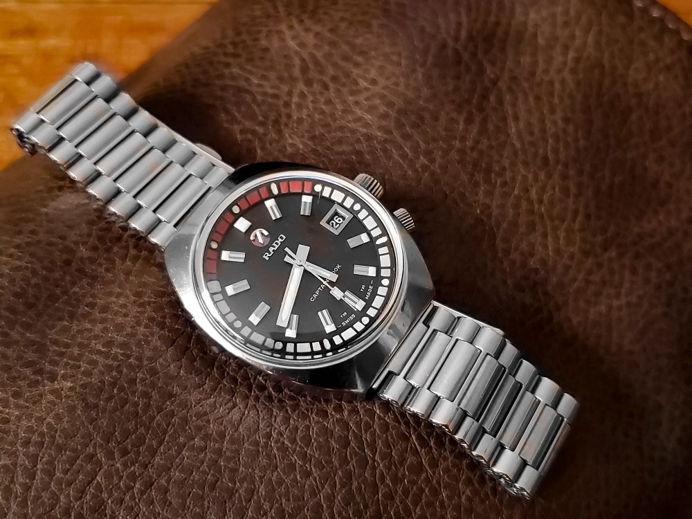
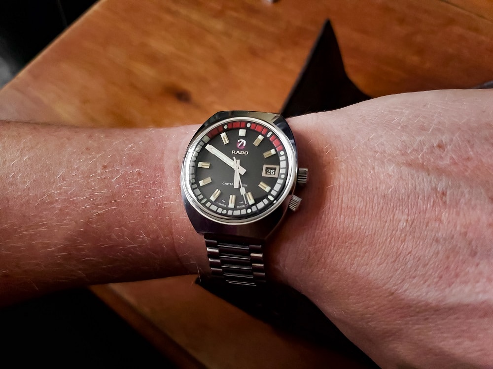
Characteristically, the MkII is very retro in appearance. The years of production for this reference span from 1967 to 1972. Hallmarks to the era include a tonneau-style case with hidden lugs, an internal rotating bezel, and rectangular-shaped applied indices to angled to reflect different directions of light. While evolution may have left these design aesthetics behind, there’s something unapologetically punk that makes this composition stand out among the other retro diver throwbacks that are increasingly popular today.
The Case
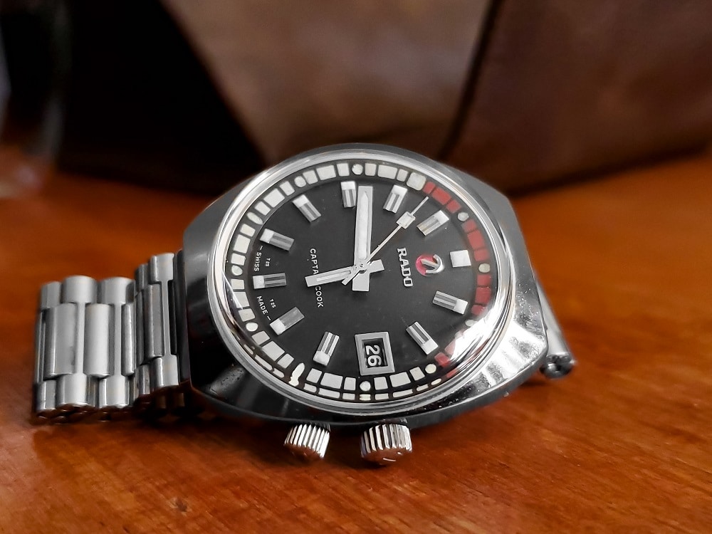
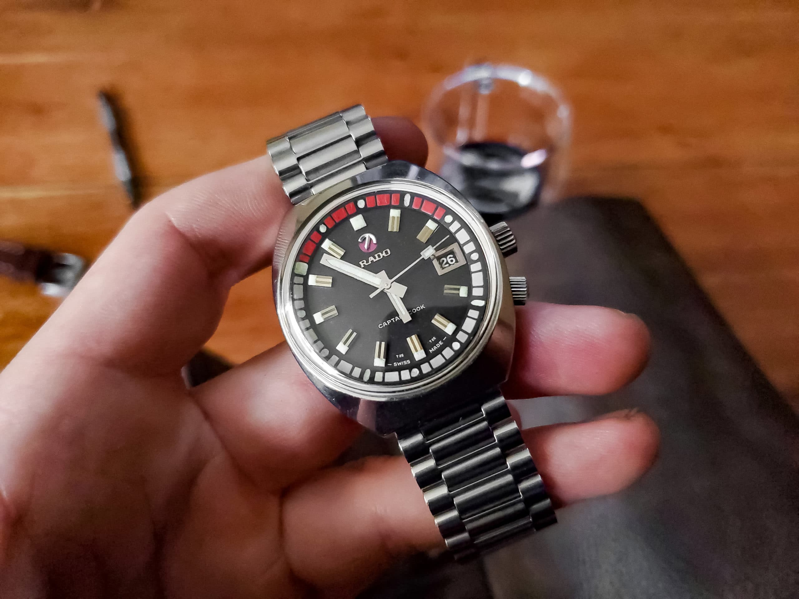
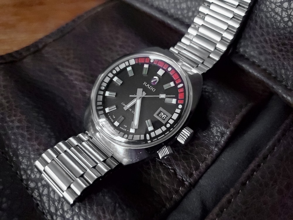
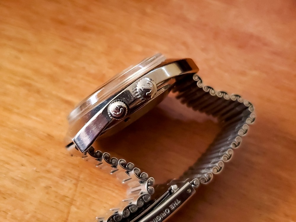
The stainless-steel body is high-polished and barrel-shaped. Across the width, it measures 37mm while the lug-to-lug length is 41mm. These are modest dimensions on paper however the footprint wears far larger due to the absence of a bezel (with a crystal that measures 35mm) and the extra real estate of steel between the lugs.
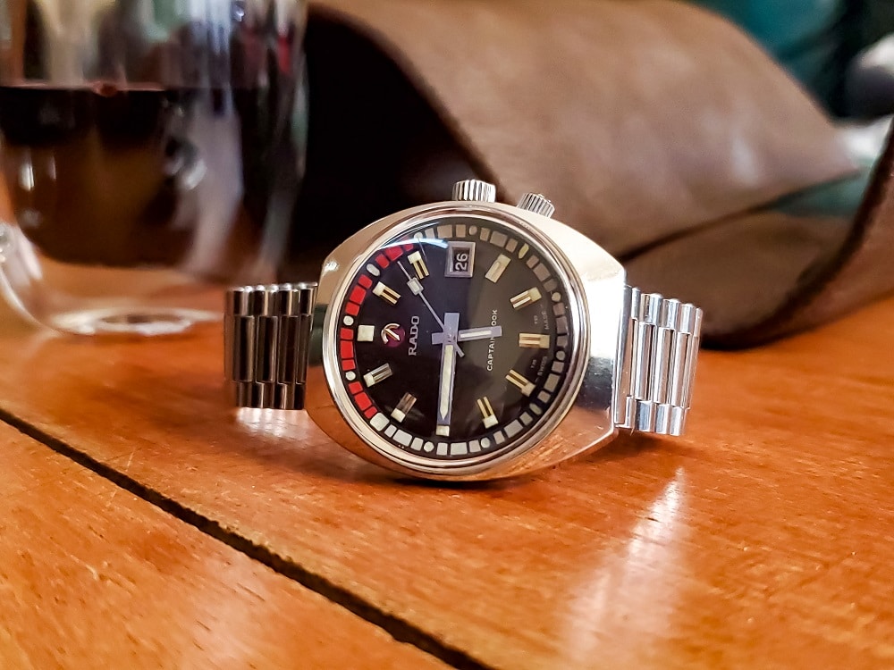
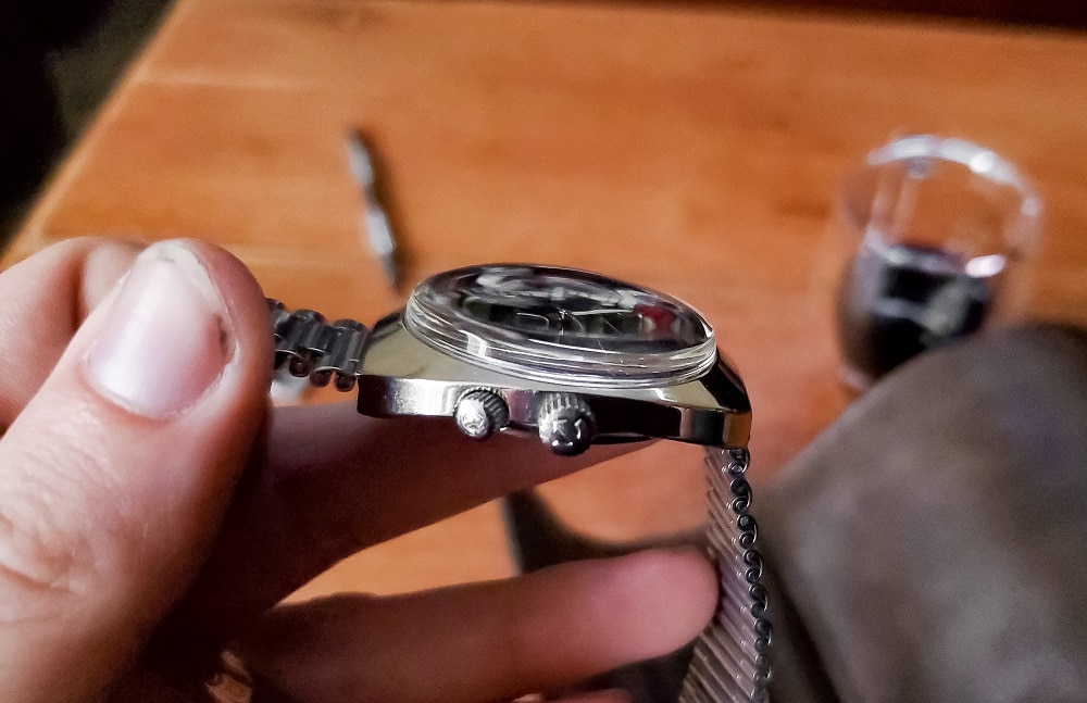
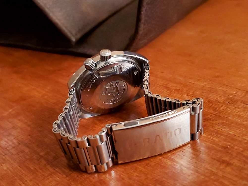
Then there’s the dome… a very thick 5mm box crystal that gives the case an appearance of heft. There are two crowns, both of which are signed with the trademark Rado anchor insignia reminiscent of an oscillating weight. The three o’clock operates the inside track while the smaller push-pull crown is protected by its recessed position between the case housing and bezel adjustment. It’s a subtle integration that speaks to Rado’s attempts of design-conscious forwardness.
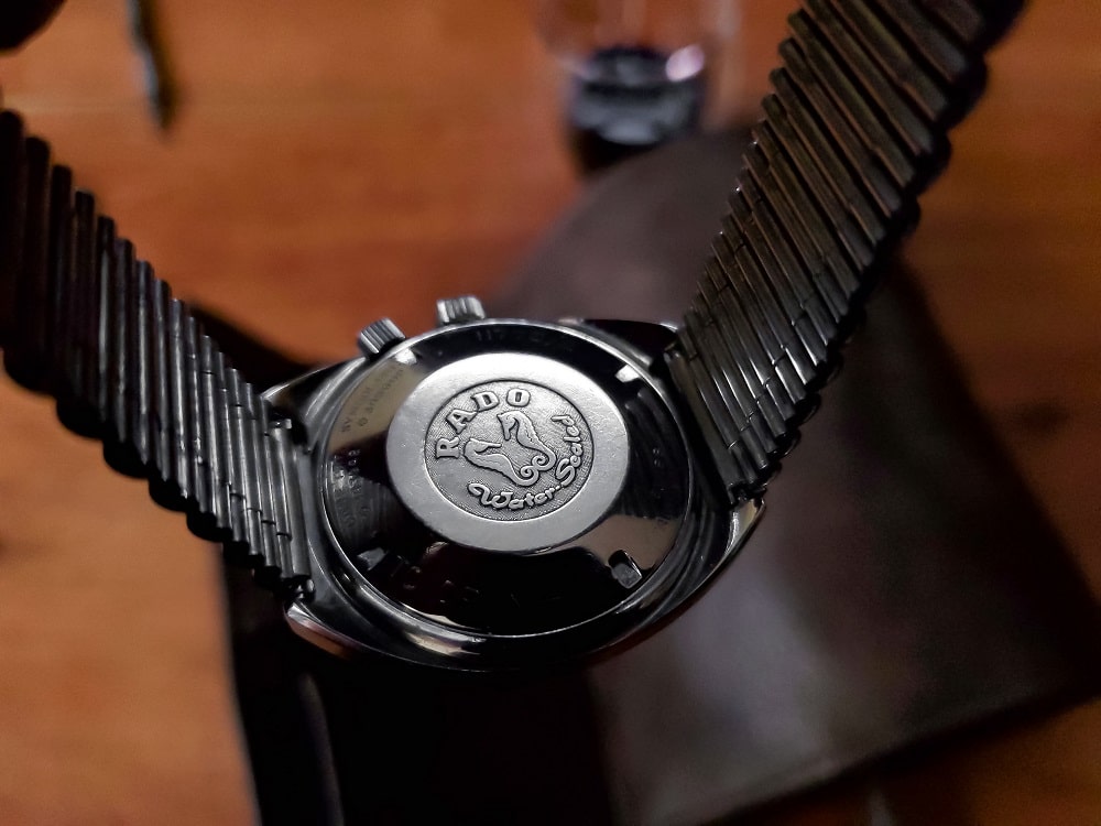
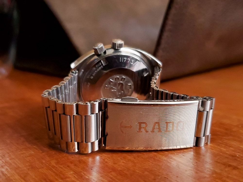
Water Resistance
The movement is secured by a screw down case back, decorated with inward-facing seahorses and the line “Water sealed.” As with any vintage watch, gaskets and general capabilities warp over time, compromising the waterproofness. The Mark II advertised itself as being waterproof to 1625 feet (495 meters). For those of you keeping mental notes, Bulova’s “Deep Sea” diver advertised itself as 666 ft.
The Dial
The three silver hands contain heavy traces of glowing Luminova paint which, amazingly, can still be seen today. While the hour and second hand are baton-shaped, the minute is accentuated with a sword-shape application of paint. The second hand is marked separate with a rectangular paddle at the end.
The black dial is painted flat and although this particular example has minimal traces of tropical aging, there’s zero ambiguity about where to locate the hour marks. Each is detailed by polished applied indices, accentuated by more lume. The notable exception would be three o’clock, where there’s an unobtrusive date window framed in a steel accent. The rotating track is marked with lesser traces of paint at five-minute intervals, a third of which is documented by red swatches to denote whatever arbitrary twenty minutes of timing might be of concern.
One of the quirky design elements that makes Rado unique is the inclusion of their anchor-shaped logo at the twelve hour mark. Although the scuttlebutt hasn’t been verified, the ability to rotate its direction based on the kinetic energy of your wrist movement is purportedly an indicator of servicing if the watch’s lubricant has dried up.
Bracelet
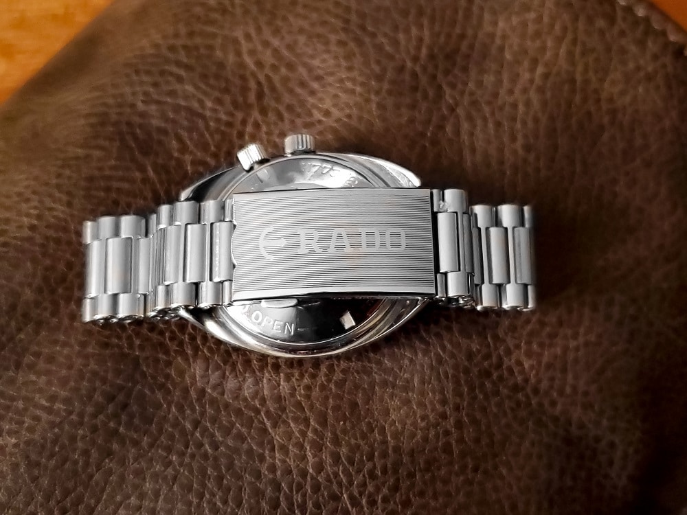
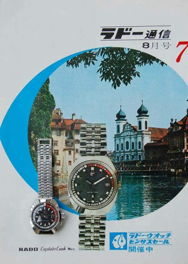
Advertising from the sixties suggested there were several different bracelet options that paired with the MkII (with no other notable changes to reference numbers). While JB Champion or GF may have partnered with some of the more notable Swiss brands, Rado leveraged their partner, NSA. More than likely, this link bracelet pictured was original to the more widely produced (but equally polarizing) Diastar model.
Due to a spring extension bracelet integrated into the fold-over clasp, this would been preferable, flexing for a half inch of travel if needing to slip over a wet suit sleeve. “RADO” is featured prominently over the clasp.
Engine
The MkII was powered by an automatic winding movement produced by A. Schild (caliber AS 1858/ 25 jewels) that beats at 21,600 vibrations per hour. It is non-hacking, but capable of being manually wound. For what it’s worth, the one reviewed was accurate to about a minute a day without any documentation of service history.
As the review portion draws to close, I’ll sum this up with my subjective opinion that a vintage Captain Cook MkII is a solid value in terms of bang for your buck. It’s not trying to be something it isn’t, its representative of a unique design era, and lays claim to silently contributing to technological advancements later shared by the greater industry toward the use of ceramic materials. This particular example was acquired online for just above the $230 mark and a suitable NOS bracelet for $25. In a world where even Caravelle, Zodiac, and Seiko pieces are starting to command flipping numbers well over the 1k mark, Rado has never even flirted with this measurable investment acclaim. How could this be possible? Is it that they’re not putting themselves out there? Should they reconsider promotional campaigns? These questions are rhetorical because we both know what’s going on and why their image is failing.
Rado’s marketing really, really sucks.
Part 2:
When a perfectly good watch is sold short by its unfortunate marketing
As a targeted demographic getting pummeled with their ads across social media, championing Rado’s merits has become increasingly difficult. I’m not really sure how far back their struggle with marketing goes… but here’s bit on the brand trying to convince you that with enough arm hair, the Diastar could be your quintessential man’s watch:

The funny thing is actually like Rado’s designs. I wouldn’t wear the majority of their line up (largely because they remind me of Ikea furniture and jingle trucks ), but I can objectively appreciate their attempts to push boundaries. To me, the name, “Captain Cook” commanded intrigue and so it felt befitting for a dive watch to pay tribute to an explorer (albeit an ill-fated one).
On an even more personal note, an overlooked brand like Rado provided me something with which I could “connect” and “make mine” because it was deemed toxic by the larger watchfam, dismissed as “the company that did ceramic stuff.” The sentiment wasn’t unlike when you were in high school and wanted to find that band nobody else knew about… you were willing to settle with lack of polish if it meant they had less mass appeal.
What I hadn’t anticipated was the onslaught of ridiculous marketing campaigns Rado launched against me in the coming years.
- “His and hers” watches.
- Astrological sign-themed watches.
- The sheer religious attachment to quartz innards and choice location dealers that would ultimately earn them the damning term, “mall watches”—a four letter word reserved for the likes of Fossil or even Shinola. But then, as if Rado were well-aware that I was campaigning their brand despite the entire internet pressuring me to think otherwise, they felt the need to release a Macy’s exclusive .
The real struggle comes with stomaching their social media campaigns. Take their Instagram account. This portal is host to some seriously basic, ratchet-vanilla storytelling that explores the drama of what it means to be white in a world montaged by arbitrary uncertainties.
In this web-series, you “Meet Karin,” a model-turned influencer-turned model who is just quirky enough to have an unconventional spelling of her name, but not extreme enough to venture outside the color white for her wardrobe. She seems overly concerned with checking her watch, despite having no particular place to be in between ordering espressos, updating her insta-feed for the perfect flower backdrop, or forgetting to move one piece of hanging art to the other side of the room. She’s a relatable human because she clumsily forgets things. Then there’s Jack. Jack likes finding things that get left behind by Karins. They both wear Rados and this coincidence paired with the serendipitous event of returning a lost item means marriage is the next logical step in getting to know one another.
This six-episode, two-minute installment campaign was entitled, “#YouCompleteMe” and if the first season weren’t enough to teach you about how to discover your soulmate through watch tastes, don’t worry; Rado followed this up with a season two. They literally called it “Season Two ”— I’m not making this shit up.


It’s this “His and Hers” campaign that has become the most infamous thing to watch aficionados about their brand. It’s no longer innovation or performance, but lifestyle. Unfortunately, this sort of approach would typically be limited to the likes of today’s Movado or MVMT, but even they know when to draw the line before drawing strength from beachside campfires or hipster weddings.
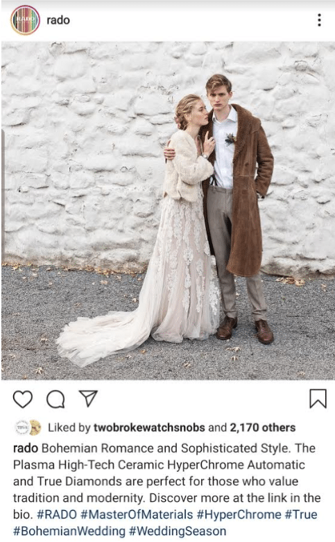
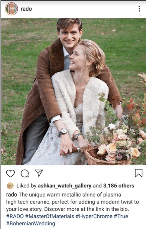
Every single time I look at this stuff I have to wonder what these folks were thinking (the ones responsible for this photoshoot). I wonder if Rado made any attempt at trying to find an actual product photographer, or if they literally just googled “Bohemian Wedding” and ran with whichever person’s feed had the most “likes.” And it’s a shame… Because I have to think about the watch designer and engineers who put their sweat and ideas into something that’s ultimately dismissed because its presence is not relevant enough to what their company is trying to communicate.
Because I’d acquired my Captain Cook MkII several years ago, I was thrilled to see Rado release the Captain Cook Hyperchrome Re-edition. The original Mk I was impossible to find (and even more difficult now). It was a unique moment for the brand to experience some acceptance among the harsh critics that make up our watch snob world. Rado has since leveraged this Mk I’s success as a flagship for their line-up. And, true to their style of marketing, has gone on to pervert my interpretation of its spirit with images of boho explorer-pirates running away from a Swedish furniture factory to canoe the high seas.
Maybe the guy who sees this video will think, “Hot damn, that looks like a serious step up from my Daniel Wellington.” And then maybe after purchasing it, he’ll realize there’s a whole other world out there… one beyond bearded bros in v-necks, filled with beating mechanical hearts geared toward innovation.
And then maybe that, too, would be a world worth exploring.


Damon is based out of the Bay Area, where he’s a black sheep among Apple Watch loyalists. Having served as a Combat Engineer with the USMC, he believes a true field watch’s success is measured by how closely it compares to a “G-Shock.” Nonsensically, a background in design has guided his preference toward higher craft, as he struggles to become the lifestyle his watch tastes more closely reflect.
Hi Damon
Great review. I used to hold the opinion that
1) Because I read watch fora, I’m a “WIS”. I’m “in the know”.
and
2) Rado are fashion watches for middle-class housewives of questionable taste.
Up until 2 years ago I had walked past every Rado boutique I had seen with a snort of contempt. I was a “watch guy”, not a “fashion guy”. But then one day while mulling over my next purchase, I wandered in to a Rado boutique literally “to see how crap these watches really are”.
I bought one 30 minutes later. And a second watch a few months after that. I wanted it so much, I ordered it from Switzerland and waited for several weeks for it to arrive. I had never done that before.
Just last night, while I was completing my regular “wind and clean” routine of my (too many) watches I noticed something else. The datewheel printing on both my Rado watches is much much crisper, precise and more generous than even on my Tudor. I recommend you take a X30 glass in good light and check a modern model out.
Rado are catastrophically under-rated watches. Their reputation is actually a damning indictment of the conservatism and group ignorance of the watch-buying community. They are disrespected for trying new designs while a ‘certain’ watch brand which hasn’t come up with a new model in 50 years is seen as The Holy of Holies.
As to the marketing nonsense, Rado are well and truly established in much of the world. In Asia, The Middle East and German Europe, they are a common sight. In The US, sensibilities tend towards the martial and/or adolescent. This is one of the reasons that Longines is not popular. Kate Winslet and Horse Shows do not connect with either “The Heartland” or urban demographic and the watches themselves are not expensive enough to be desirable to the Park Avenue crowd.
Personally, I DO NOT want Rado to develop a successful marketing strategy for The US. After seeing the abominations which Grand Seiko have come out with over the last couple of years in an effort to appeal to bloated wrists and an unsophisticated aesthetic of many Americans, I want Rado to stay exactly the way it is.
Tam,
You bring up some great talking points.
While most watch guys are quick to recount how their fetish started with a Rolex family heirloom, I wasn’t nearly as lucky. For the rest of us, we start by looking at the ground… then learned to crawl… walk… run (and so forth). Rado was the first to pop my mechanical watch cherry; and while I’m not proud of it, I’m not ashamed of it either.
While I’ve found folks who drool over vintage Bulovas, Tissots, Seikos, and even Casios, I’ve yet to find a cult following for Rado in the wild. I think a lot of this comes down to a lack of tool application early on… they didn’t have a lot of presence (that I know of) for military production in WW2 or chronographs of the sixties. Then, as you mentioned, they doubled down on their cultural presence in south Asia.
This would be almost tragic if not for Rado’s overt nonchalance for their image in the States. Breitling would cringe if we were reminded of their designs in the seventies and yet Rado stands unapologetic as if to say, “Yeah, I used to porn. Google me.” Despite leaning into their Captain Cook as a flagship (which it feel is at the encouragement of Swatch), I respect their attempts to hire designers and continuing to push the envelope for aesthetics.
The fact that their original Captain Cook limited release is still available on their site (1962 made) is indicative of their lack of collectability… no thanks, I’m sure, to their dog shit marketing.