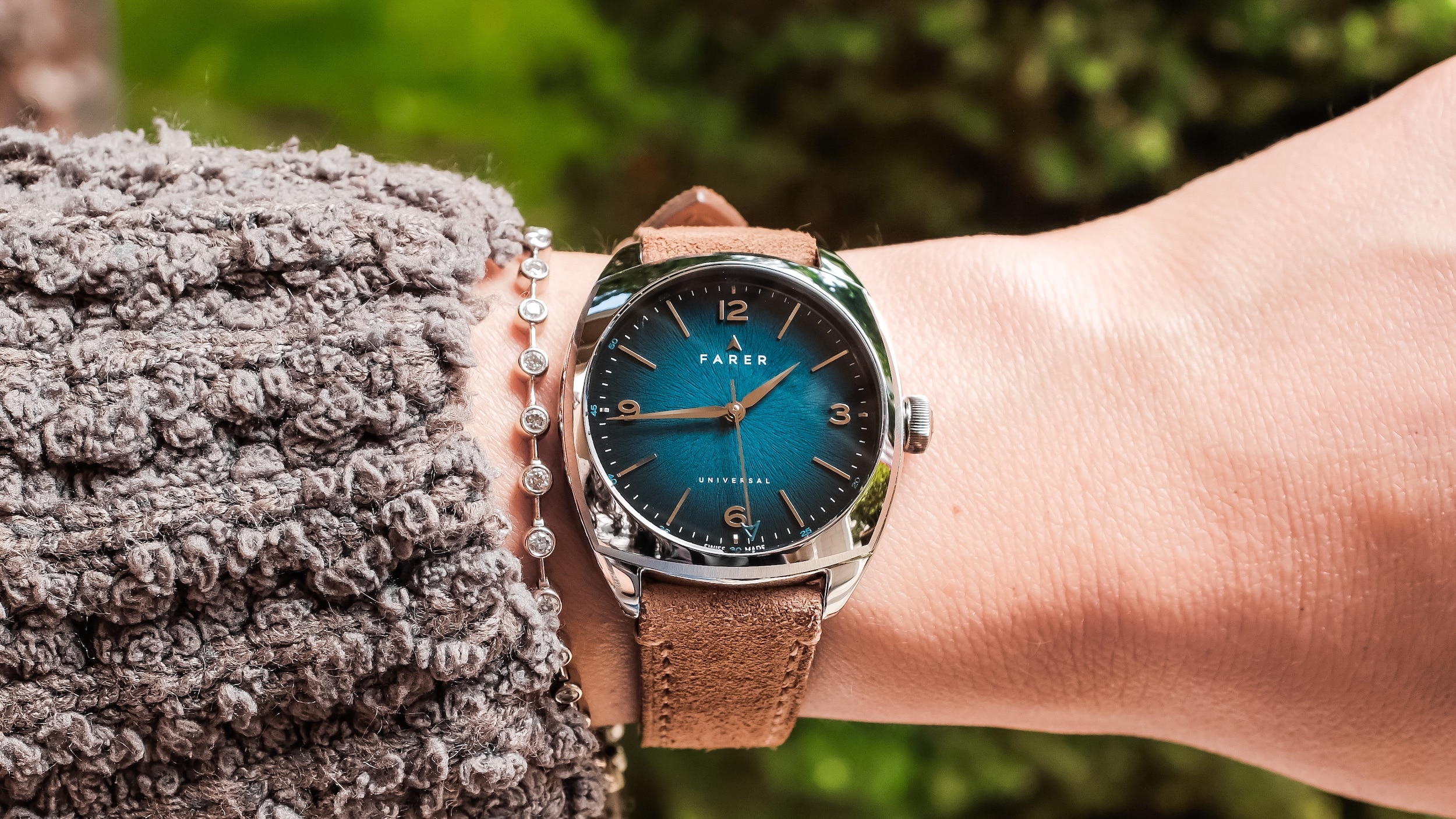
Back when Farer announced its new 35mm Cushion Case collection in March, I came away from the initial press images feeling pretty positive about the whole thing. The 35mm diameter never concerned me much, especially with a case shape like this, and I was far more interested in seeing how that fully polished case and the dial treatments would come across once they were off a screen and on the wrist.
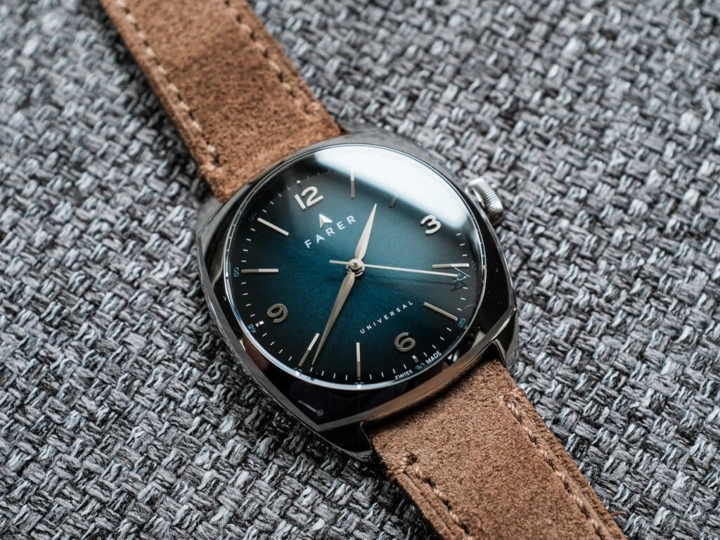
Thankfully, Farer recently sent over the Belzoni for me to spend a few days with. This was the version I was most curious about, largely because of its teal gradient dial and how much its appearance seemed to depend on the lighting. I wanted to see how much of that character survived in person and how the compact proportions worked once I actually had the watch on my wrist.
My first challenge ended up being something I hadn’t anticipated. Almost immediately after I unboxed it, my wife fell in love with the thing, and getting it back from her became a recurring part of my time with the watch. That turned out to be useful in its own way. You’ll see the Belzoni photographed on both of our wrists throughout this review, along with shots under harsher and more subdued lighting to show just how much the case and dial can change depending on the conditions. After a few days of passing it back and forth, I have a much better sense of what Farer has done with this little 35mm case.
Getting the 35mm Case Right
Farer has spent years establishing a design language built around color, and the Belzoni fits within that broader catalog. Here, though, all of that color is contained inside a 35mm cushion case that feels considerably different from what that measurement might suggest on paper.
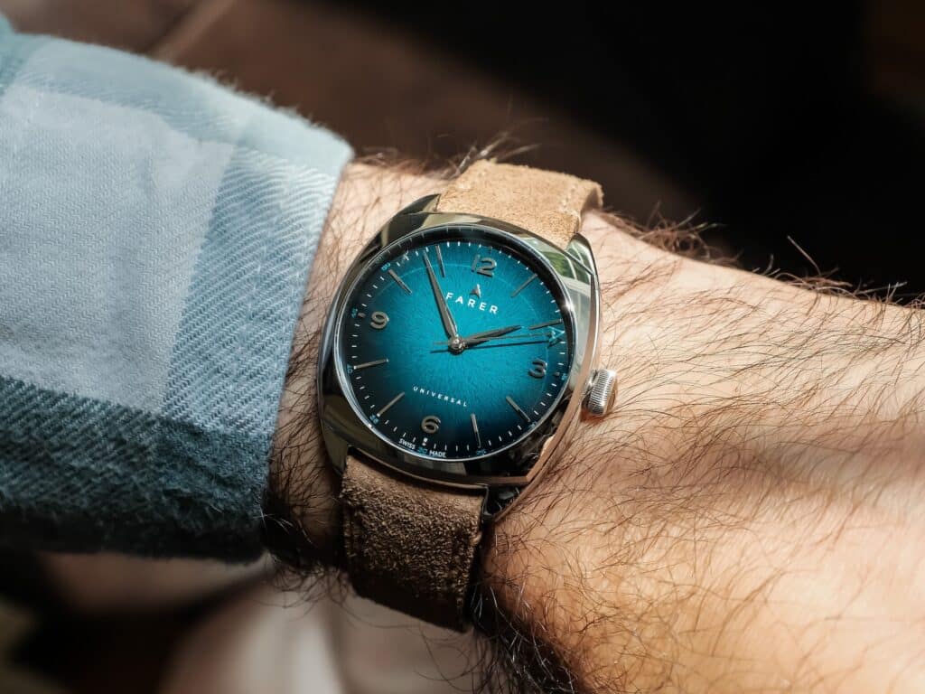
At 35mm across, 38mm lug-to-lug, and just 10mm thick, this is a compact watch by current standards. On my 6.75-inch wrist, however, I never felt like I was wearing something undersized. Cushion cases have a way of occupying the wrist differently from conventional round cases, and the broader, almost square footprint gives the Belzoni more visual presence than I expected from the diameter alone. I wouldn’t get too hung up on trying to translate it directly into an equivalent round-watch measurement. What matters more is that the proportions feel balanced once it’s strapped on.
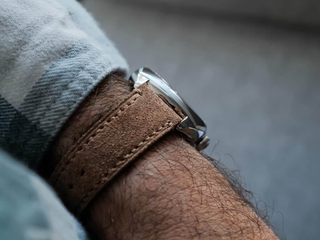
The short 38mm lug-to-lug measurement helps. There’s very little excess case extending across the wrist, and the 10mm thickness keeps the entire package close and comfortable. It has vintage-adjacent proportions without requiring me to treat the watch like some exercise in historical reenactment. I can appreciate a smaller watch when the geometry supports it, and this case does.
Farer uses 316L stainless steel here, with the case largely polished and a brushed chamfer around the bezel providing some separation. That amount of polish was one of the details I wanted to evaluate in person because renders can make a highly reflective case look a little clinical. In practice, the finishing works particularly well with this shape. The rounded cushion profile catches light from several directions, and that becomes part of the visual experience of wearing the Belzoni.
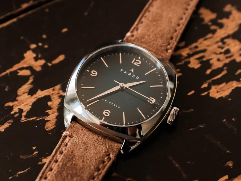
There is a practical trade-off there. A case with this much polished surface area is going to make fingerprints and eventual wear easier to see. For me, that’s simply part of accepting this particular finish rather than a serious criticism of the watch. I would still take the polished execution here because it suits the design.
One of the better details is easy to miss until you look closely at how the strap meets the case. Farer has shaped the area between the lugs so the strap can tuck remarkably close to the case. With only 18mm between the lugs and very little visible space between leather and steel, the transition looks unusually cohesive. It reinforces the cushion shape instead of making the strap feel like something attached underneath it.
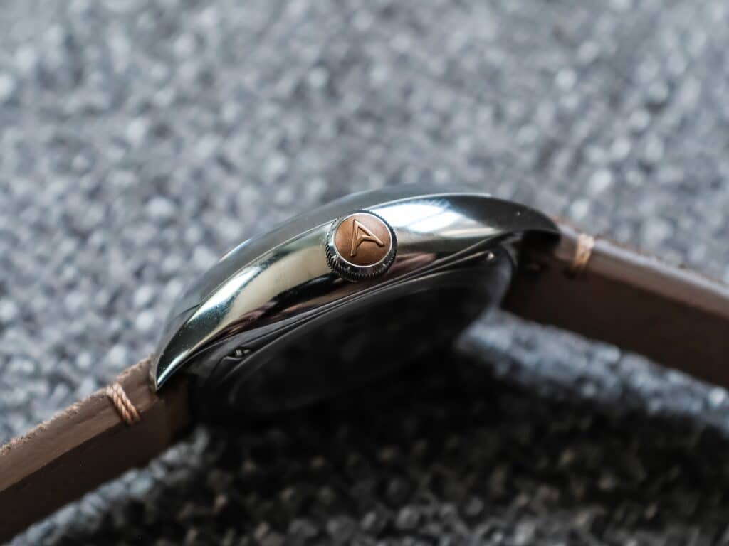
The crown carries another familiar Farer detail. It’s a rounded steel push-pull crown with a bronze cap bearing the brand’s “A” logo. Against all that polished steel, the bronze adds a small amount of warmth without becoming a dominant design element.
Water resistance is 50 meters, which makes sense within the context of the watch. For the kind of daily wear I’d expect from something like the Belzoni, that’s enough to keep me from thinking much about ordinary contact with water. This obviously isn’t the watch I’d reach for when swimming, and nothing about the design suggests otherwise.
The Belzoni Dial
The dial is where most of my curiosity was concentrated when Farer originally announced these watches.
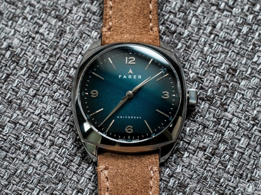
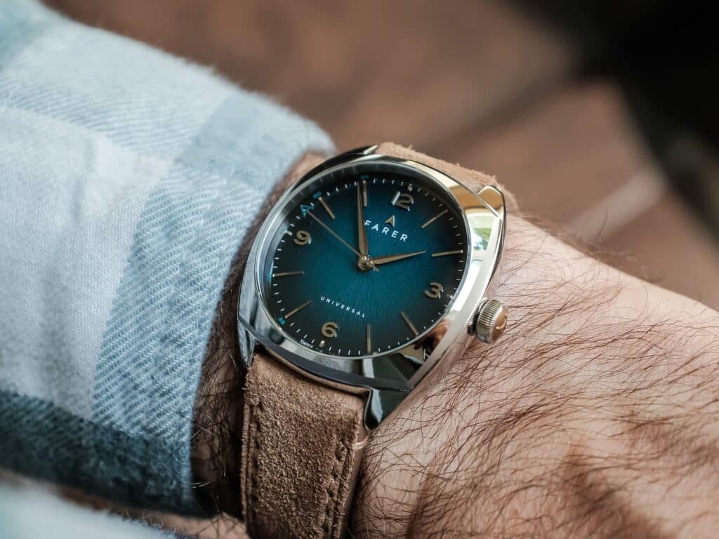
Farer has never seemed particularly afraid of color, and the Belzoni gives that tendency plenty of room to work despite the relatively small dimensions. The teal dial transitions from a brighter center toward considerably darker edges, and the effect changes depending on how much light reaches it. Under stronger light, the teal becomes much more apparent and the gradient opens up. Move into softer conditions and those outer portions darken considerably, changing the overall character of the watch.
That variability was difficult to judge from the original press photography, and it was a big reason I wanted to see this particular version in person. It also explains why I’ve tried to photograph the watch under different lighting conditions. A single carefully lit photograph doesn’t really tell the whole story here.
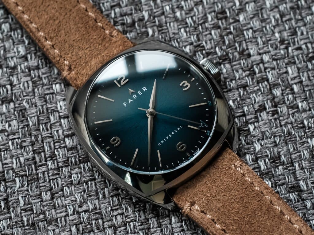
Farer builds plenty of detail on top of that color without making the dial difficult for me to read. Applied baton markers provide some physical depth, while the contrasting minute track gives the perimeter enough definition to keep everything organized. Polished steel alpha hands handle the hours and minutes, and the seconds hand carries the small teal Farer “A” at its tip.
There’s a lot happening within a fairly small space, yet I never found the dial excessively crowded. That balance matters because color can become the entire point of a watch very quickly. Here, I think the stronger part of the execution is how the color interacts with the case, markers, and hands rather than simply how saturated the teal happens to be.
The Belzoni name itself follows Farer’s habit of pulling from historical explorers. Giovanni Battista Belzoni was an Italian explorer and archaeologist associated with early work in Egypt, and Farer has made these kinds of references part of its naming convention for years. I tend to treat that as background flavor rather than something that materially affects my experience with the watch.
A Hand-Wound Movement Makes Sense Here
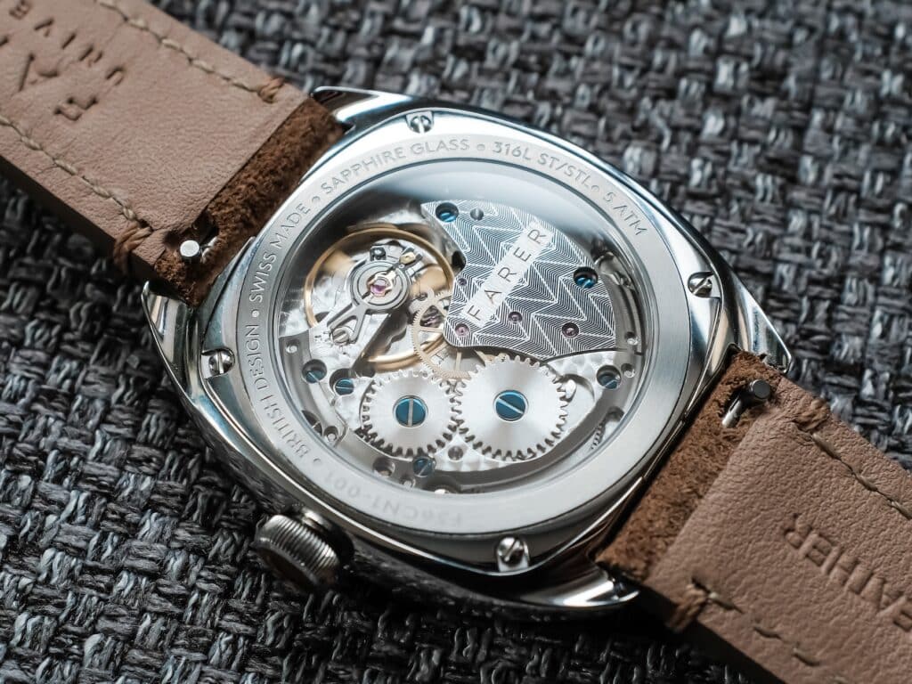
Turning the watch over reveals the Sellita SW210-1 Elaboré, and I think the decision to go manual fits the proportions of the Belzoni particularly well.
The SW210-1 runs at 28,800 vibrations per hour, or 4 Hz, with 18 jewels and roughly 45 hours of power reserve when fully wound. It also hacks for precise setting. Those are useful details, though the more relevant part for me is how a hand-wound movement changes the relationship I have with a watch like this.
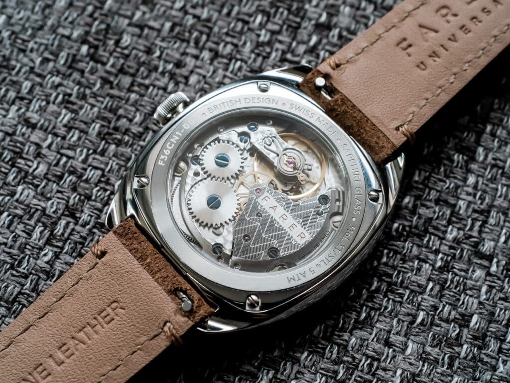
With roughly 45 hours available, the Belzoni isn’t something I could leave untouched for several days and expect to find running when I came back. In a larger rotation, that means winding becomes part of wearing it. I don’t mind that. The manual movement feels appropriate for the scale and general character of the watch, and there is something satisfying about having that small bit of interaction built into putting it on.
Farer has also made an effort with the movement presentation. Through the sapphire exhibition caseback, the SW210-1 receives upgraded decoration with bespoke Farer branding and blued screws. Sellita is a familiar name at this point, and I don’t need the movement to pretend to be something exotic for the Belzoni to make sense. What I appreciate more is that Farer chose to make the caliber worth looking at through the back. It’s gorgeous.
That distinction becomes relevant at the Belzoni’s $1,165 price. At that level, I start paying closer attention to the cumulative execution rather than searching for one spec that somehow justifies the entire watch. Here I get the compact case, the more involved finishing, the gradient dial, a decorated Swiss manual movement, sapphire front and back, and a design that feels specific to Farer.
The 45-hour reserve would probably be my main practical compromise with the movement. I rotate through watches regularly, so anything hand-wound with less than two full days of reserve has a decent chance of stopping between wears. That doesn’t bother me much with a watch I’m choosing specifically because I enjoy the manual interaction, though someone looking for maximum grab-and-go convenience may feel differently.
Wearing the Belzoni
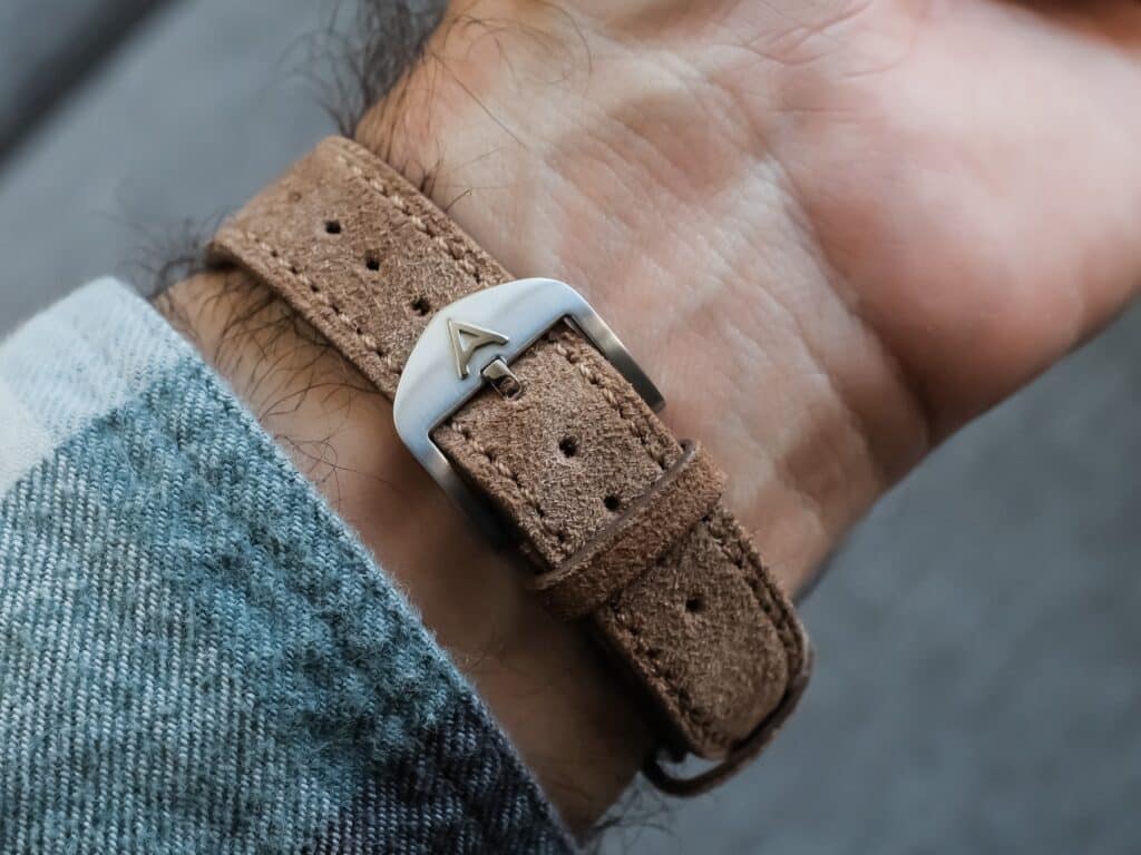
The supplied brown suede strap keeps things simple, which I think was the right move given everything happening above it. It’s comfortable, uses a conventional stainless steel buckle, and the way it sits against those short lugs gives the watch a more complete appearance than I’d expect from a standard straight-ended leather strap. More importantly, nothing about wearing the Belzoni made me wish Farer had enlarged it.
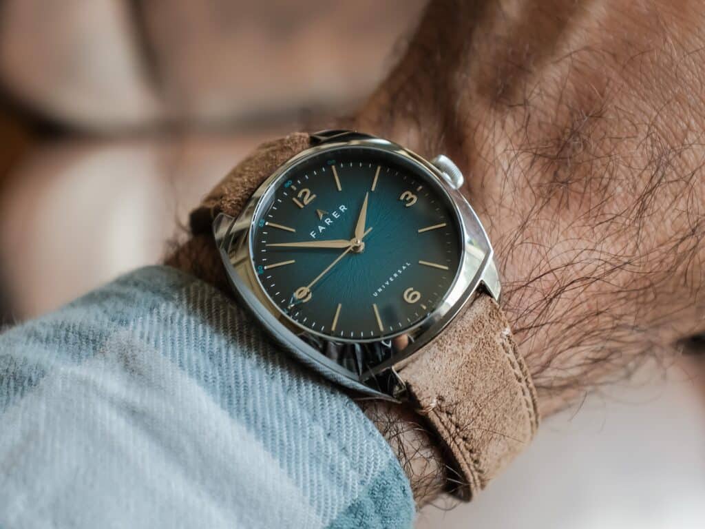
I know 35mm will be the number some collectors fixate on. My few days with the watch reinforced how unreliable diameter can be when it’s considered by itself. Between the cushion geometry, short lugs, and broad polished surfaces, the Belzoni has enough presence on my 6.75-inch wrist without losing the compactness that makes the design interesting in the first place.
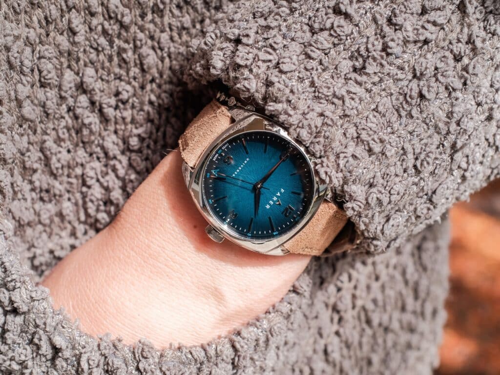
That sizing also became more interesting after watching my wife wear it. The same proportions that worked comfortably on my wrist translated naturally to hers, and seeing the watch move between us helped underline how versatile this particular case can be. I don’t think that means 35mm suddenly becomes some universally perfect size. It simply means Farer has built the case around the dimension rather than shrinking a larger design.
My bigger consideration would be whether I wanted this much polish in a watch I planned to wear heavily. The case looks great when it’s catching light around those rounded surfaces, though that finish will inevitably document some of the life it encounters. I tend to accept scratches as part of ownership, but the Belzoni isn’t going to disguise them particularly well.
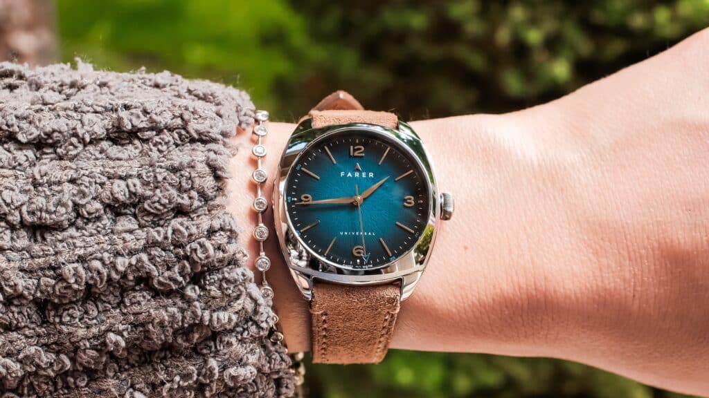
After a Few Days
A few days isn’t enough time for me to make claims about long-term ownership, and I don’t want to pretend otherwise. What it did give me was enough time to answer the main questions I had when I first covered these watches back in March. The cushion shape gives the watch enough presence without sacrificing the compact dimensions that attracted me to the design. The polished case also makes considerably more sense once it’s moving through different lighting conditions rather than sitting inside a press image. And the Belzoni dial was ultimately the part I kept returning to, especially as the teal shifted between brighter and darker environments.
There are compromises I’d have to accept. 50 meters of water resistance puts some boundaries around how I’d use it, the polished case will show wear, and the 45-hour reserve requires more attention if the watch is moving through a larger rotation. None of those became a major issue during my limited time with it, though they’re worth acknowledging at $1,165.
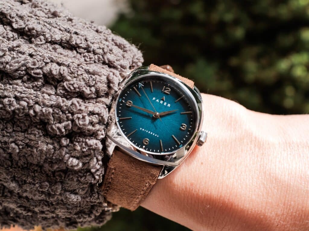
The more revealing part of this loan may have been how often the Belzoni disappeared from my desk and ended up on my wife’s wrist. I started this review wanting to understand whether the dimensions and dial treatment I liked in Farer’s original announcement would translate into a convincing physical watch. After passing it back and forth for a few days, I think they do.
If the Belzoni were staying in my collection, its role would be fairly clear. This would be the compact, colorful hand-wound watch I’d reach for when I wanted something more visually expressive than the watches I typically wear, without giving up the proportions I tend to enjoy. For now, though, it’s heading back to Farer. Assuming I can get it away from my wife again.

Co-Founder & Senior Editor
Michael Peñate is an American writer, photographer, and podcaster based in Seattle, Washington. His work typically focuses on the passage of time and the tools we use to connect with that very journey. From aviation to music and travel, his interests span a multitude of disciplines that often intersect with the world of watches – and the obsessive culture behind collecting them.
Definitely a wife’s watch… (she kept it)
I bought it, expected it, and really liked it. My only issue: the case size—I’m not a big guy, but 35 mm just felt too small/narrow.
Hopefully Farer comes out with a bigger version.
They might!