“I don’t get it” is probably the single most common phrase uttered in any twentieth century art museum across America (and for good reason). You could say a lot of it is shit.
Somewhere between refrigerator-mounted finger paintings and interpretive dance, the belief was born that anybody could make art and all of it’s worthy of being studied. Sure enough, every BFA student eventually confronts the proverbial question, “What is art?” It is, to say the least, a rabbit hole of discussion. If urinals and canned feces count as creative expression alongside the Mona Lisa, then what makes art (in whatever form it may take) “good?” Eventually we need to tie this back into watches, so let’s keep the criteria simple:
- Strength of Concept: This is the level of originality, complexity, or thematic elements in addition to what’s material.
- Craft or Execution: Literally, how well is it made? If it’s a painting, would it appear as though anybody could do it? How well is it rendered? To what lengths did the artist go to breathe life into their subject?
- Communication: How effective is the content communicated to the viewer? Does it earn their attention? Will it make them think or does it rely on shock value, alone?
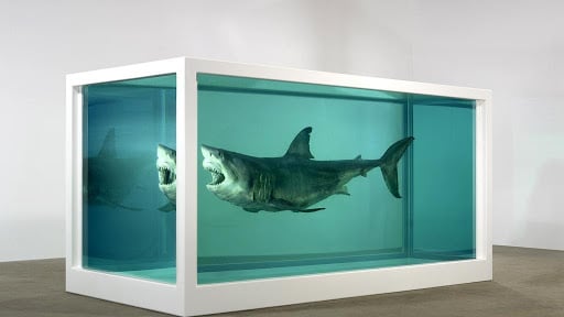
Fine art must find strength in all three areas to be considered strong. Similar to poker, a low ranked three of-a-kind can beat out a pair of kings. By this measure, a masterfully painted bowl of fruit is not art. It’s a study or a decoration. On the other hand, Damien Hirst’s stunt of suspending a Tiger Shark in glass box of formaldehyde is thought-provoking enough to prove it’s something more.
Where am I going with this? The same dude who sold a rotting fish for $8 million also designs Mickey Mouse watches for Swatch. Does this make him a sellout? Or are we witnessing a something new here… not a physical or chemical, but a conceptual reaction between low-brow fashion, abstract high-art, and commercial consumerism? Because if so, you’re messing around with some seriously next level meta.
Side note: This would also mean that some Swatches are arguably more artistic than some Patek Phillipes. Come at me, bro.
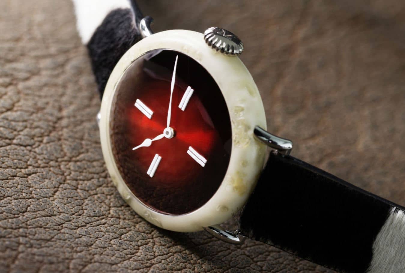
The concept of the watch is no longer a tool, but a medium—and in a category of its own alongside sculpture or painting (consider Moser’s high-art Swiss Cheese Venturer or Swiss Alp Repeater). If this is something you’re willing to entertain, then it’s worth acknowledging the contributions of several dismissed brands and the artists behind them.
Movado – Fine Art from a Forgotten Brand
If you were to measure Movado’s history by their current line-up, you’d be woefully ignorant. They were experimental with in-house movements and Avant Garde with designs well into the early nineties. As most of us know, their later years became controversially lackluster in the same way that Orson Welles had peaked at the beginning of his career; both suffered a bit of an identity crisis at their end.
Thankfully, it was the perfect time for Movado to give up their reigns to some artists who knew exactly what they wanted from conception to completion, so much so that it’s questionable whether they had any influence at all. By all appearances Movado was something of a sponsor here, facilitating handshakes to get these creations out to the public without any attempts to include a “dot dial” or regulated price point.
Andy Warhol Times/5
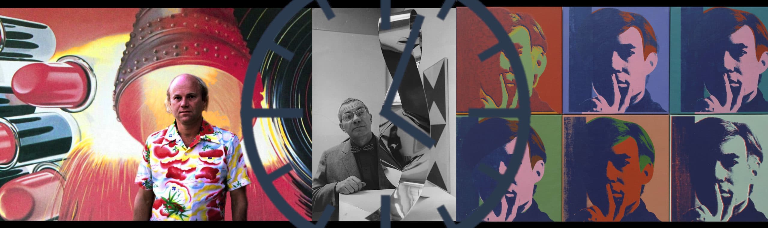
 Andy Warhol, the most prolific Pop Artist of all time, had a unique relationship with the Movado brand. He ran in the same celebrity circles as Gedalio Grinberg, then founder of the Movado group (as well as art collector), and was keen to the idea of collaborating on a watch project in 1983. Despite having more than three hundred watches to his name, Warhol was most often seen with a Cartier Tank, a watch he wore purely for fashion since he’d never set the time.

With objects as much as celebrities, he challenged the notions of image and association—that through enough repetition in print, they would be void of their context. This resulted in the mass reproduction of imagery through silkscreened photography that eventually became all the iconic Marilyns and Elvises you know of today.
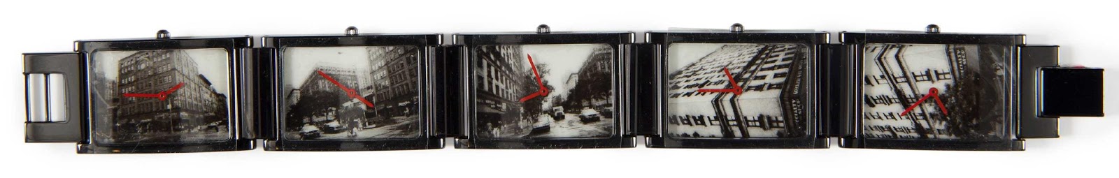 The inspiration for Times/5 was the images taken from contact sheets, developed film used to select which images would be worthy of print. Each photographed building on the dial acts as its own quartz watch (and link) that would continue around to form a bracelet. After several years of tinkering with ideas, Warhol selected these images of Manhattan within weeks of his untimely death prior to its release.

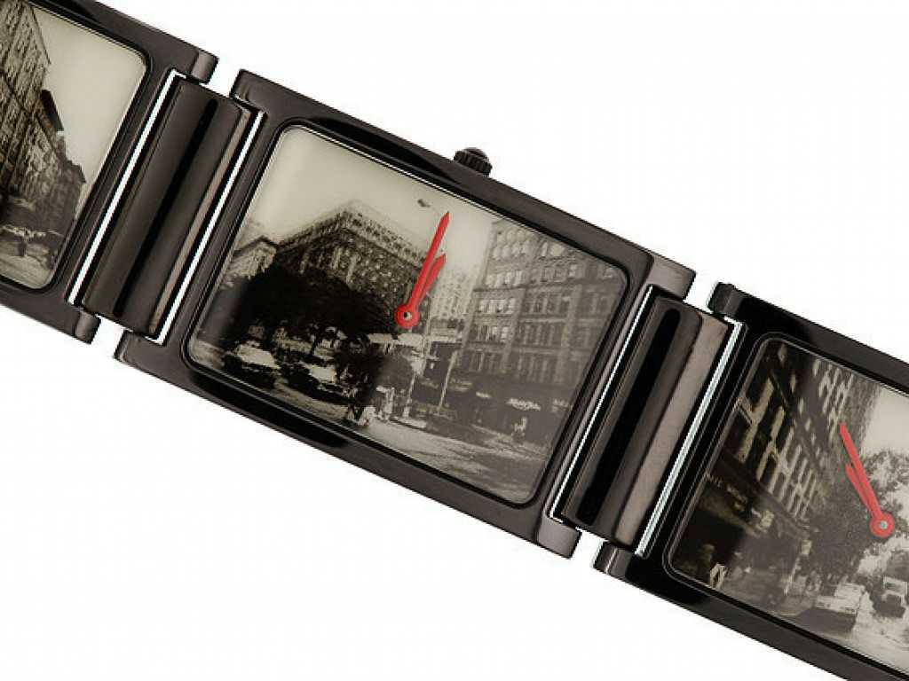
Like many artists, he rarely worked alone. Warhol’s process consisted of directing small teams of printmakers to execute concepts on his behalf, the closest of which carried the torch for realizing the watch’s completion in 1988.
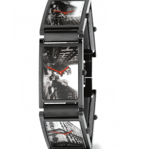
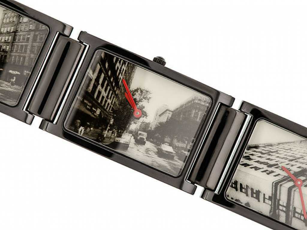
In this bittersweet sense, Times/5 is one of his very last works of art to have been released to the public, limited to 250 produced. In 2015 a model sold for $18,000—almost a bargain compared to the cost of his screenprints.
Max Bill’s “Bill Time”

 Nearly three decades before Breitling, Movado had integrated color wheel aesthetics into design—only they’d totally owned it rather than pussyfooting around its appearance by solely modifying hour markers and feigning it as an awkward “tribute to the laid-back surfing culture of the sixties.” ‘How loaded, yet minimalist,’ Breitling hoped you might say. But really, this might as well be on par with coloring the crown green plaid and saying it’s in memoriam to the great Irish potato famine (which was no less relevant to Breitling’s associations than California’s free-love lifestyle).
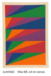
When you hear “Max Bill,” the mind probably gravitates to Junghans’ model of the same name. Today, the watches have become a tribute to the designer who was largely credited for incorporating Bauhaus-themes in practical application—minimalist and conservative in appearance. So one may not have expected his Movado submission, Bill-time, to be a total departure of style, opting for an Easter egg color palette the screams “rainbow”… unless you were familiar with his larger scope of work.
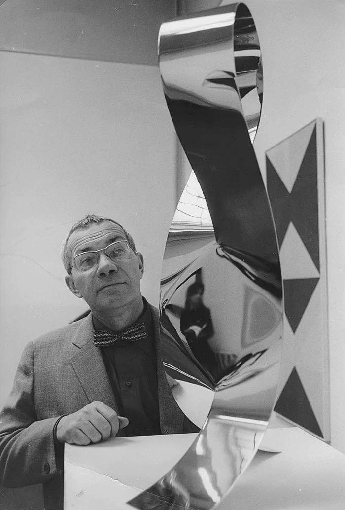
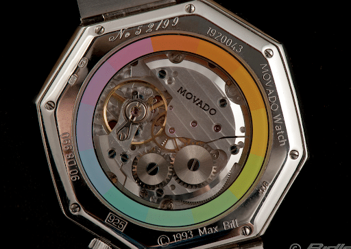
Be it in paintings or sculpture, Max Bill aggressively explored the use of bold colors, shapes, and mixed materials. How bold? Let’s circle back to the watch. Being a former silversmith, he produced the enamel-laden links and octagonal case (measuring a massive 45mm across) all out of sterling silver. An overhauled nickel-plated ETA 2600 series is showcased behind an exhibition caseback.
Ninety-nine Bill-time pieces were produced, one of which sold for $13,700 at auction in 2015.
James Rosenquist’s “Elapse, Eclipse, Ellipse”


While he was technically part of the Pop Art scene, James Rosenquist’s style was considered abstract expressionism.

Compared to the previous mentioned, his work was less design-focused and more controversial through the juxtaposition of loaded imagery. His most important work, F-111, superimposes several concepts as a metaphor that speaks to the civil unrest of the sixties.
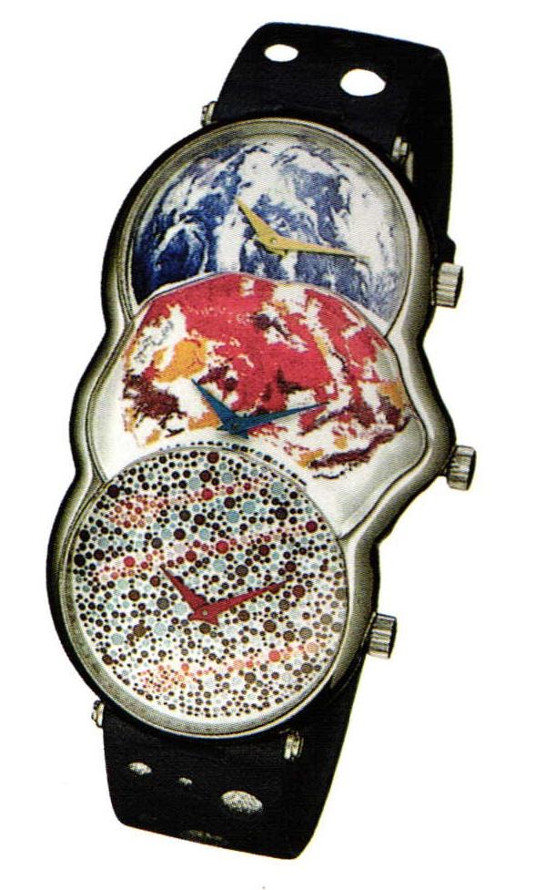 The title behind Rosenquist’s watch, Elapse, Eclipse, Ellipse, refers to the collision of three watches and themes where the outer clocks are symbolically squeezing the center dial into a contorted shape. Despite the “pressure” inflicted, all retain their shape and individuality.
Intended to be a world time watch, he had a location in mind for Europe, LA, and New York, each a place of personal significance. If the play on words and self-portrait innuendo isn’t enough to keep the viewer’s brain turning, consider the material construction: three manual-wind watches fashioned into an amorphous 18kt white gold case with three floating dials, protected by a single layer of convex sapphire glass. To call this “unique” would be an understatement.
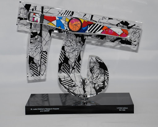
Romero Britto’s “The Children of the World”
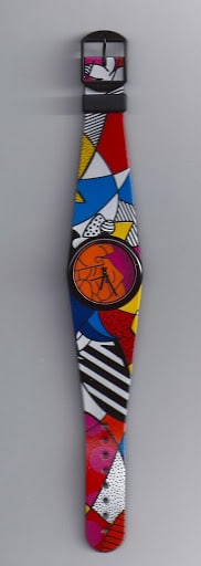 If Lisa Frank were to say, “Screw Pandas and top hats… I’m doing stained glass!” her work would probably look eerily similar to Romero Britto’s, whose paintings were destined to hang on the walls of any Christian daycare or pedophile’s tool shed across America. Thankfully neither of these themes made their way into Movado’s last collaboration. Folks had to instead settle for what looked like a Swatch watch at a fine-art price point… proving once and for all how much something can be forgiven if it goes to a good cause.
Movado took the high road and opted to donate all proceeds from the thousand watches sold to St Jude Children’s Research Hospital and the world-wide children’s charity, UNICEF. Although unintentional, the Swatch influence was undeniably apparent by its “plastic-style”—more so when fitted inside its acrylic display.
Together, the statue spells out the last three letters of Britto’s signature and resembles the Chinese character “Chi,” a symbol for human energy and motif of his work (the majority of which revolves around social causes).
In closing…
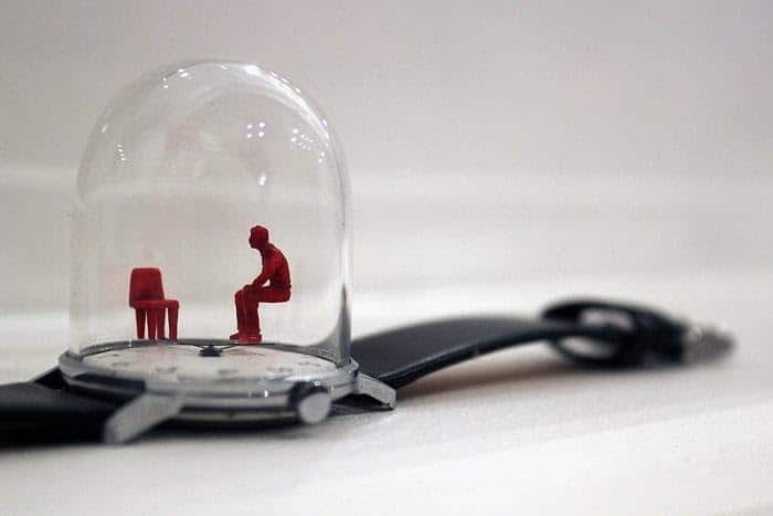
For some, the Movado Artist Series watches and their worth can only be measured by whether or not they could see themselves wearing them… but that’s not the point. Jenny Saville’s paintings aren’t remarkable because they’d look spectacular in your living room. Even if you believed these to be as ugly as sin (and trust me, you’d be in good company), subjective preferences should be checked at the door along with your verifications for water resistance and, “but what’s the lume like?” inquiries. This is fertile ground for a different kind of dialogue…
The discussion worth considering is that, not too long ago, the watch world took a crack at pushing the envelope to the point of absurd, forfeiting all creative control to several auteurs—who were outsiders of the watch game—for a new take on what they considered “interesting.” The results were completely original ideas, a reimagining of form, and the repurposing of functional fashion. More importantly, this collection continues to serve as lasting reminder that the industry hasn’t exhausted its options for thinking outside the box—something every brand could benefit from remembering (and consider)…
… as soon they close the book on their archives.

Damon is based out of the Bay Area, where he’s a black sheep among Apple Watch loyalists. Having served as a Combat Engineer with the USMC, he believes a true field watch’s success is measured by how closely it compares to a “G-Shock.” Nonsensically, a background in design has guided his preference toward higher craft, as he struggles to become the lifestyle his watch tastes more closely reflect.