I never actually owned a Seiko Alpinist. Years ago, a podcast listener loaned me their SARB017—the green-dial legend—for a short while. Long enough for me to understand why it’s one of Seiko’s most beloved designs, but not long enough to convince me to buy one. I remember thinking it had this weird mix of elegance and purpose with those cathedral hands, gold accents, and that quirky compass crown that didn’t make a ton of sense. But it all looked right. It was charming in a way that Seiko doesn’t always let itself be anymore.

When Seiko discontinued the SARB017 in 2018, it stung the community. That watch had become shorthand for affordable Seiko magic—sapphire crystal, 200 meters of water resistance, and that distinct dial layout that felt timeless without pretending to be “vintage-inspired.” The replacements that followed under the Prospex label were solid, but the “Alpinist-inspired” language always felt a little detached, like Seiko was reluctant to embrace its own legacy. That changes now.

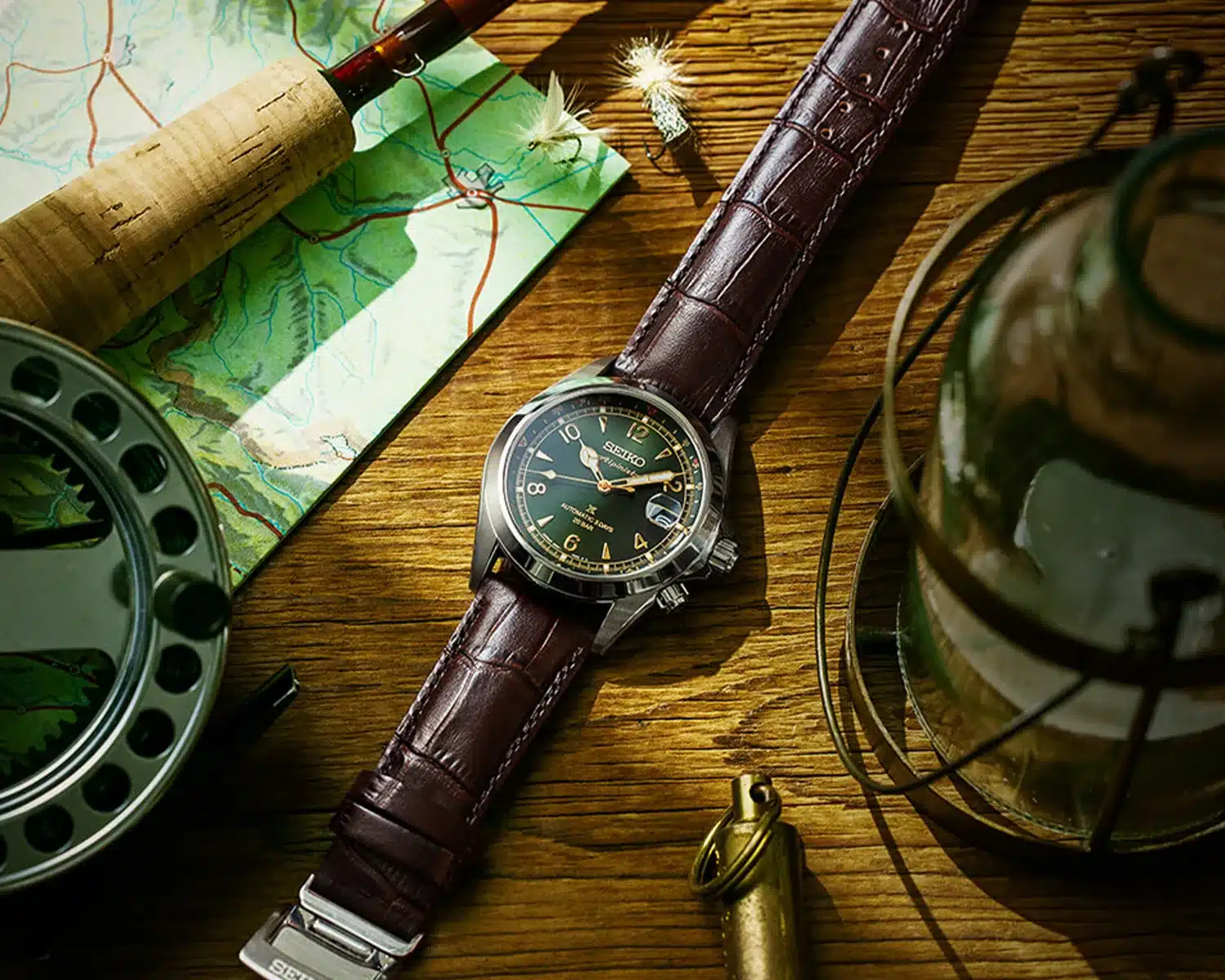
Seiko just unveiled a full refresh of the Alpinist line, and for the first time in years, the word Alpinist actually appears on the dial—written out in that vintage script right beneath the reworked Seiko logo. It’s a subtle shift, but for collectors who’ve followed this line since the SARB days, it’s a big deal. It means Seiko’s acknowledging the Alpinist for what it’s always been: one of their true icons, especially when it comes to affordable field watches.
The updates themselves are measured and thoughtful. The stainless steel case still comes in at 39.5mm wide and 46.4mm lug-to-lug, but Seiko’s managed to shave the thickness down to 12.7mm. There’s now a super-hard coating for better scratch resistance—a nice touch considering the watch’s supposed mountaineering spirit. Inside beats the newer Caliber 6R55, an evolution of the 6R35 with a slightly longer 72-hour reserve and some cleaner finishing (including a gold rotor you can admire through the display back).

Flip it over and you’ll see another returning detail: the mountain range logo, paired this time with the Alpinist name. It’s the kind of nod that longtime fans will catch instantly, and it helps tie this generation back to its roots.
The dial keeps its familiar character—alternating Arabic numerals and triangles, sunray finish, cathedral hands, and enough Lumibrite to light your way off a hiking trail (or more realistically, through your sock drawer). The cyclops and Prospex “X” both remain, which I know still divides the room, but the new Alpinist script helps balance the composition a bit better.

Three models lead the release: the green-and-gold SPB507 on brown leather, a black dial with red bezel accents, and a teal version with orange touches that may remind some of the old “SSASS” special edition (an absolute dream Seiko watch, by the way). The green one is clearly the heir to the SARB017’s legacy, and at $900, it sits about $175 above the outgoing SPB121. Whether that premium feels worth it depends on how much weight you give to the name, the coating, and the slight refinements inside.

For me, the appeal of the Alpinist has always been less about the specs and more about the spirit behind it—a field watch that’s both waaaay overbuilt and oddly elegant. Even though I never pulled the trigger on owning one, I’ve always respected it as one of Seiko’s rare designs that never needed to be justified. And now that Seiko’s put “Alpinist” back on the dial, it feels like they’re finally embracing what we all knew already: this watch never stopped being special.

Co-Founder & Senior Editor
Michael Peñate is an American writer, photographer, and podcaster based in Seattle, Washington. His work typically focuses on the passage of time and the tools we use to connect with that very journey. From aviation to music and travel, his interests span a multitude of disciplines that often intersect with the world of watches – and the obsessive culture behind collecting them.
A $175 increase for a whopping 2 hours of additional reserve time, more unneeded dial text, and a gold-tone rotor nobody but me will ever see. I’ll hang onto my SPB121 thanks.
Picking up an older non-Prospex SARB version is looking more and more attractive every year.