Moduco Watches Review
By: Kaz Mirza
Lately ive been suffering from microbrand over-saturation – how many iterations of the sub homage diver can we possibly put out there? Green bezel – Teal bezel – mauve markers – Dinosaur logo aggressively partaking in reptile BDSM on the caseback – whatever – make it and charge $800 for it. I know my microbrand ennui will pass and I’ll go right back to absolutely being head over heels in love with that teal bezel, white dial sub homage, but in the meantime, I think I’ll stew a bit longer.
Enter: Moduco Watches
Moduco took me by surprise – literally. While at Wind Up NYC this past year I serendipitously ran into and struck up a conversation with Jacob, one of the co-founders of Moduco Watches. First thing I thought when I saw the piece – “My, Christ. It’s not a microbrand diver!” The second thing I thought – “Hey, this thing’s pretty badass!”
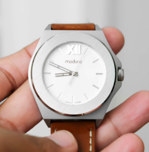
The impetus behind Moduco’s design aesthetic is bold but clean modern architecture. And in this Broke Watch Snob’s opinion, the impetus has been executed on perfectly. Overall the watch has a very clean architectural vibe to it. But can a watch survive on a cool vibe enough to take a watch all the way? That’s what I’m looking to find out in my review below. Read on for delicious microbrand goodness.
The Case:
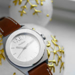
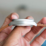
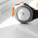
The case flirts with two different shape-extremes without really committing to either: the shapes are the circle and the hexagon. Literally, as you take the visuals of the Moduco watch in, you slowly realize the case is (at its core) the combination of a cylinder and a hexagon. Essentially, you can think of it as a pipe and a nut/bolt – very (quite literally) architectural.
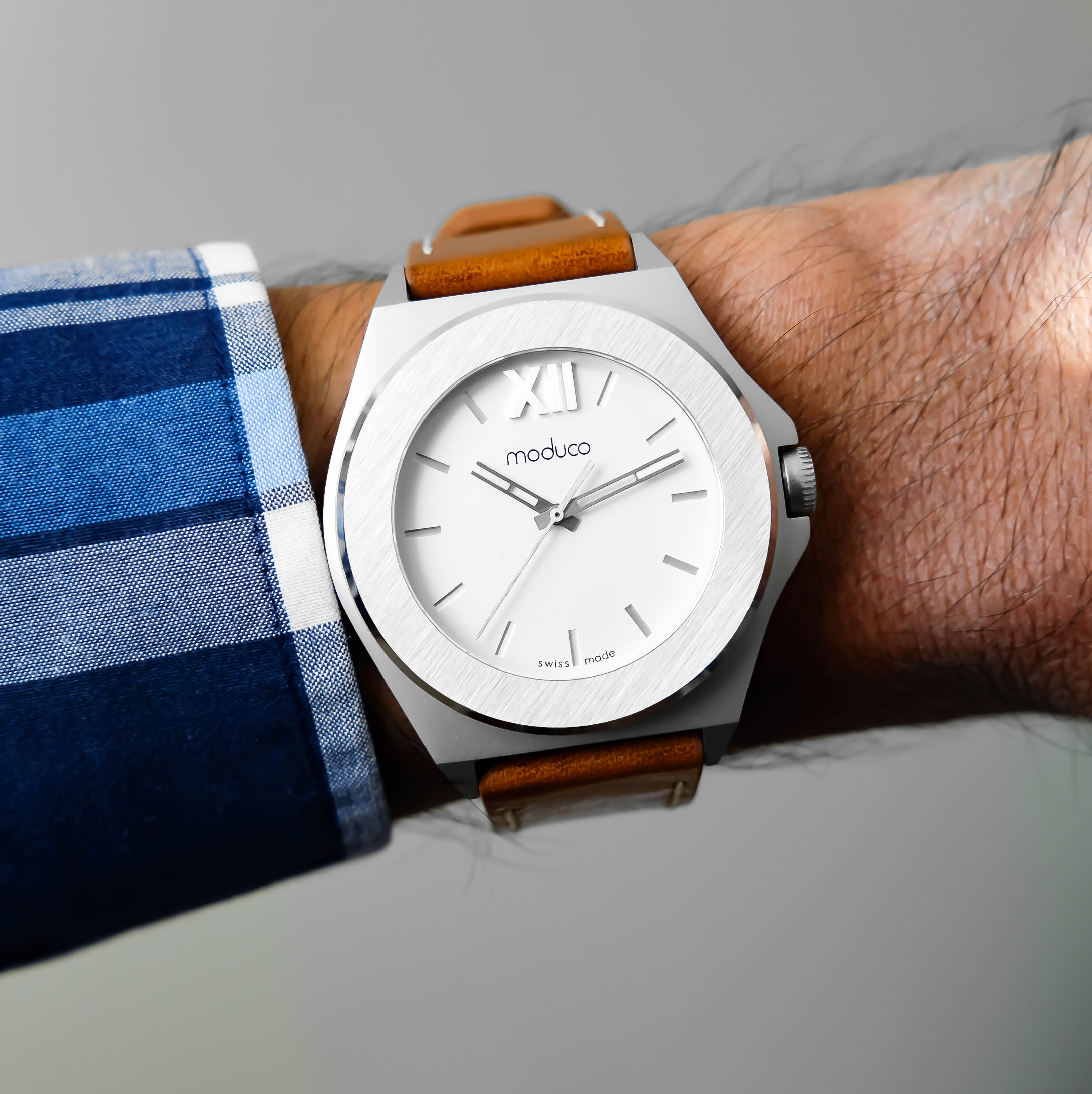
It’s able to balance these two shapes in a way that this broke watch snob feels is only possible with an architecturally based design. Staring at the watch head-on immediately puts the hexagon shape front and center. But as you focus on it you realize that 4 of the 6 sides are ever-so-slightly curved, they aren’t completely straight. But the general shape of the hexagon case implies straight edges that aren’t really there. Then as you look at the watch from a side angle the circular protrusion (or I suppose in this case what would constitute the bezel) begins to take form. This bold circle actually ends up accentuating the implied (but not necessarily present) straightness of the hexagon case shape.
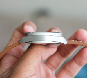
 Plus, the circle bezel features a brushed pattern on top with a high polished beveling that adds further visual intrigue to the overall forward presentation. Basically what’s happening here is that something which is deceptively simple to visually take in actually has a lot of balance and interplay that’s easily overlooked (kinda cool because I feel like the same can be said of modern architecture – simple at first glace but complex on pondering).
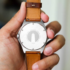
The Moduco caseback features in a much more prominent fashion the straight brushing pattern that the bezel has. Six flat-head screws keep the caseback secure on the case. These screws along with the Moduco watches logo actually make the caseback feel like metropolitan manhole cover – a super cool, but subtle detail.
The Dial:
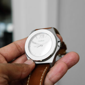
Much like the case, it’s easily for the dial to simply be called “a white dial” and just move on. And much like the case, there’s an interplay of height, texture, and angles going on. I feel like for a lot of watches (and certainly microbrands to an extent), the focal point of a watch’s design aesthetic is the dial. It tends to be where the color is, where the logo is located, ect.
However, Moduco’s visual positioning of the interior dial elements as well as the overall presentation of the dial itself lend it to being not a design focal point, but an extension of the unique elements found in the case. It’s easily one of the more holistic approach to the relationship between a dial and a case that I’ve ever seen.
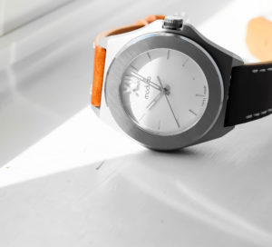
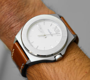
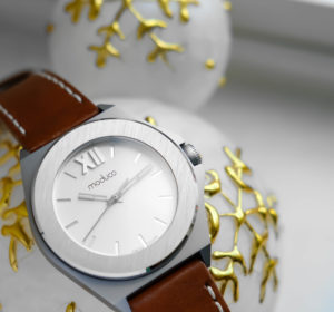
The dial is a sandwich style dial, but what’s obviously very noteworthy is the raised roman numeral XII at the 12 o’clock position. The bold protruding XII punctuates the dial in such a way that it offers a great place for your eye to settle on, which is necessary for a design like this.
Strap:
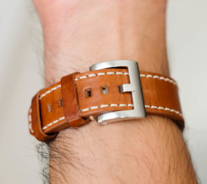
Moduco Watches are offered in the following strap options: Italian calf leather, Cordura textile, nylon nato, stainless steel mesh.
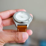
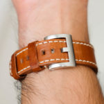
The Moduco I’m reviewing features the Light Brown Italian Calf Leather Strap (with built-in quick change spring bars). The strap features a cream stitching around the entire perimeter (except on the spring bar side) and the strap material is of appropriate thickness in my opinion. Not too thick to be unwearable but also not too thin to feel flimsy. The appropriate thickness of the strap lends itself really well to the bold presence of the case. And the brown of the leather adds great contrast to the white dial while also still being complementing.
Movement:
There are two versions of the Moduco available: a Swiss Ronda Quartz Caliber 513 and a Swiss Automatic Sellita SW200. These models are designated as the 305A (automatic) and 305Q (quartz) – as an /aside, the very beginnings of the brand has its roots in Miami, Florida where the duo that would eventually make up Moduco were roommates. As a native south Floridian myself the numbers 305 are significant because that’s the locally well-known Miami area code. If that is the inspiration for the model designations then I think that’s pretty cool – subtle, tasteful, and fun. /aside over.
The piece I’m reviewing features the Ronda Quartz. As far as quartz movement goes, the Ronda performs great (which isn’t surprising since the company has a solid history of providing reliable movements). Featuring a single jewel (which isn’t common for quartz – usually it’s zero jewel), a 45mos battery life, and reliable time keeping, the Ronda Caliber 513 is probably one of the more stronger quartz choices Moduco could have gone with with also keeping the price reasonable.
Final Thoughts:
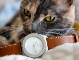
So I’ve been talking a lot about the features that make up the watch. But the reality is that we need to ask ourselves a super important question: who is this watch for? Anytime a design comes out that breaks the mold of the microbrand sub homage, it can be odd to figure out the demographic for the piece. Especially since the greater majority of microbrand watch enthusiasts aren’t receptive to anything that deviates from what they expect of a microbrand. So who is the Moduco piece for?
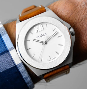
In this Broke Watch Snobs opinion, Moduco would be an excellent addition to the watchbox of anyone (horology-Civilian or Watch Enthusiast) looking to add a watch that not only had horological street cred, but one that also reflected their own unique individual style in a way that’s very modern metropolitan. It’s the type of piece that will probably lend itself very well to an office/professional environment while being both subtle and also not necessarily blending into the crowd of Apple Watches and “minimal 3-handers.” Is it a watch for everyone? No. But that’s what makes it great. Microbrands are trending more and more dangerously to the notion of playing it safe and designing for already established tastes.
What makes Moduco noteworthy in my opinion is the fact that they’ve designed a piece to push the boundary of normal microbrand aesthetics beyond where most folks are comfortable. And regardless of what people believe or feel, pushing those boundaries is how you make a niche progress and excel, which is exactly what microbrands need right now.
For more info and background on Moduco please totally check out https://www.moduco-watches.com/.
Also totally be sure to check out the Moduco Kickstarter Page: https://www.kickstarter.com/projects/1976231399/moduco-watches.

Co-Founder and Senior Editor
Kaz has been collecting watches since 2015, but he’s been fascinated by product design, the Collector’s psychology, and brand marketing his whole life. While sharing the same strong fondness for all things horologically-affordable as Mike (his TBWS partner in crime), Kaz’s collection niche is also focused on vintage Soviet watches as well as watches that feature a unique, but well-designed quirk or visual hook.



What’s the wearability of this Moduco with regards its 44mm? Is it only for large wrists?
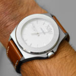
Hey, Matt! Super solid question – the wearability of the case at 44mm is certainly unique. What I’ll say is that the back of the case doesn’t have quite the curvature that a 44mm Seiko diver would have, however on my wrist the Moduco is comfortable because the top of my wrist is on the flatter side.
I wouldn’t say it was for larger wrist or smaller wrist. The way I would describe it is that its really a watch for folks looking to wear a time piece with a more than normal pronounced wrist presence that isn’t overwhelming (in terms of feel on-the-wrist, you’re going to def be aware that you’re wearing a watch (not really one of those watches you forget you’re wearing)) – but IMO that’s part of the appeal and draw – bold but subtle. If the watch was 44mm and the dial had a whole bunch of crazy crap on it then it would wear and feel too big/loud. But with this type of 44mm case paired with this clean of a dial there is balance IMO.
Does that address your question? Let me know if there’s anything I can do to clarify in case I’m misunderstanding. Really appreciate you leaving a comment as well – thank you!
-Kaz
Morning Kaz! Thanks a lot for this detailed reply. The reference to the Seiko diver is quite helpful. I believe I understand your explanation. Could we say, in a nutshell, that the MODUCO is somehow like a SevenFriday or a Dietrich in term of presence on the wrist but in a more discreet/subtle way? Have a great day.
Matt – yea I think that’s actually a super great way of phrasing it. Similar presence to those two but much more subtle and architecturally inspired.
Really glad that was helpful – you have a great day too!
-Kaz