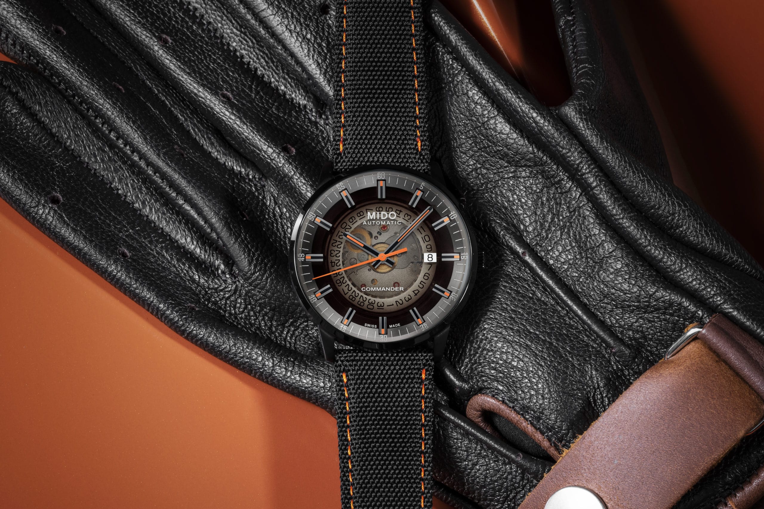
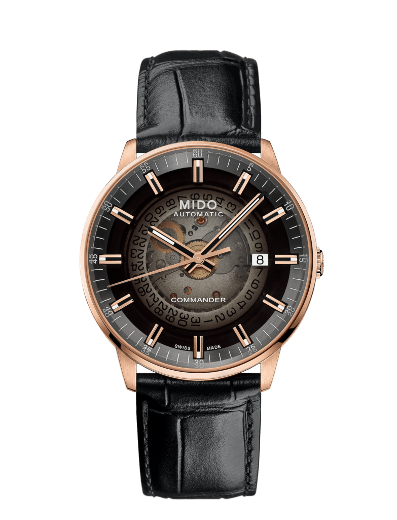
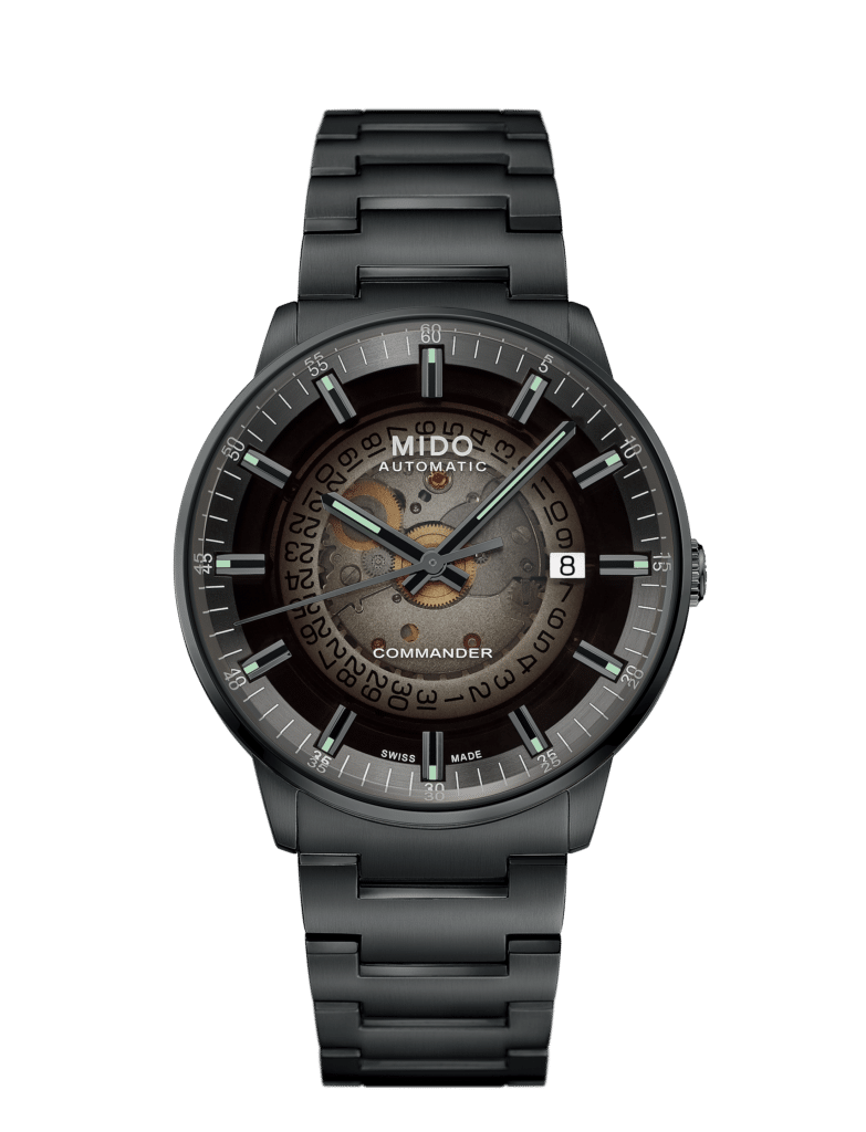
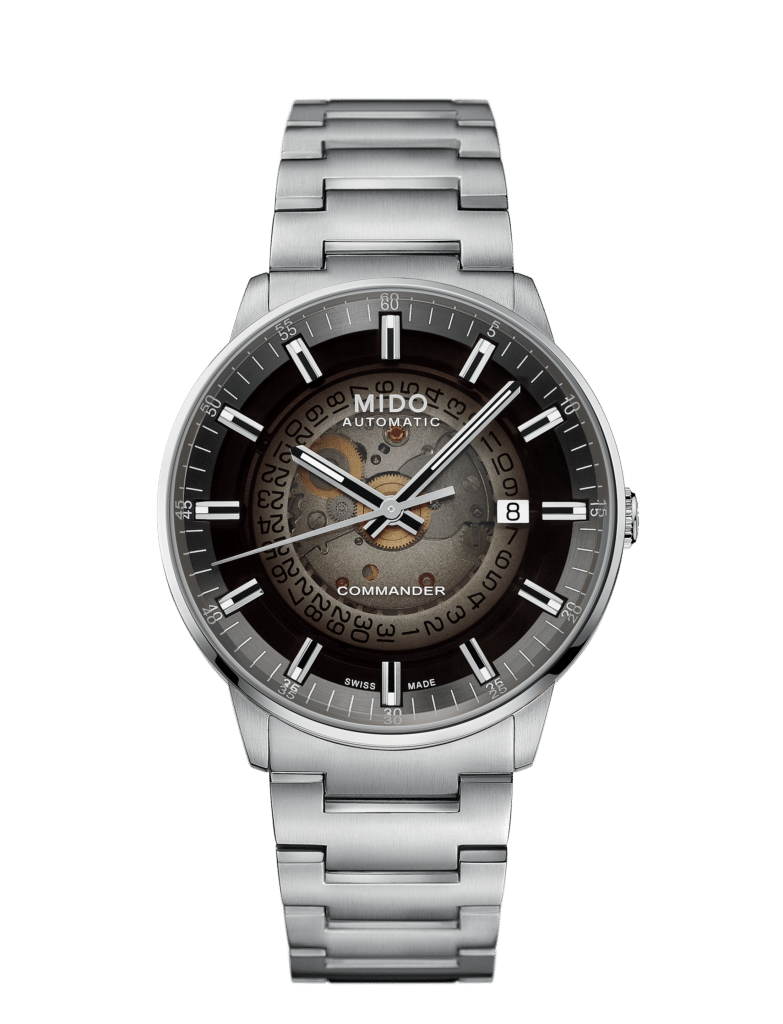
The Mido Commander offers an interesting new take on the iconic commander line, there are some major hits here and some misses. But you be the final judge on this one.
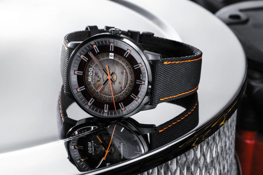
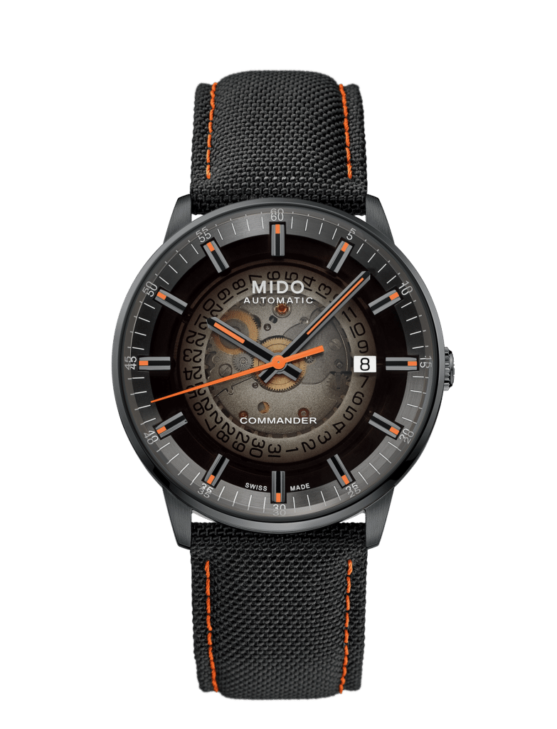
The most striking feature of the Mido Commander Gradient (and the source of its name) is it’s semi opaque dial. A darker tone that transitions to a lighter, smokey gray creates a gradient effect that offers both visual interest and also (surprisingly) a pretty legible dial.
The first thing that struck me about the opaque dial is that it would have been incredibly easy to screw it up. If mishandled, the opacity of the Mido Commander Gradient could have seriously impacted the legibility, but it didn’t. Crazily enough, the transition of darker tone on the perimeter promotes strong legibility from the markers and hand tips.
Being able to see through the interior surface of the dial actually ends up creating some really visually interesting depth play. It makes the watch feel much more interesting that just a static surface with markers that have been applied to it.
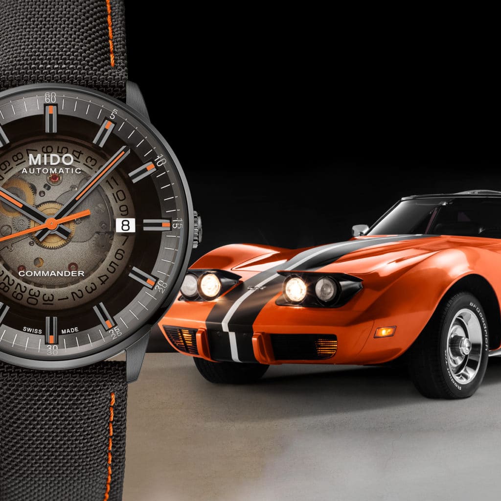
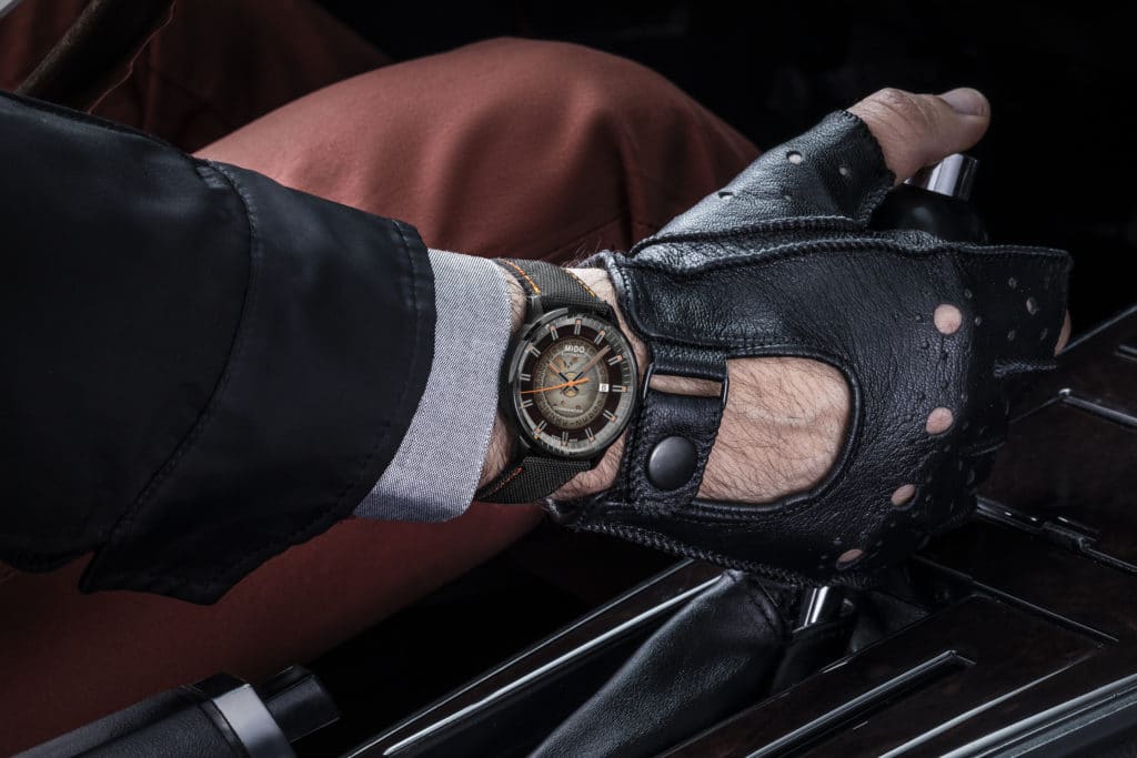
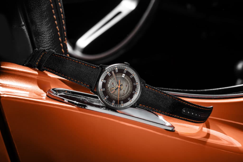
Plus the M021.407.37.411.00 model has orange lume, which when charged will really create a cool effect against the opaque dial. It’s worth mentioning that Mido claims the inspiration for this watch is actually a car speedometer (hence all the random car themed photos they’ve included with the press material).
I’m hard pressed to really focus on that because if a speedometer was the inspiration for this watch, it would be a stretch to classify it as an “automotive enthusiasts watch.”
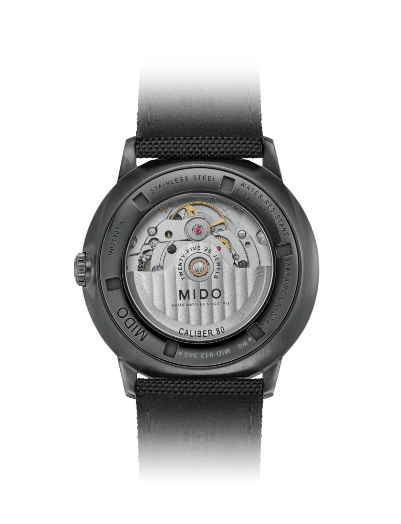
Weird automotive theme aside, I need to address what’s really holding the watch back. If a brand is going to show off a movement, it needs to be decorated in some way. Make no mistake, I love the movement Mido has used here; it’s the Mido Caliber 80 (a modified ETA C07.611, which features 80 hours of power reserve).
However some sort of treatment to the movement plate would have gone a long way. You can leave the date wheel, seeing that is cool. But the solid pieces of the movement would send this watch to a whole new level if they featured decoration or possibly skeletonization. That said, I know doing so would probably double the price (Mido Commander Gradient price to follow below). I will say that having the exhibition caseback with an opaque dial is a really cool effect.
While I understand Mido’s predilection to use their branded orange on everything, I do wish this initial release featured more pigment options like green or blue (although it looks like M021.407.11.411.00 has green lume accents at least – so that’s something). What honestly would get me really excited is if they offered the actual gradient in another color option than black/grey – like maybe blue/grey. However Mido generally tends to stay within their self-imposed box when it comes to color choices. So who knows how far they’ll expand this new Commander Gradient collection.
What does everything think? I think the novelty factor is very high (in a good way) while also leaving room for improvement. Here are the reference numbers with prices.
-
- M021.407.37.411.00 – $960 | Rose gold PVD case, white lume accents with with leather strap
- M021.407.37.411.00 – $1060 | Black PVD case, white lume accents with with black PVD bracelet
- M021.407.37.411.00 – $960 | Black PVD case, orange lume accents with fabric strap
- M021.407.11.411.00 – $920 | Stainless steel case, green lume accents with stainless steel bracelet
Check them out on Mido’s Site.
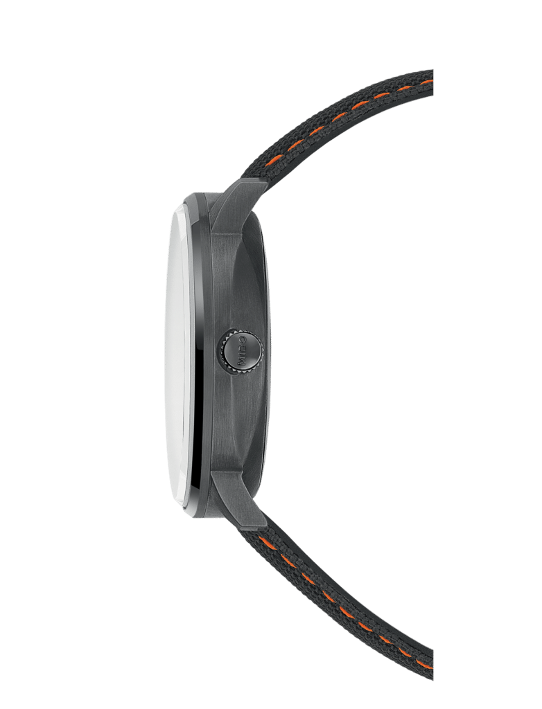
• 10.84mm thick
• sapphire crystal
• 50m Water Resistance
• Mido Caliber 80
• applied markers
• $960 – $1060 USD

Co-Founder and Senior Editor
Kaz has been collecting watches since 2015, but he’s been fascinated by product design, the Collector’s psychology, and brand marketing his whole life. While sharing the same strong fondness for all things horologically-affordable as Mike (his TBWS partner in crime), Kaz’s collection niche is also focused on vintage Soviet watches as well as watches that feature a unique, but well-designed quirk or visual hook.
