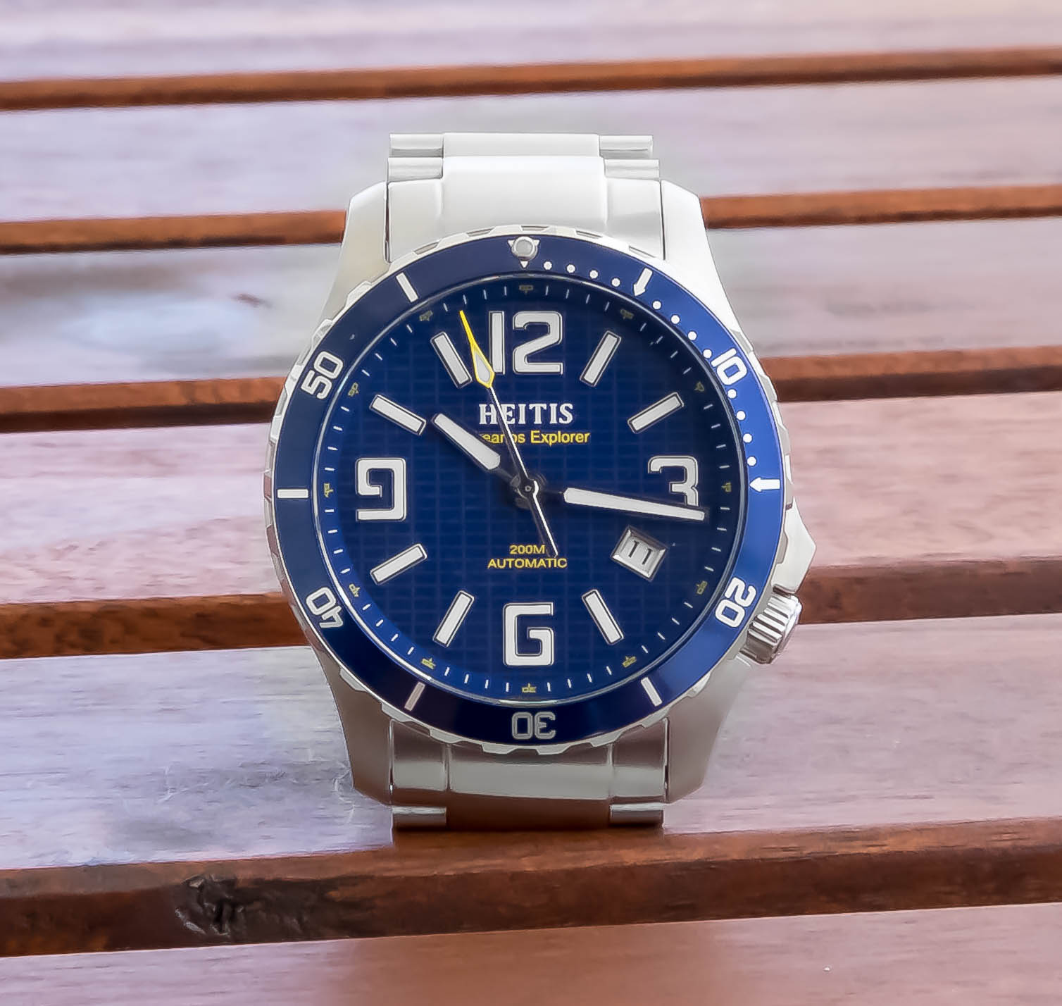
Heitis Watches Okeanos Explorer Review
By: Kaz Mirza
We’ve talked a lot on the Two Broke Watch Snobs podcast about how manufacturing restrictions often forces Microbrands to design watches in set templates. It usually takes someone with enough care, drive, and vision to actually work with manufacturers to fulfill something that’s actually unique and not another sub-homage with a clicky aqua bezel. That’s why I’ve been a huge fan of Heitis Watches and the work DJ Heider (founder, owner, operator) is doing there. Last year I reviewed the Heitis Aviator and the Chronograph. Well, this year Heitis Watches decided to take a step in what would be considered uncharted territory for the brand: a dive watch.
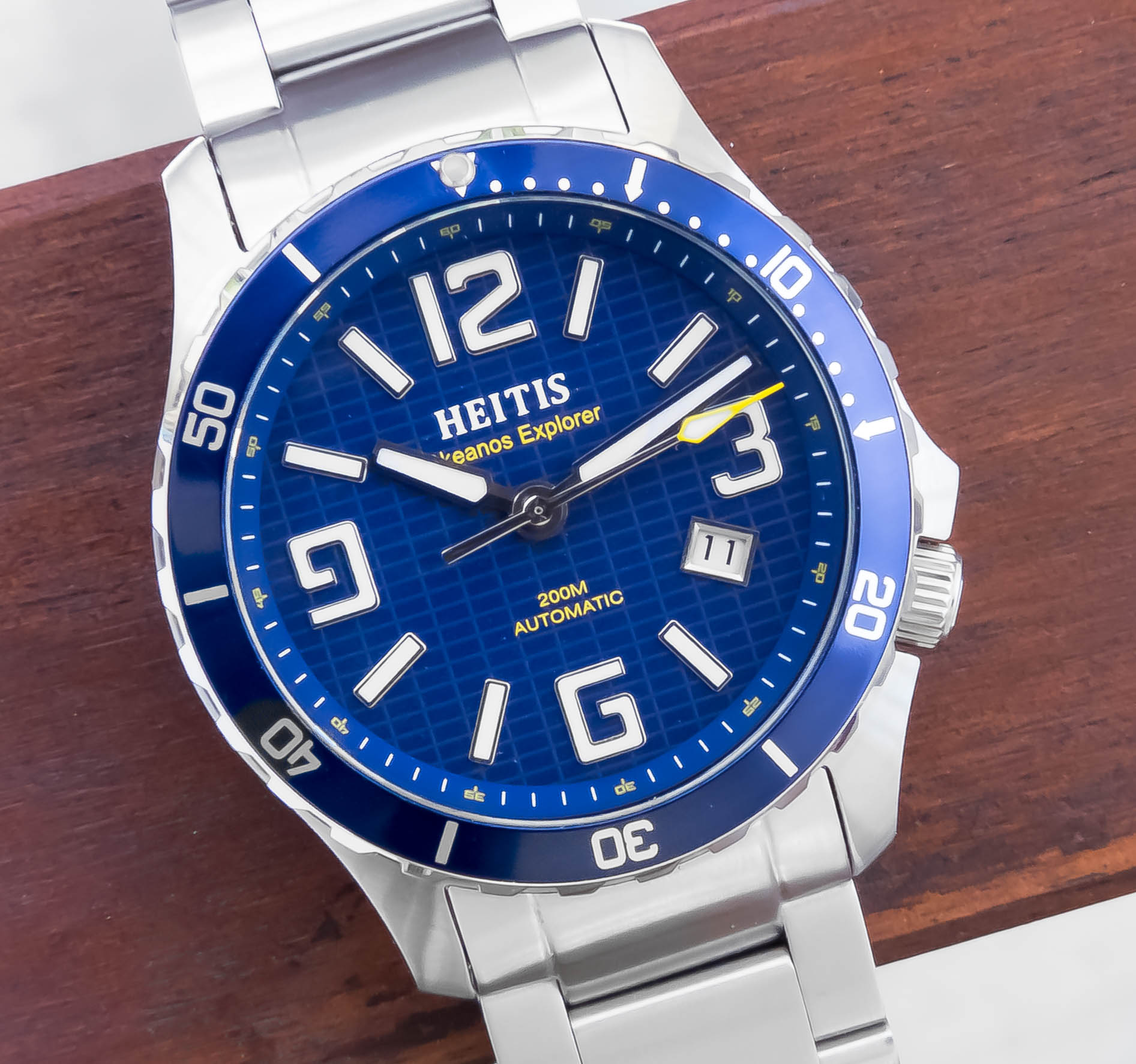
That’s the Heitis Watches Okeanos Explorer you see above. Off-the-bat, I’m smitten with the watch because it’s a surprisingly refreshing microbrand dive watch, but at the same time there is something extremely authentic and accessible about it. But how does the piece stack up to holistic scrutiny? What’s to be said of how the watch performs and feels as the sum of it’s disparate parts? That’s what I wanted to find out too – so let’s dive into it.
The Case:
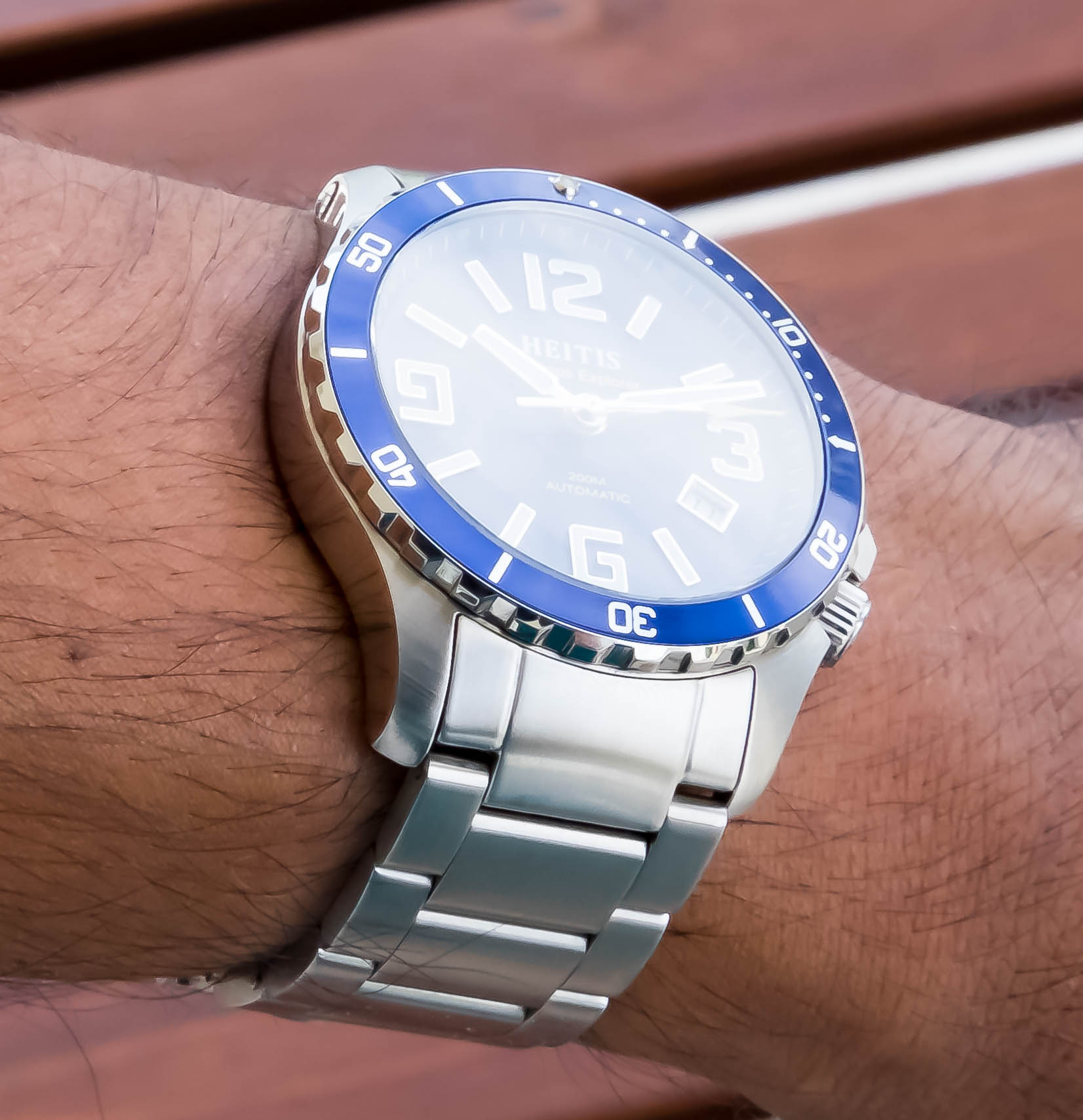
At 42mm the case sits comfortably on the wrist. My wrist is a touch under 7 inches in diameter and sorta flat on top and I find that the watch conforms pretty nicely. There’re two really noteworthy elements about the case that I want to bring up.
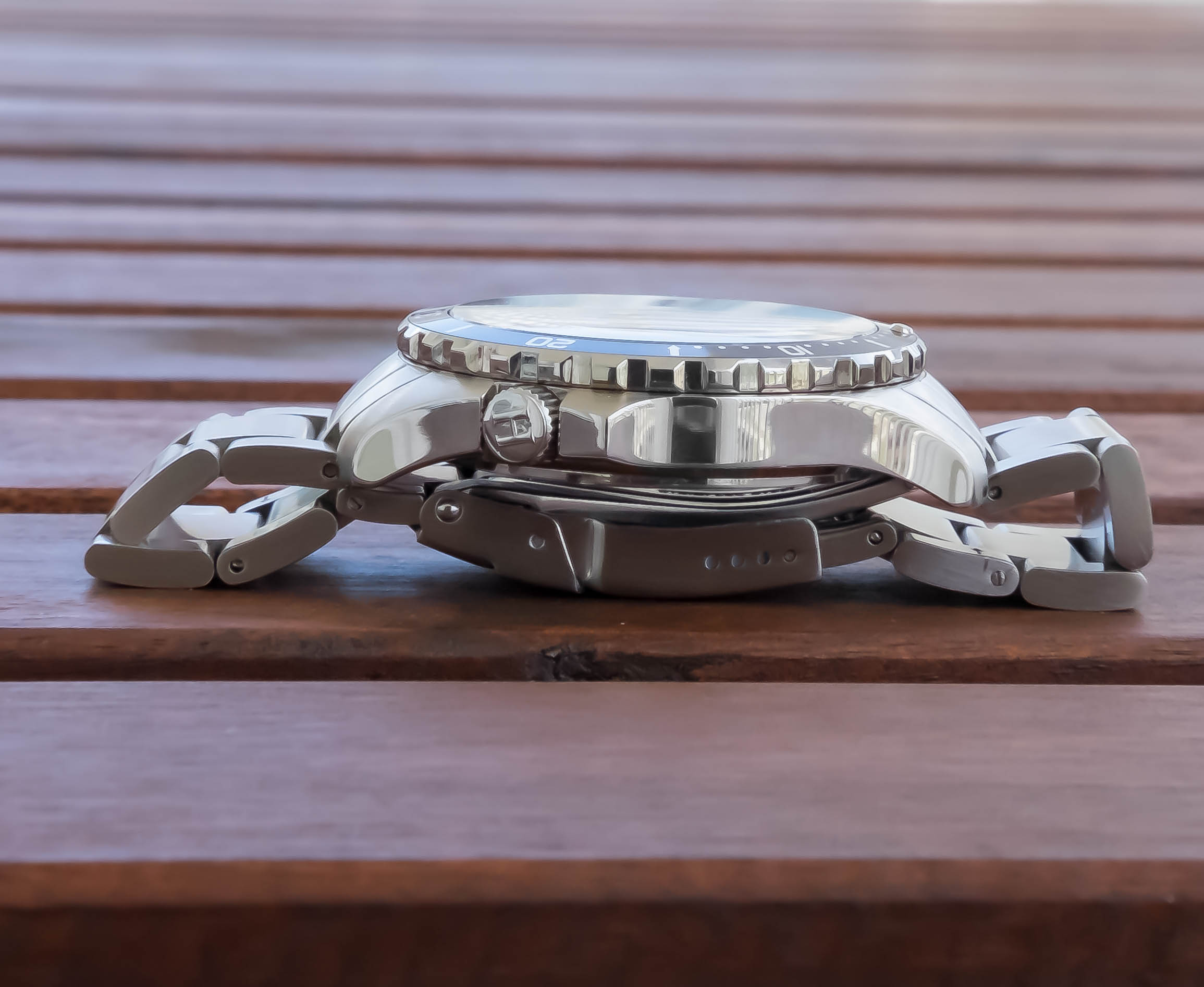
Of note first is this crown guard. Lots time-tested products and goods will have some sort of visually aesthetic “hook” – something unique that’s pretty integral to recognizing the watch before you even see the logo (I’m looking at you, Panerai! *shakes fist*). In the case here for the Heitis Okeanos Explorer it’s the crown guard. Situated at 4 O’clock, there’s a type of visually ergonomic motion that creates the crown guard’s protrusion from the case. It’s both extremely noticable but also fairly well balanced. It doesn’t look out of place and it looks very natural to the watch. What’s interesting also is that this crown guard offers a very refreshing curvature that see-saws well with a lot of the other hand-angled features of the watch.
The second noteworthy element about the case is the lugs themselves. There’s a concerted effort within the Heitis Okeanos to position the dial as forward-facing as possible, and the lugs contribute to this. But what’s cool is that they’re contributing to the forward-facing nature not by being diminutive or small, but by controlling the motion of angle. It’s easier to notice it at certain angles, but although the lugs are quite substantial, they aren’t the focus of the watch. That’s because the curvature of the entire lug begins at the circumference of the bezel. The downward angle of the lugs serves to both facilitate comfort, but to also “raise-up” the dial portion of the watch, which is a great legibility-effort. It’s one of those cool details that you would normally glance over simply because it’s executed so well, which is why I appreciate it. It’s these types of details that Heitis watches will focus on.
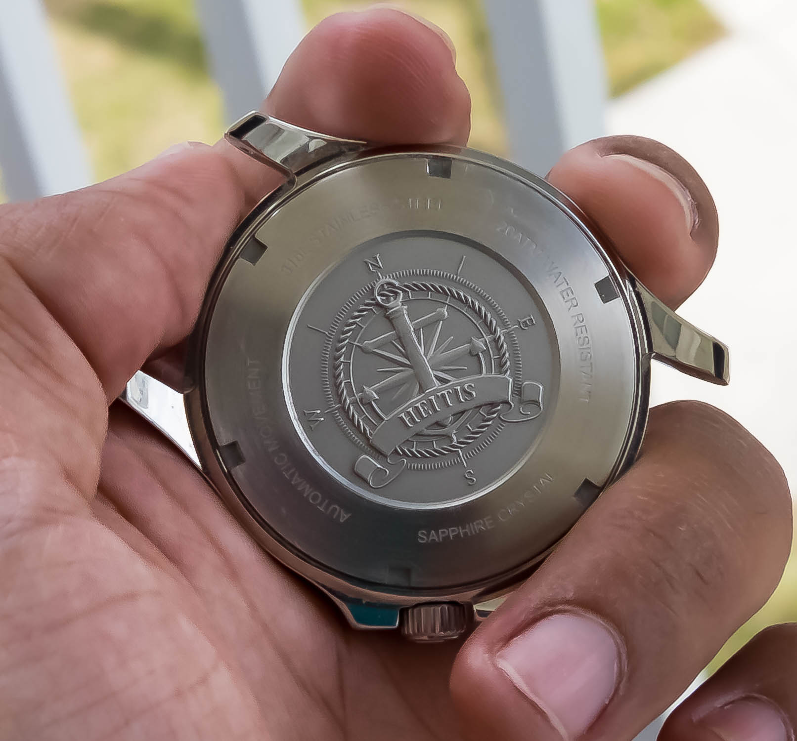
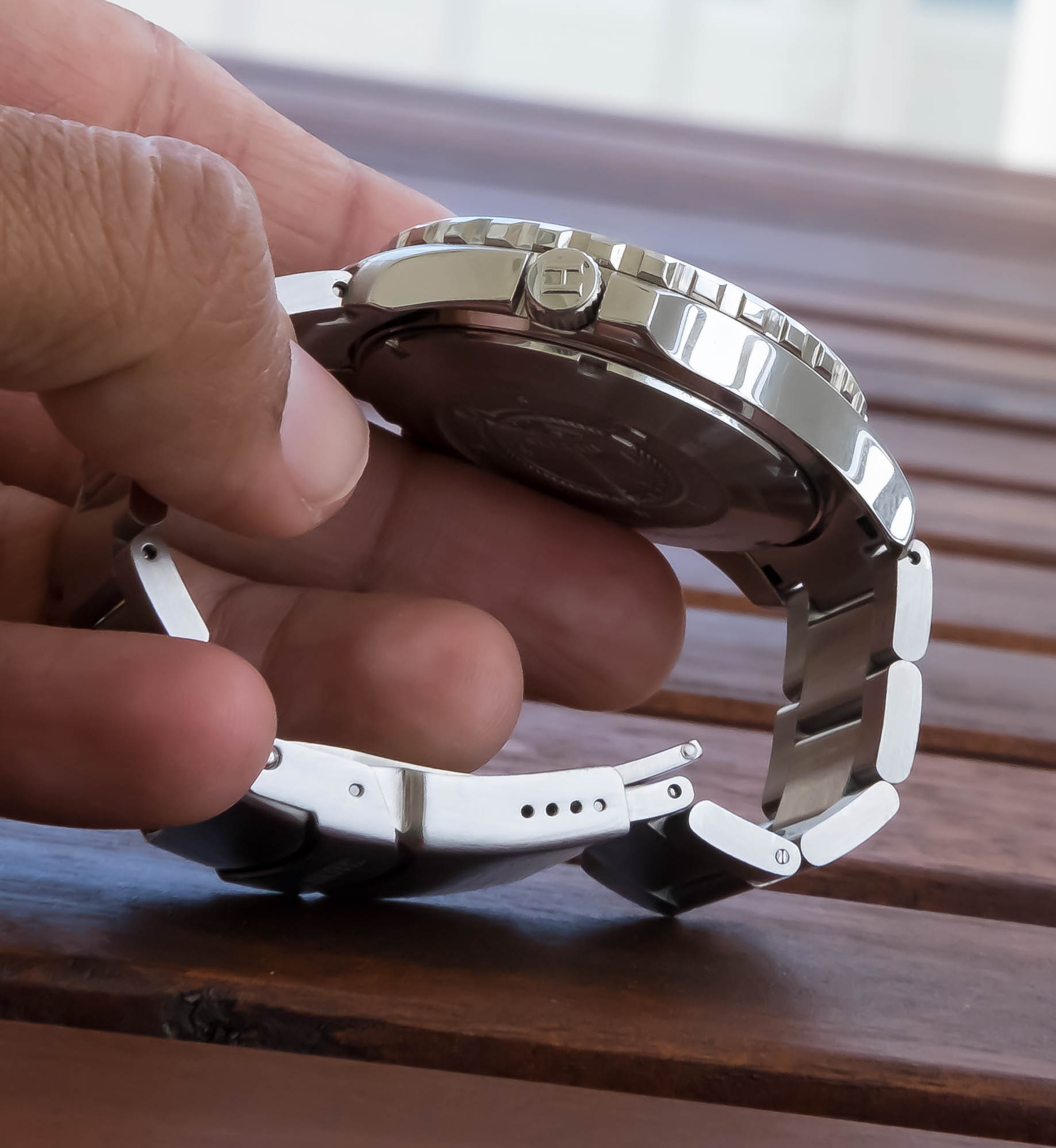
In regard to case construction quality, it’s solid. The edges feel good – angles are on point. There’s a fun mix of polish and brushed surfaces with the sides of the case being polished and the tops of the lug being brushed. I think it’s worth mentioning the quality of the case back logo. It’s not normally a place I focus on but when I got the watch and started putting my grubby fingers all over it, I immediately stopped at the case back and really inspected it. A lot of fine details – really well done – not half-assed.
The Dial:
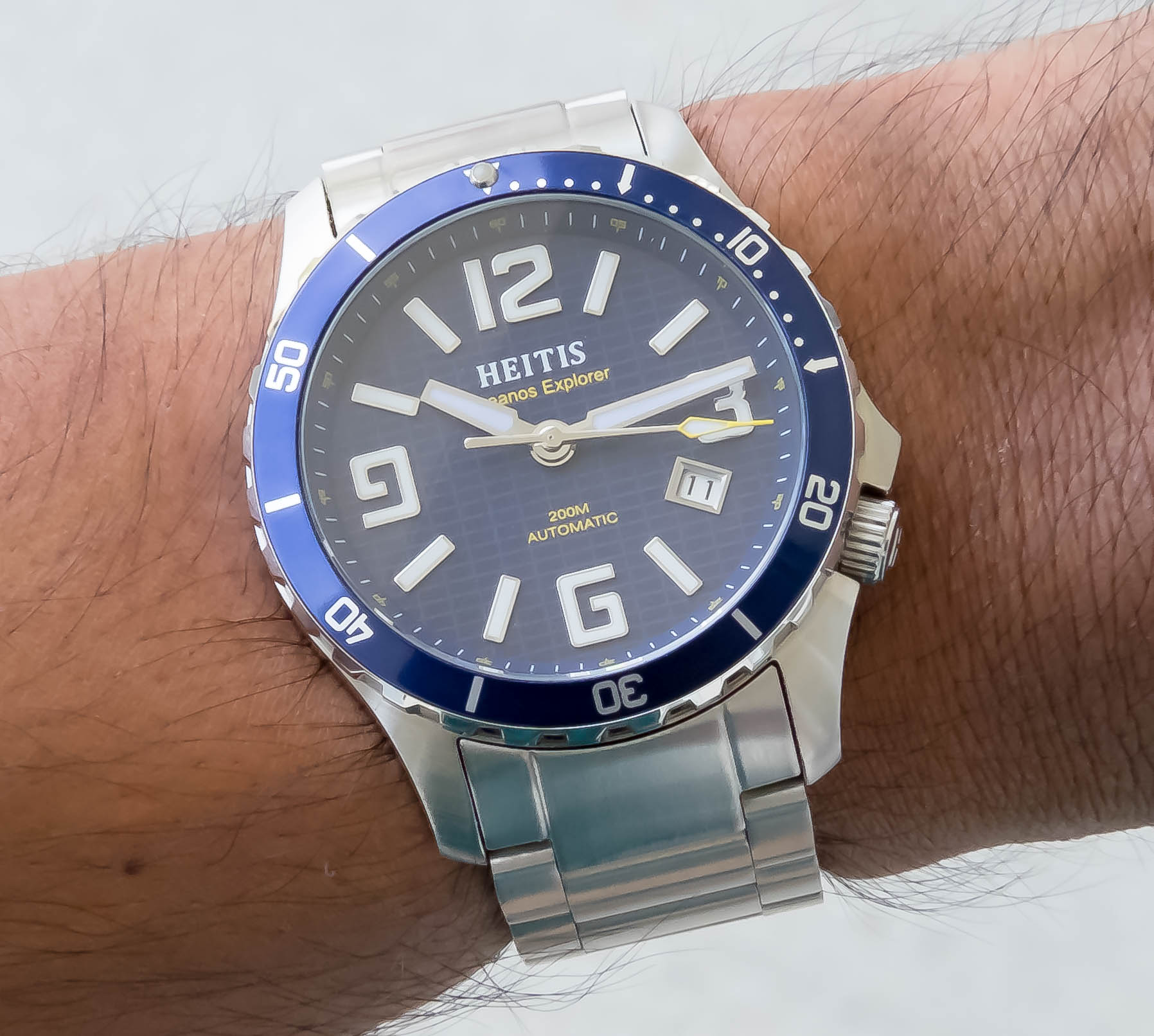
If the Heitis Watches Okeanos Explorer’s case is an execution of great angles, then the dial would be the inverse – an execution of really cool hard corners and right angles. The first thing that’ll probably pop out is the markers. They’re applied and featured a polished metal wrap around their edges, which really accentuates the fun corner-nature of the font. This in turn really supports legibility – it’s not so much about having gigantic markers on your watch to make it legibility, it’s how you balance the nuances of the markers. In the same vein, the hands are equally legible, offering a bold presentation but making sure to balance it and dial it down a bit by creating an indent-taper on the hands closer to center dial. The seconds hand features a gratuitously large spear tip that’s accented with a pop of color (for this model, it’s yellow). This type of seconds hand treatment makes the watch feel more special (by not just having a simple stick seconds hand) while also reinforcing the nautical dive watch nature of the piece (plus it’s just a fun touch!).
I’m always a sucker for fun dial texture and the one here on the Heitis Okeanos Explorer is cool – very grid-like. We talked about on air how it reminds us a bit of Tron. I think that’s because the grid texture is reminiscent of Light Cycle races from the film. I feel like the comparison isn’t superfluous because there is almost a really fun and authentic 80s inspiration/ethos with how the dial texture, markers, and case are converging with each other.
Bezel action is solid on this piece – the model I’m reviewing is a prototype and DJ informed me that he’ll be making the action a touch tighter for production models – no worries there in my opinion. The bezel is rocking a classic aluminum insert, which I feel like more brands need to utilize these days. It’s fun and adds a really fun and unpretentious vibe to the piece. The presence of the bezel itself is quite thin, which supports stronger legibility of the dial elements and the bezel grip features pretty substantial teeth that are easy (and honestly fun) to grip and turn. Also, please note the the Okeanos features a single dome, AR-coated sapphire crystal.
The blue and yellow version I’m reviewing has BGw9 Lume and the other black and red version has C3 Superluminova.
The Bracelet:
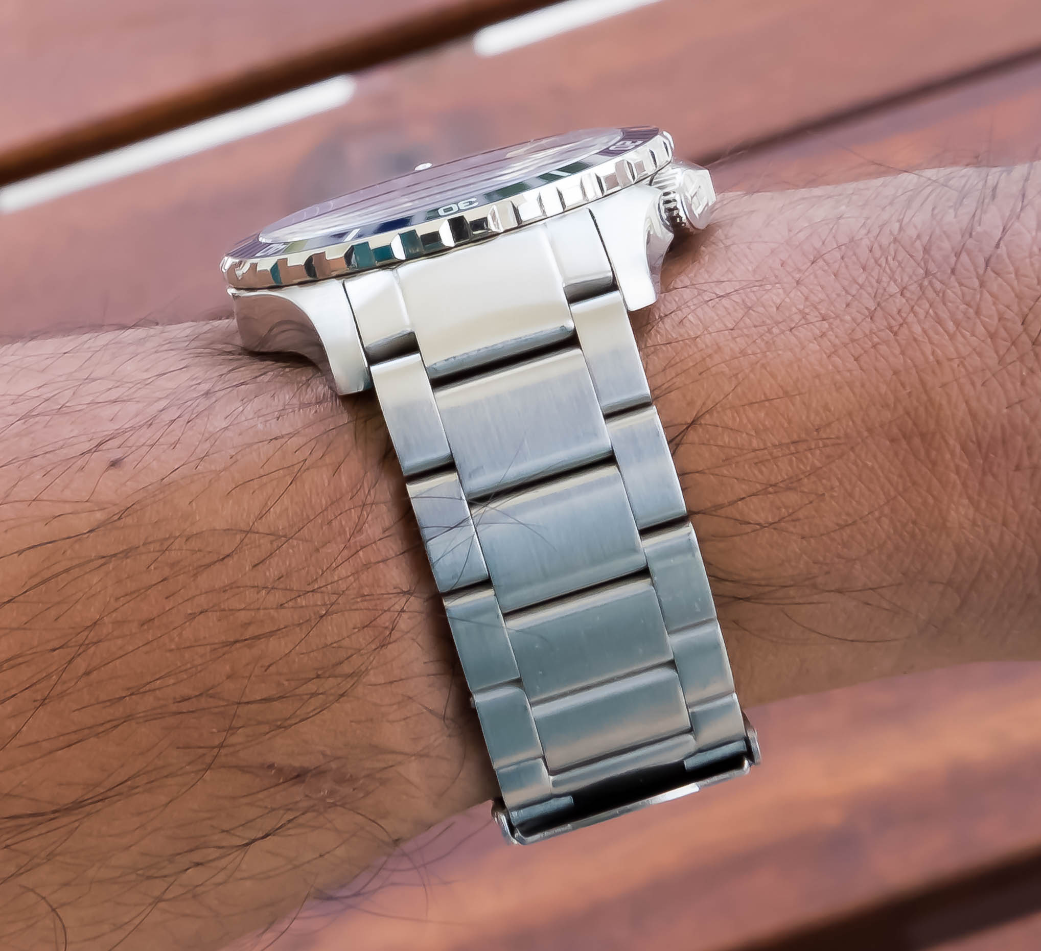
The bracelet incorporates itself well with the Okeanos Explorer’s case – this type of blended conformity helps keep your visual focus on what’s most important for the watch (dat legible dial O_0). The construction of the bracelet itself feels quite solid and the clasp snaps really tight and feels very secure. The clasp also features micro adjustments in case you’re like me and having the option of fine-tuning your bracelet tightness can make all the difference. The bracelet also features brushing across the entire surface – no gleaming polishing in site on the bracelet’s surface. In my opinion this helps the wearer remember that this piece is as much about function as it is looks – if there’s too much polishing it can make the piece feel a bit too dressy. But in this case, featuring subtle brushing on the bracelet makes the watch feel more like a utility piece.
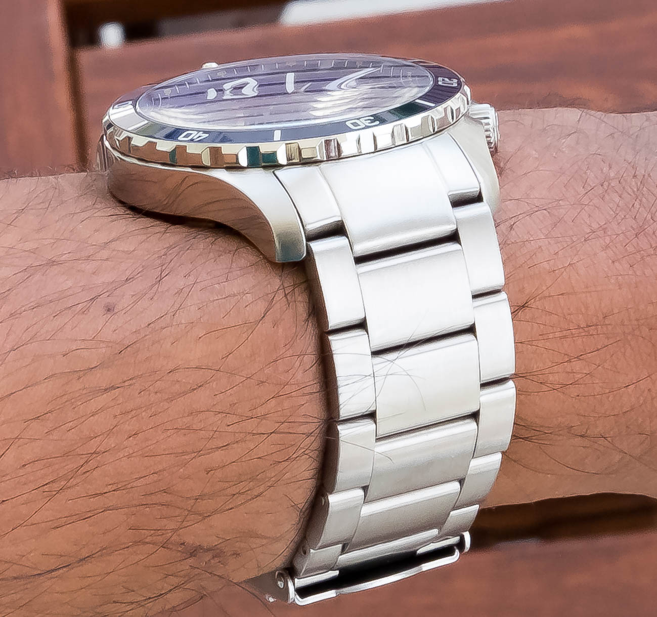
What I can see potentially being an issue for some folks is that the bracelet doesn’t taper towards the clasp. The bracelet’s width is consistent throughout. This treatment gives the Okeanos Explorer more of a solid feel on the wrist, but I know some folks like bracelts that taper simply because that type of nuance can make the piece feel a bit more dynamic in terms of appropriateness (dress it up – dress it down). But just to reiterate the point above, the piece is really trying to position itself as a functional utility tool that’s also aesthetically fun. With that in mind, creating the bracelet sans taper makes sense. That said, it’s worth noting here in the review so folks know in case the non-taper goes against preference.
The Movement:
You’re going to find the good old Miyota 9015 in the Heitis Okeanos Explorer. 28,800 VPH, 42-Hour Power Reserve, Automatic/Manual Wind – the movement is reliable and has become a staple for the microbrand community. So no worries here – you can count on the Miyota.
Final Thoughts:
I mean, let’s be real – it’s very easy to create a unique looking watch that looks like dogshit – but to actually create a unique looking watch that’s balanced, refreshing, and still rocks a timeless look – now that’s not easy. And that’s exactly what the Heitis Watches Okeanos Explorer is – it’s a refreshing microbrand dive watch that features a timeless look and can also handle most things you throw at it. Designed to be aesthetically pleasing but also functional, it’s really a welcomed addition to anyone interested in adding a microbrand diver to their watch box.
Now here’s the thing! – the Kickstarter for the Heitis Watches Okeanos Explorer ends in a few hours – a few hours, guys! The only reason I’m highlighting it to such an extent is simply because this killer microbrand diver is currently on the Kickstarter for $329, which is an insane steal – after the campaign it’s jumping up to $529. That’s still a great price – but why pass up on saving 40%? If you’ve been thinking about the piece it’s time to stop thinking and make a choice – save 40%? Or spend an extra $200?
Check out the Kickstarter Below to save 40%! 0_o

Co-Founder and Senior Editor
Kaz has been collecting watches since 2015, but he’s been fascinated by product design, the Collector’s psychology, and brand marketing his whole life. While sharing the same strong fondness for all things horologically-affordable as Mike (his TBWS partner in crime), Kaz’s collection niche is also focused on vintage Soviet watches as well as watches that feature a unique, but well-designed quirk or visual hook.
