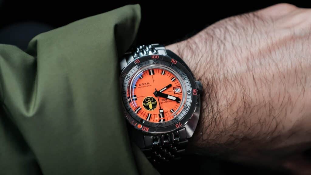
It’s time. Now, in 2025, I think it’s the perfect moment to reflect on the Doxa Sub 300 “Black Lung” re-edition I purchased back in 2017. Some watches show up after a lot of second-guessing. At the time, I’d been curious about a Doxa for years, but wanting one and choosing one were two very different things. When the Doxa Sub 300 Aqua Lung reissue started circulating online, it hit that part of me that had always romanticized the golden era of dive watches. Jacques Cousteau, SeaLab, the bold orange dial that didn’t totally make sense all the time. But even then, I wasn’t sure.
There were teaser images on The Dive Watch Connection and spec lists, and I kept trying to talk myself out of it. I thought maybe the case would wear too weird. Maybe the Aqua Lung logo would feel like a gimmick. Maybe it wasn’t the right Doxa to start with. Should I go vintage? Get the 300T? The $2,190 price tag for pre-order was also no joke. I hovered over the pre-order page. Closed the tab. Opened it again. Went back to old forum posts. I had almost convinced myself to let it go, until a listener from the TBWS podcast chatted me through Instagram. Just a nudge after a lengthy conversation about my indecision. Something about how rare this run was going to be, how it felt right for someone who had been circling Doxa for as long as I had. I pulled the trigger.
What I got was the one watch that followed me through every meaningful shift in my life since. It marked the celebration of my 30th birthday and the purchase of our first home. I’ve taken it across continents. From cities in Europe I can’t pronounce properly to long bus rides in South America, this has been the watch I’ve trusted to take the beating and come back asking for more.
A Strange and Rare Origin
The original “Black Lung” diver was never meant to be famous. I think it was a prototype, a small batch of watches that Doxa built in the late 1960s while working with Aqua Lung. The earliest SUB 300s already had a cult mystique, but the versions with that filled black U.S. Divers logo were on another level entirely. Depending on who you ask, the count was so low that some collectors haven’t even agreed on an exact number. Pieces would pop up in old magazines, dive club photos, or forum threads, and then vanish again (thanks, Photobucket). For anyone already obsessed with the brand, those watches became the kind of thing you didn’t expect to actually see in the wild.
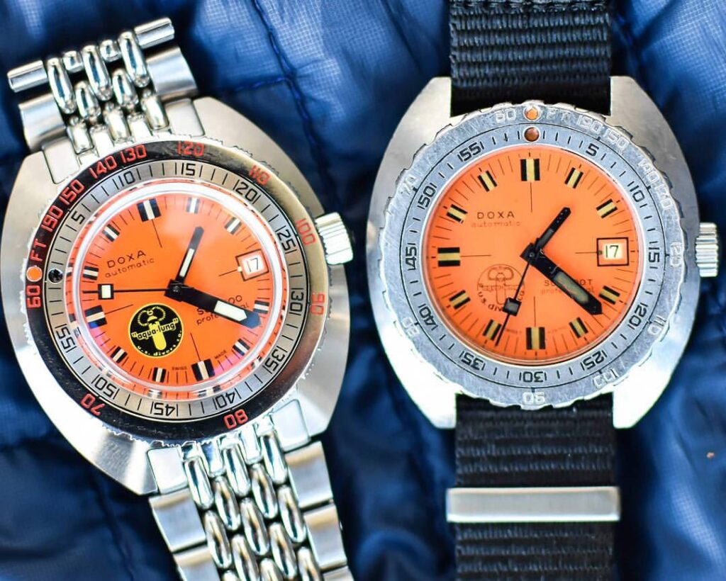
Part of the story goes that the logo itself caused trouble early on. That solid circle sat so close to the fat black minute hand that it apparently became an issue when glancing at the dial underwater. Whether that’s apocryphal or not, Doxa moved on from the filled version pretty quickly and shifted to the familiar outline style we all know from the later SUB 300T generations. This reissue brings the bold circle back exactly as it appeared on those rare early dials, and even though I’m never pushing it to the visibility limits it was designed for, I still love having that bit of imperfect history right there on the surface.
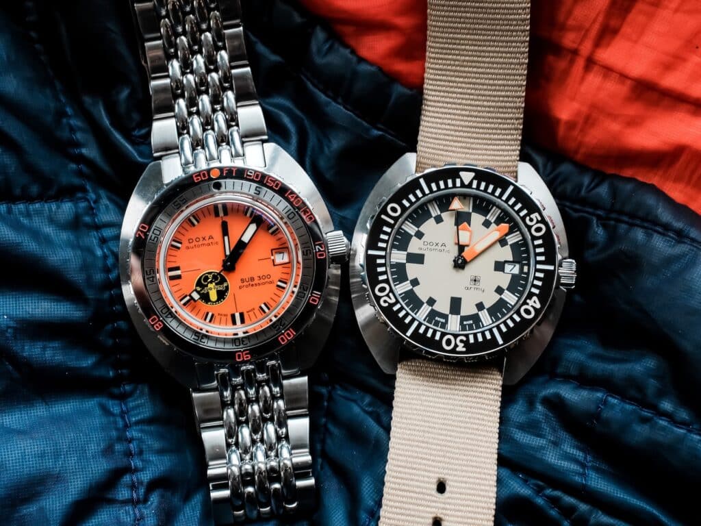
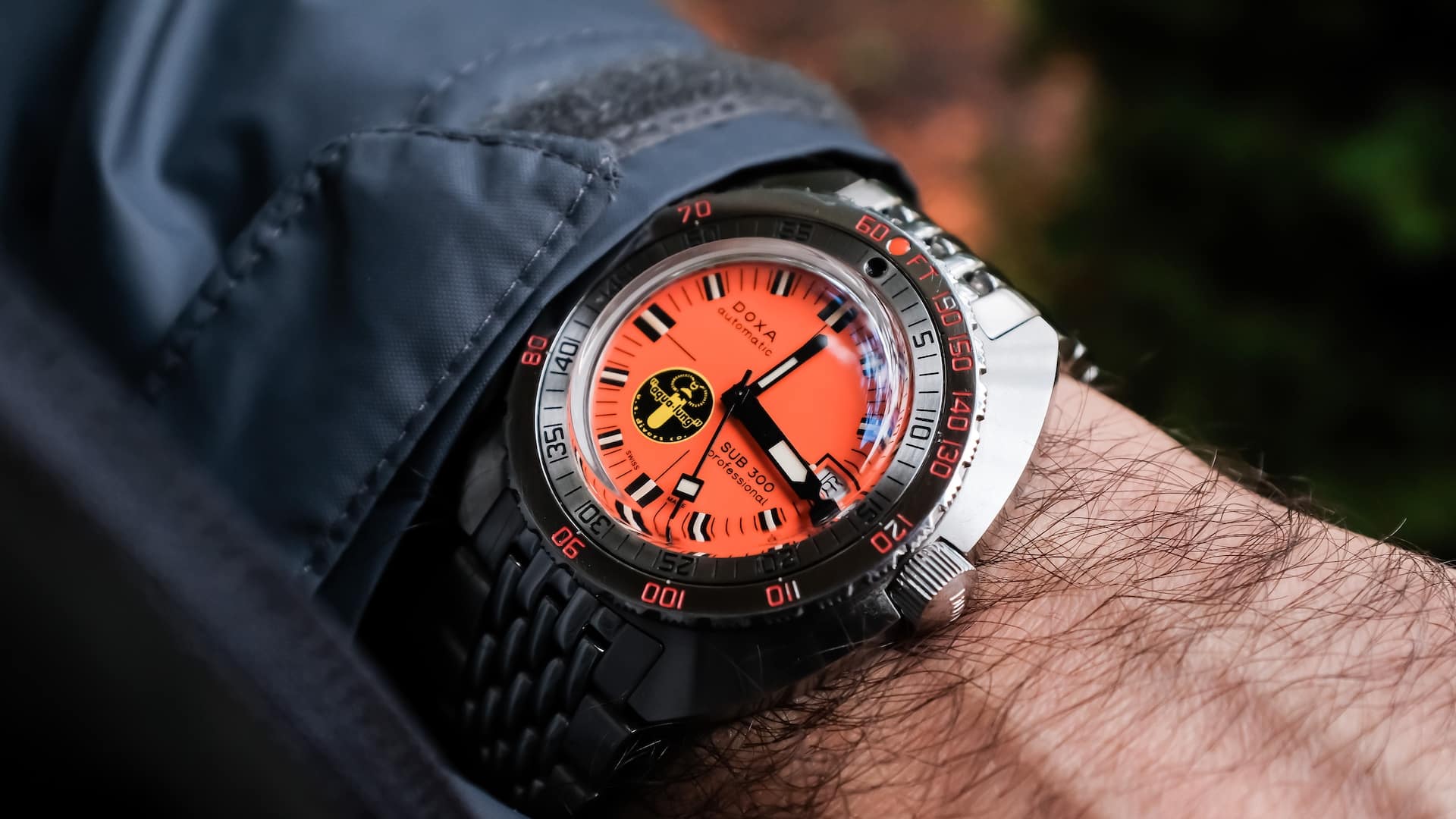
The 2017 reissue brought the original layout back with care and accuracy, keeping the same proportions, same orange dial, same logo placement, and the same sense of purpose. Doxa didn’t scale it up or modernize it beyond recognition. They just gave it better materials and a COSC-certified movement. It felt like a watch built for people who already knew what it was. That’s what pulled me in. Even if I didn’t live through the era it came from, I had spent enough time around the idea of it to know this was something worth holding onto.
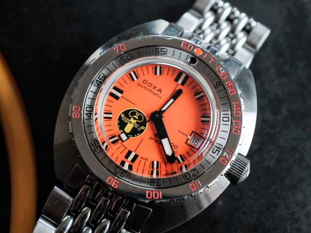
Case, Crystal, and Bezel Character
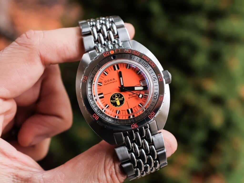
The cushion case—technically a 42.5mm tonneau-shaped steel case—has always been one of the reasons the Sub 300 feels right on my wrist. I always joke that this case and a CWC Royal Navy Diver make for the two watches that fit my wrist perfectly. There’s a strange confidence to it. Wide-set, low-profile, with curves that flow naturally into the bracelet. No sharp transitions or awkward angles. Just a shape that seems to enhance what wearability means when you’re out in the real world, not just posing for a flat lay. There’s some proportional weirdness with the bracelet, but we’ll get to that later.
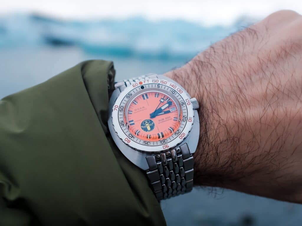
The steel has taken on a softened look over time. Some of the paint set in the bezel markers has even started to fall out, just like older Sub 300 models you see around. That factory brushing on the top surface still shows when the light hits it cleanly, but it’s mixed now with the kind of honest wear that only comes from years of use. There’s a slight bevel where the case sides meet the top surface.

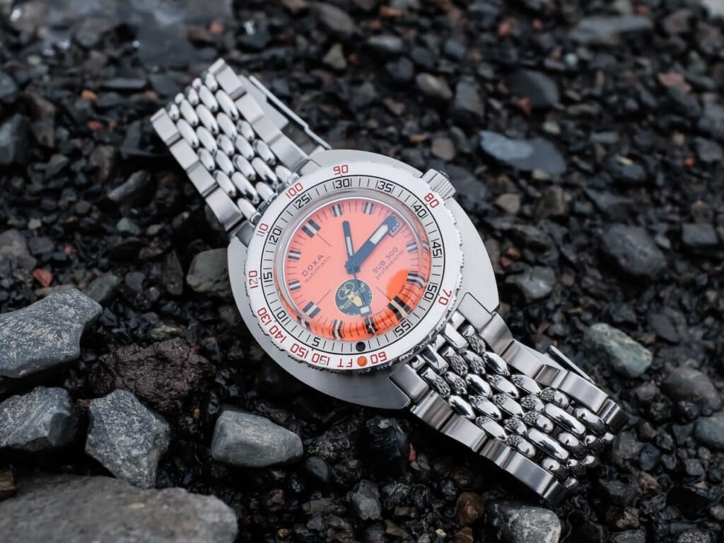
Bezel action is still exactly what I expect from a Doxa. Firm clicks, no backplay, and a grip that works just as well on dry land as it does in water or fresh out of a backpack in Iceland. The bezel itself sits proud of the case with those saw-like edges that make it easy to turn even with cold hands. It carries the old-school no-decompression scale, the same system divers used long before computers existed. I’m not a diver, so the math behind it means nothing to me, but there’s still something undeniably cool about seeing that dual-scale system circling the dial. The zero marker isn’t lumed, and the shallow engravings can be tough to read in dim light, but that’s just part of the design. The 300-meter water resistance has never felt theoretical—it’s handled every swim, dunk, and weather shift I’ve thrown at it.
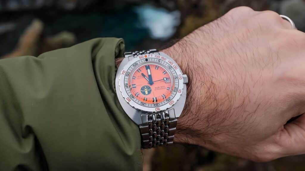
It wears compact for its size. That’s something I always appreciated. The short lug span, 12mm thickness, and the way the caseback settles all keep it from feeling oversized. Most of that height comes from the bubble-shaped crystal and the hefty bezel, and both work together to give the watch its old-school silhouette. On the wrist, it plants itself securely and stays put. The watch never shifts in a way that feels distracting. It just stays centered.
Dial, Hands, and Legibility
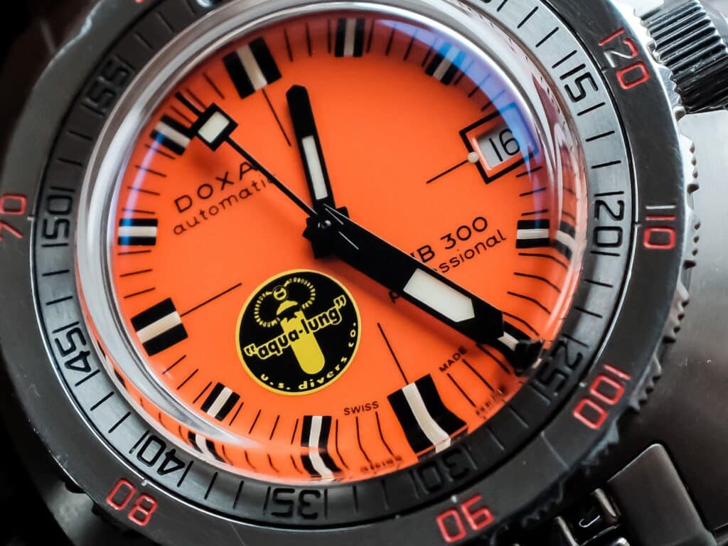
The dial was what pulled me in first. Some folks were originally freaked out by how small the dial appears considering the watch’s overall proportions. That dial really is compact—about 25.5mm across—which only exaggerates the personality of the orange. The crystal adds to the effect, bending light around the edges and creating that weird sense of looking into a tiny ship window. It’s one of the things that makes these reissues feel genuinely vintage rather than inspired by vintage. Even with the distortion, legibility never takes a hit.
That yellow and black Aqua Lung logo at the lower left has become such a fixture that I forget how bold it actually is. There’s nothing else like it in my collection. The placement is unapologetically odd, slightly off-balance, yet somehow perfect in its disruption. It reminds me that this watch isn’t trying to be symmetrical. It’s just doing its thing. I wonder how they came to the decision of this logo placement back in the late 1960s.
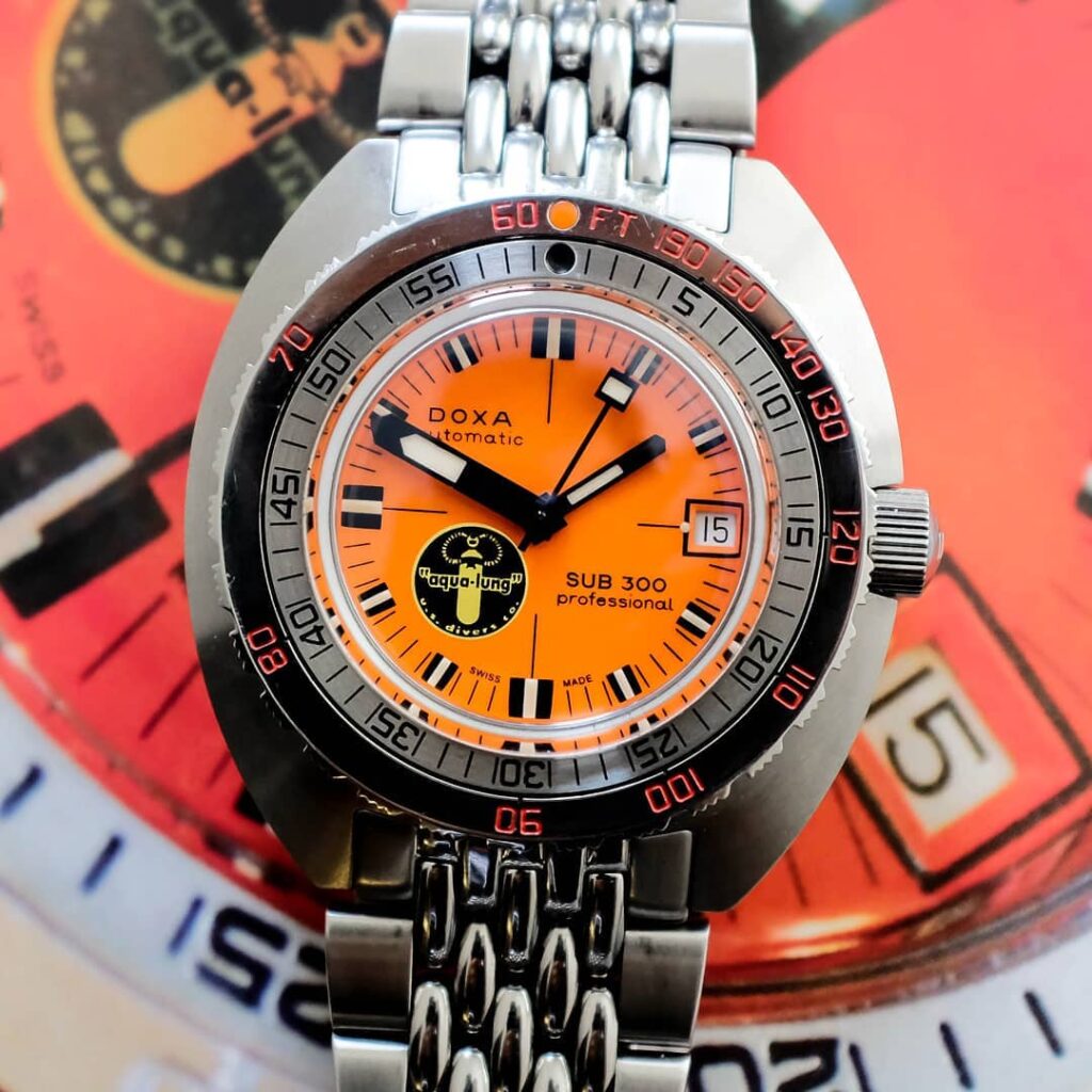
Indices are chunky, and filled with lume that hasn’t really aged. They carry just enough glossy shine around the edges to catch stray light, but never enough to turn reflective. The hands are classic Doxa. Wide, blocky, easy to read. The minute hand reaches exactly where it should. The hour hand almost feels like an afterthought in comparison—short, skinny, and tucked into the dial the way the original “dwarf” hands were. The oversized minute track along the outer edge gives you everything you need when timing gets specific. I’ve used it often enough to trust it without thinking.
Lume performance has also stayed consistent, even after all these years. It’s not the kind of torchy, overpowered glow you find in some modern Seikos. It’s calmer. Warmer. It builds gradually with exposure and holds enough charge to stay legible long after the lights cut out. There’s a kind of honesty to that. It’s lume that supports function, not drama.
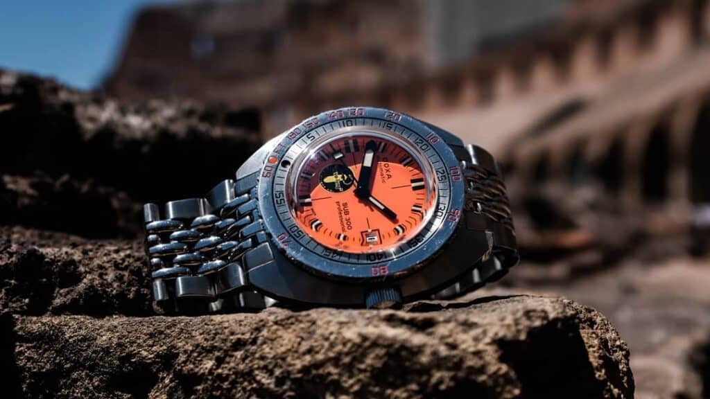
Branding stays where it should. The Doxa name floats just above the Aqua Lung logo, crisp and restrained. Nothing about the text tries to oversell itself. No slogans, no heritage overstatements. Just the name, the logo, and the model. I’ve always loved the font they used on this and earlier vintage models.

Bracelet, Movement, and the Long View
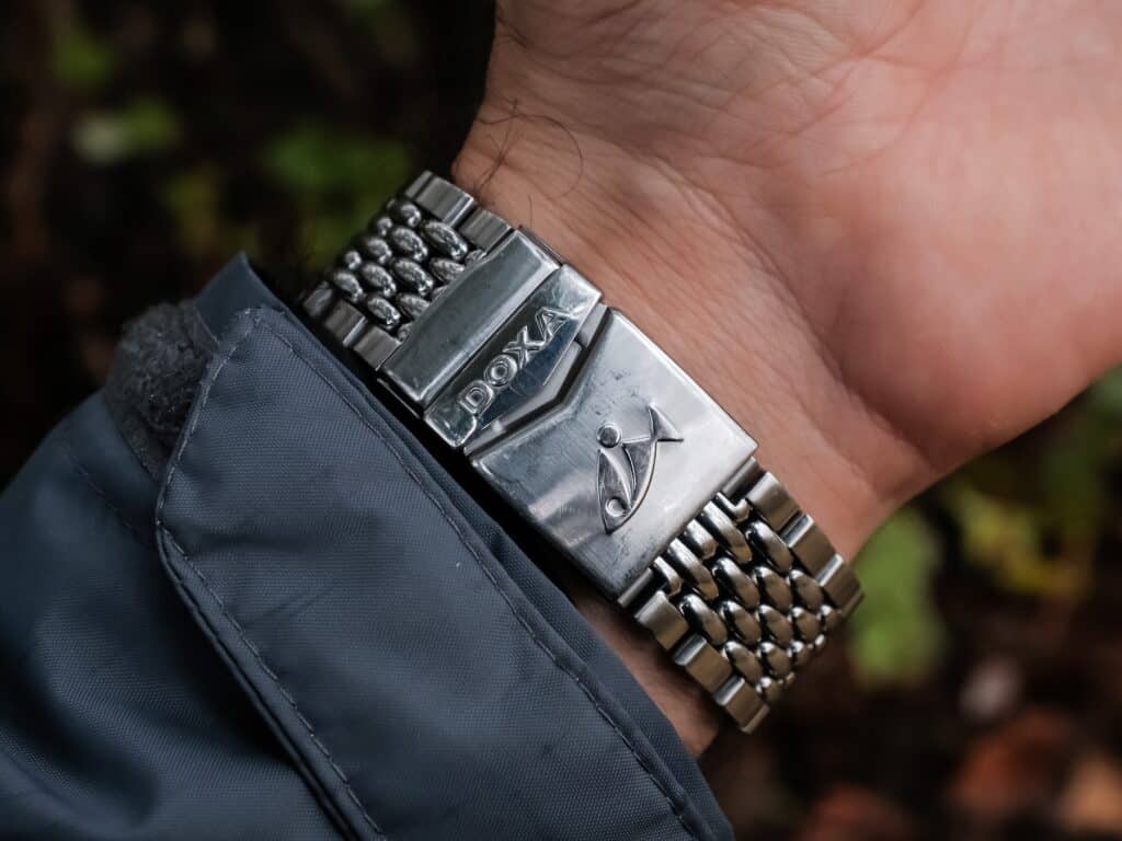
The bracelet was never flashy, but I don’t think that was never the point. You see a lot of cool Instagram shots around that show this watch on a variety of straps but I’ve always just kept it on the bracelet. That beads-of-rice style hugs the wrist in a way that feels more like fabric than steel. It flexes just enough, with a gentle taper that keeps the weight centered. When I first sized it, I remember being surprised at how balanced it felt. Most bracelets with this kind of visual character feel a bit costume-like. Only weird thing about it is that it doesn’t evenly taper down all the way to the clasp. I don’t know why Doxa did this but it often leaves me wondering if it would be fun to source a vintage Doxa beads of rice bracelet for an even more “accurate” fit. The clasp is simple and has always done its job without complaint. It has a dive extension and a small set of micro-adjust holes, nothing fancy, but exactly what you’d expect on a watch built around utility.
The movement is one of those things I never really think about until someone asks. Doxa used a COSC ETA-2824 for this run, and mine has been steady in a way that almost feels boring—in a good way. It winds with that familiar resistance you expect from the caliber, sets cleanly, and hasn’t developed any quirks despite everything I’ve put it through. I’ve checked it against clocks while traveling or during long stretches at home, and it stays within a range that never bothers me. It’s mechanical enough to feel alive without being temperamental, which is probably why it’s been so easy to trust.
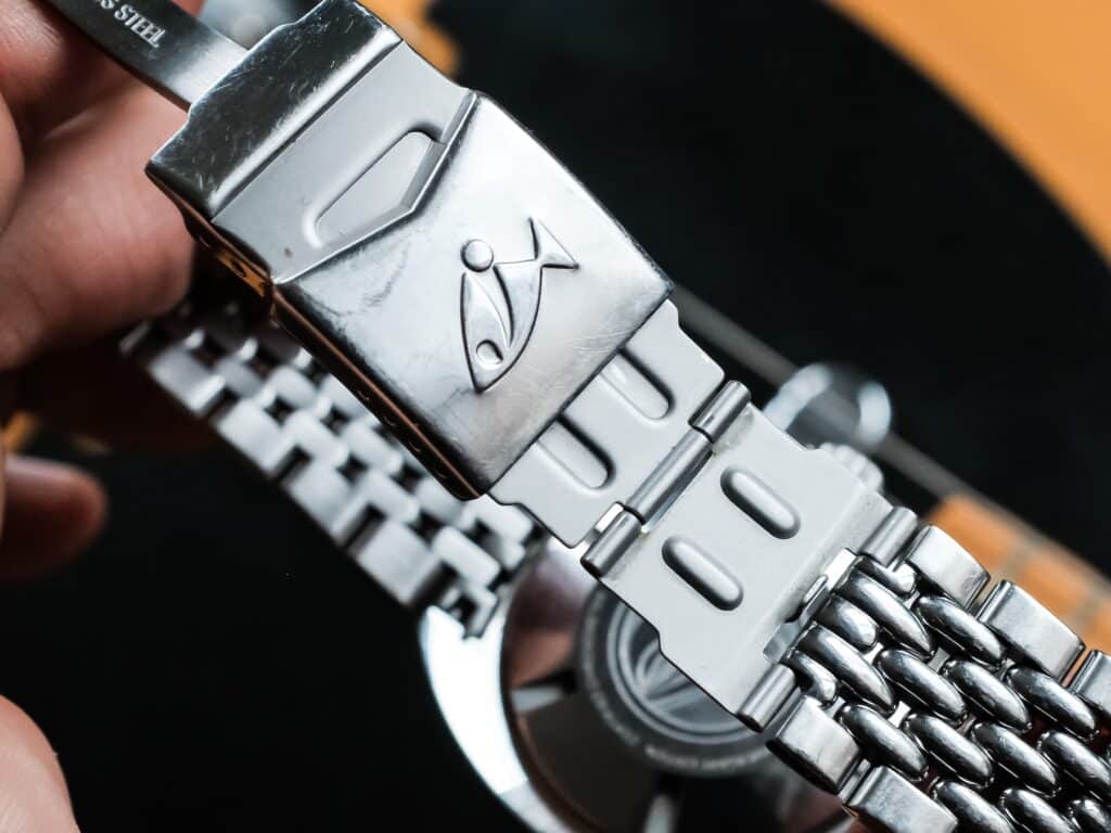
Daily use has reinforced that reliability. Nothing about the movement has softened or loosened over time. The crown still has the same bite it did in 2017. The date flips without hesitation. In a way, the lack of surprises has been the biggest part of the experience. It does its job, always has, and that’s all I really wanted from it.

Looking back, the part that sticks with me isn’t the limited-edition angle or the vintage connection. It’s how naturally this watch settled into my routine. I’ve had plenty of divers cycle in and out since, including ones with better finishing or more interesting movements, but this is the one that kept finding its way back onto my wrist. At some point it stopped feeling like a “re-edition” and just felt like my watch. The one I didn’t worry about. The one I packed without thinking. The one that made sense during big moments and long stretches of nothing special.

Nearly a decade later, it still shows up the same way. The wear on the case and bracelet feels earned. The crystal has a few lines that only show at the right angle. It has grown into itself the way good tool watches tend to. I don’t keep it around because it’s rare or collectible. I keep it because it’s been part of my life long enough that letting it go would feel strange (believe me, I’ve thought about it). And maybe that’s the real measure of why this reissue worked for me in the first place. It didn’t try to be more than it needed to be, and somewhere along the line, that became the reason it stayed.

Co-Founder & Senior Editor
Michael Peñate is an American writer, photographer, and podcaster based in Seattle, Washington. His work typically focuses on the passage of time and the tools we use to connect with that very journey. From aviation to music and travel, his interests span a multitude of disciplines that often intersect with the world of watches – and the obsessive culture behind collecting them.
Great article and story Michael. I’m wearing #141 today and it’s a constant companion. For me also the bracelet is disappointingly un-vintage for such a dedicated recreation — it’s too wide (don’t forget the first links are actually wider than the 20mm lugs) with basically no taper and the clasp is clunky. All very high quality, but too much. I very happily have mine on the Yobokies BOR — it only tapers to 18mm, but it’s an improvement and Harold did us a favor making the endlinks fit perfectly. The kinda crummy generic clasp broke recently, and I eagerly replaced it with this Amazon hero. It’s got a vintage look with gobs of micro adjust and also fits perfectly. Hell I’ve even thought about getting an engraver to do a Doxa logo on the acres of stainless on the cover. [LINK REDACTED PER EDITORIAL POLICY]
The OEM bracelet is tucked away, and vintage Expandros are utterly rare in crap condition and cost like sin, so this setup is gonna stay in place for the long remaining duration.
Hey I appreciate the insight. So cool that you’ve got one too. I didn’t know there was a compatible yobokies BOR option – I’ll have to look into that. Doxa did a lot to make this bracelet feel super hefty and modern. In a way, I like that. But some days, like you said, it’s just too much. I don’t want to simply swap onto a NATO like so many of my other divers so it’s nice to know that there’s at least one good aftermarket option to consider. Thanks for reading!
Finally.
It was time 🙂
I just picked up the 4-watch 2017 set (orange, black, white and carbon fiber) at auction. Really looking forward to wearing each because like Michael I couldn’t decide on which Doxa to pull the trigger on. But now I think I’m set 😄
Dang! You are set 😀