Brew Watches Review:
HP-1 Automatic
By: Greg Bedrosian
Brew Watch Co. is small watch company that is the brainchild of New York-based industrial designer Jonathan Ferrer. The coffee inspired company was launched on Kickstarter in early 2015 with the Brew Special Blend quartz chronograph. This was enough to get the company off the ground and they announced they’d be making a second watch in 2016, the Brew Watches HP-1 Automatic. The HP-1 comes in three colorways Proto (Stainless Steel), Darkbrew (PVD Black), and Joy (PVD rose gold). We will be taking a look at the Brew Watches HP-1 in Darkbrew.
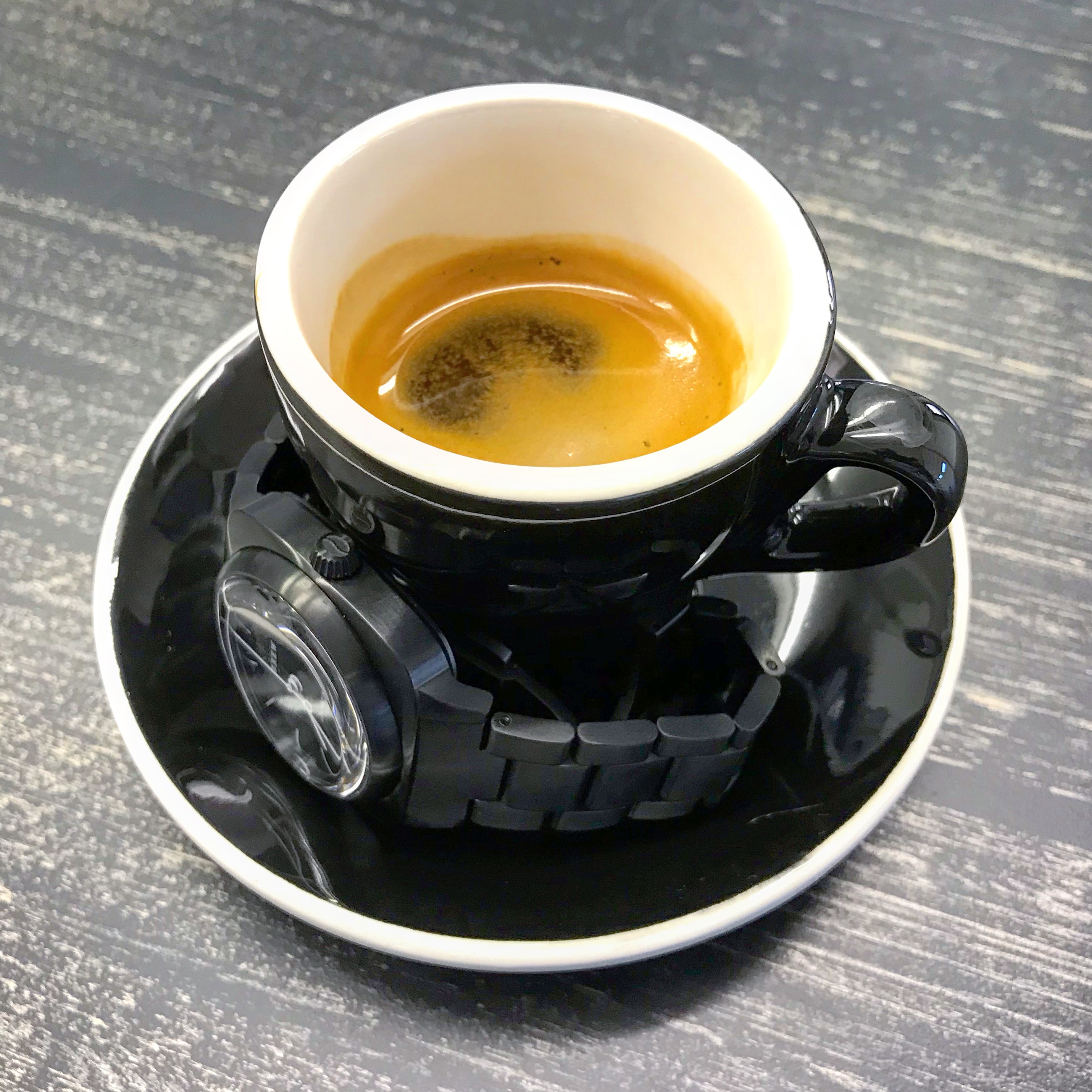
My normal wheelhouse is sport oriented tool watches: divers, drivers, and flyers. So, I was very excited to have the opportunity to do a Brew Watches HP-1 review. It was different, bold, yet familiar. I just wasn’t sure where to start. The logical thing to do was to head over to Brutus Roasting to get a better cup of coffee, shoot some photos, and chat with the owner, Stephen. He’s a coffee expert and a watch guy. It was the caffeinated inspiration that I needed. Perfect!
The Case:
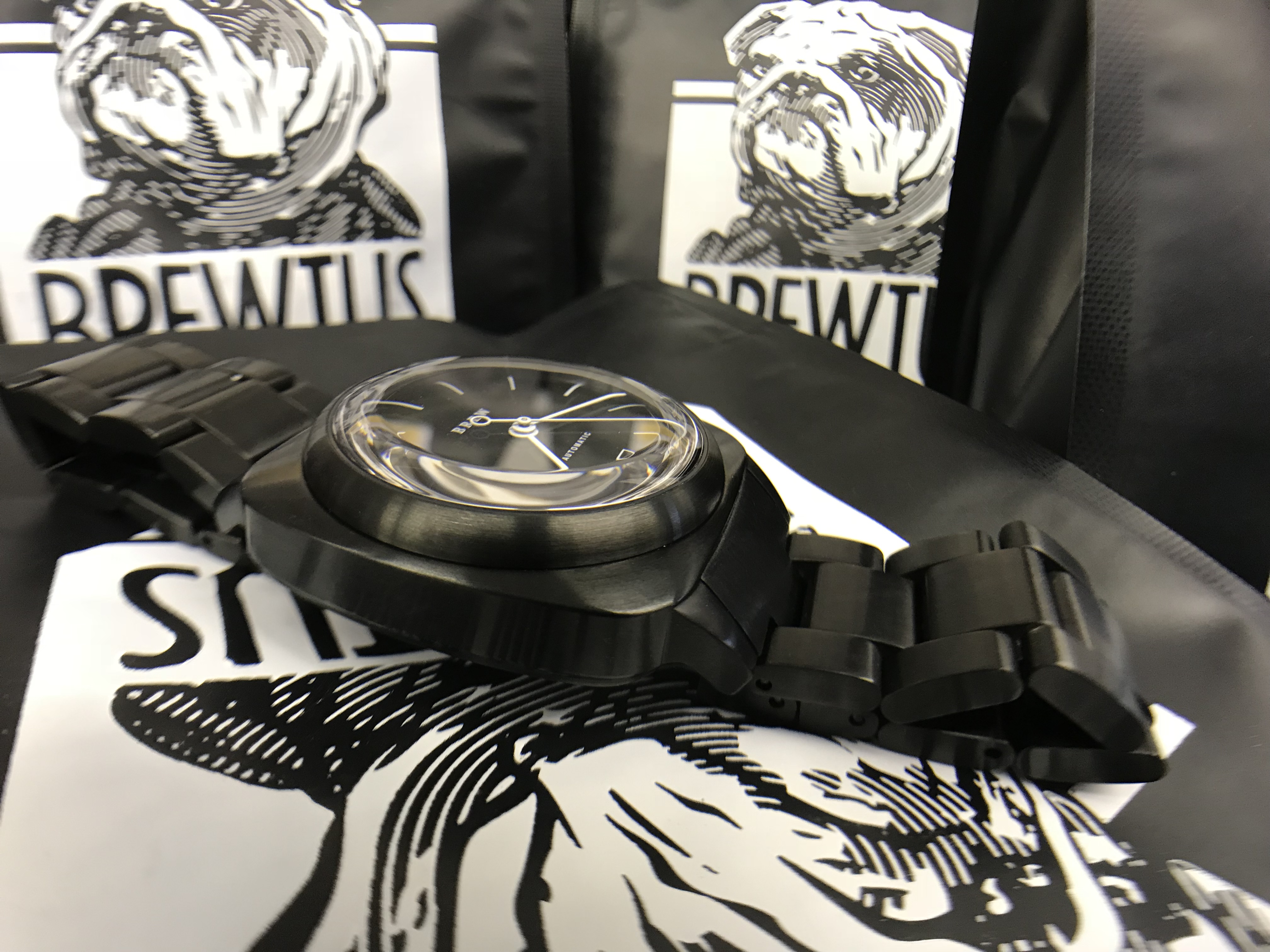
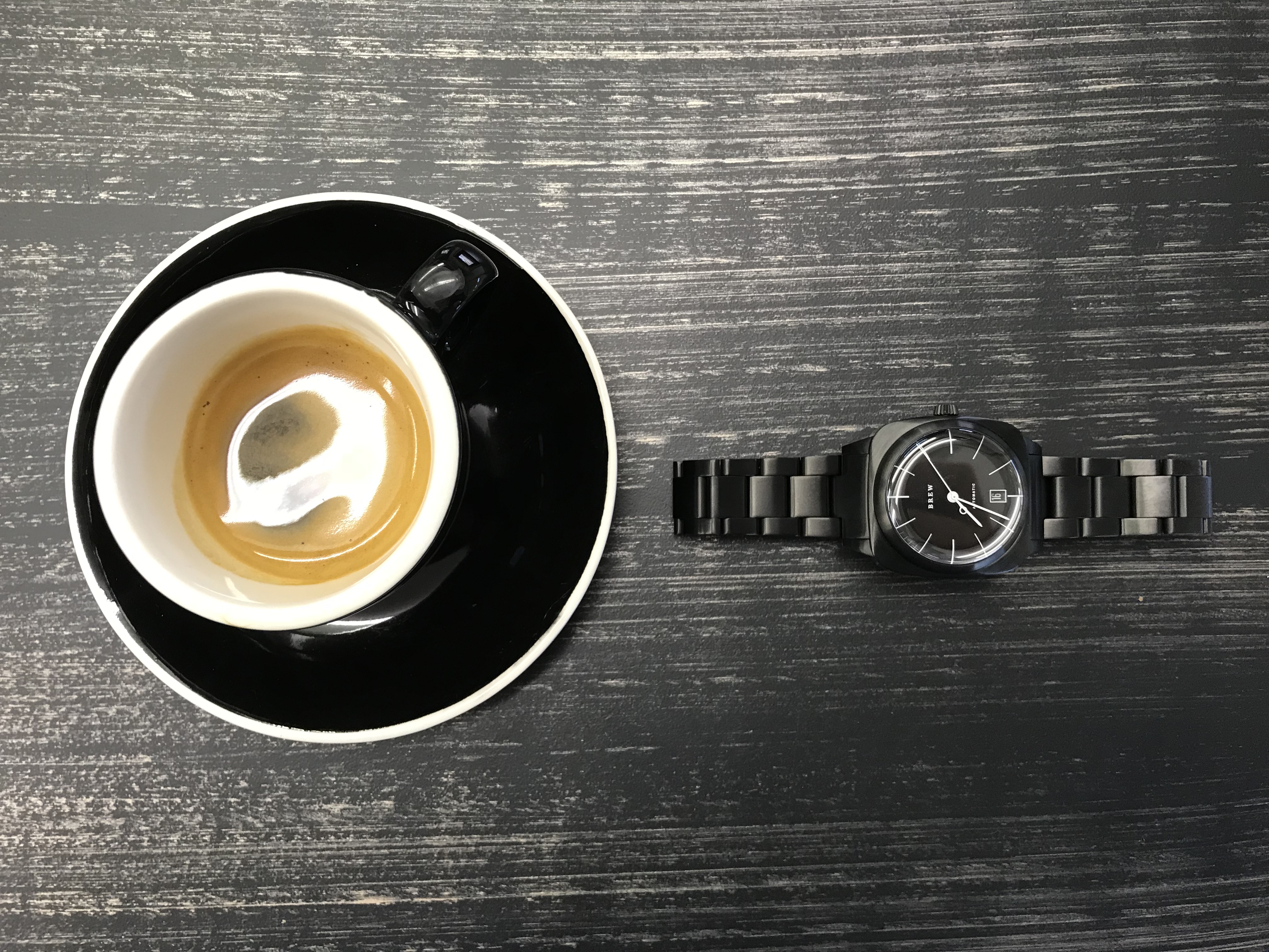
The first thing that you notice about the case is that it’s square. The Brew Watches HP-1 case has aesthetics that are so pleasing because the soft square is something that we are already familiar with. We are seeing a rise in square watch cases in response to the design language of smartwatches. The case dimensions of the HP-1 are 38x38mm, strikingly similar to an Apple Watch.
Smaller brands aren’t the first to make drastic changes to classic shapes. For example, the Rolex maxi-case (new style Submariner), the Cartier Drive de Cartier Extra-Flat, and Seiko “Samurai” SRPBxxxx all have updated case shapes that are more square than the predecessors that they evolved from. While Brew Watches have been squared since their inception, their case shapes are unmistakably relevant and modern. The watch is 47.5mm lug to lug. The lugs also fall away from the case at a steep angle. The Brew Watches HP-1 instantly felt welcoming on my 6.75″ wrist.
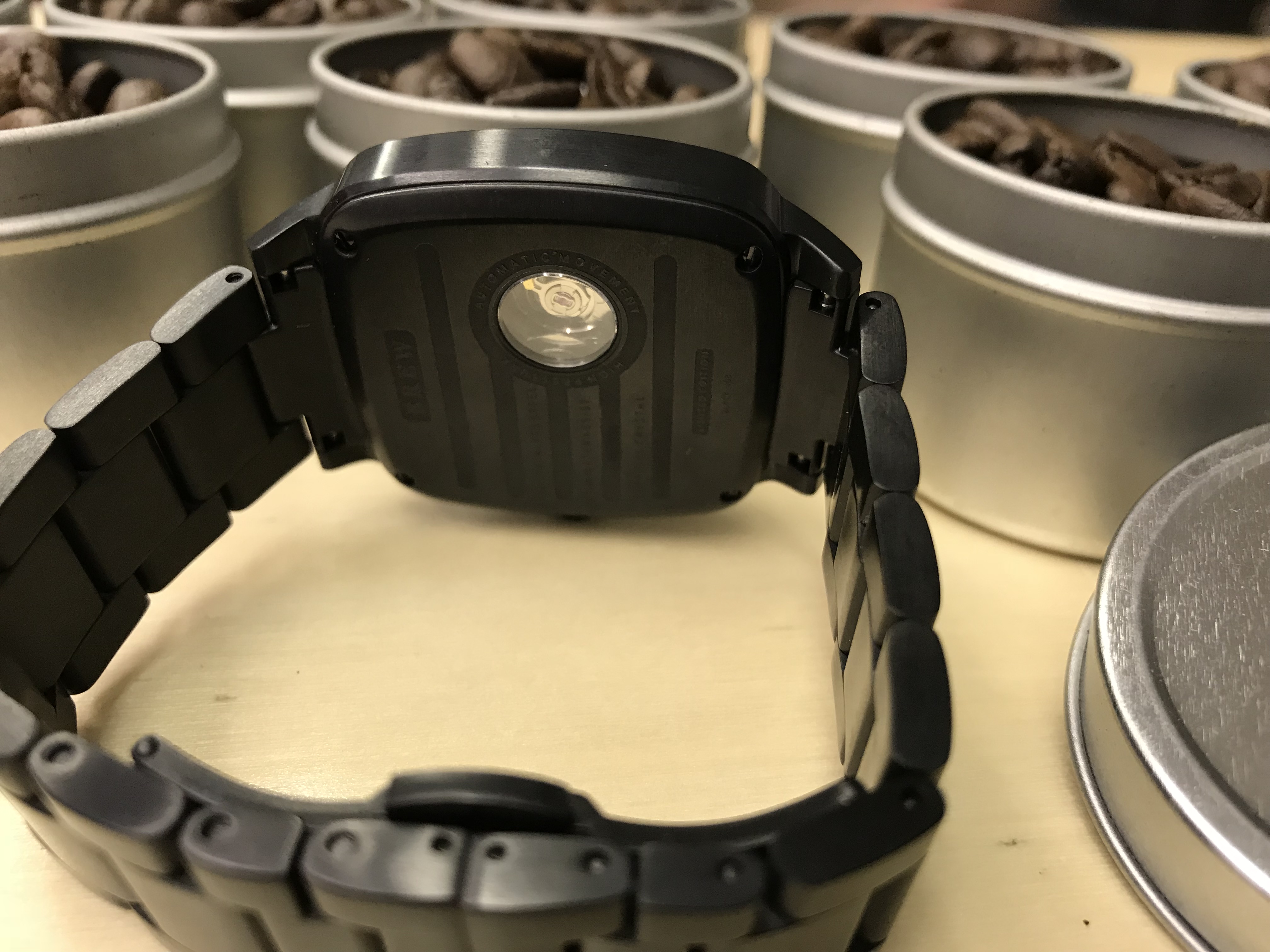
Also unique on the HP-1 is the caseback. It’s squared and is attached with four screws. The most notable feature is the display back. Well, actually it’s more of a peep show. The reverse open-heart shows the balance and part of the balance bridge. It’s refreshingly subtle and provides just enough to remind you that the Brew Watches HP-1 is a mechanical watch. The crown is tapered from 5.5mm to 4.5mm. I instantly viewed it a clever way to add a coffee filter as a nod to the HP-1’s coffee-centric inspiration.
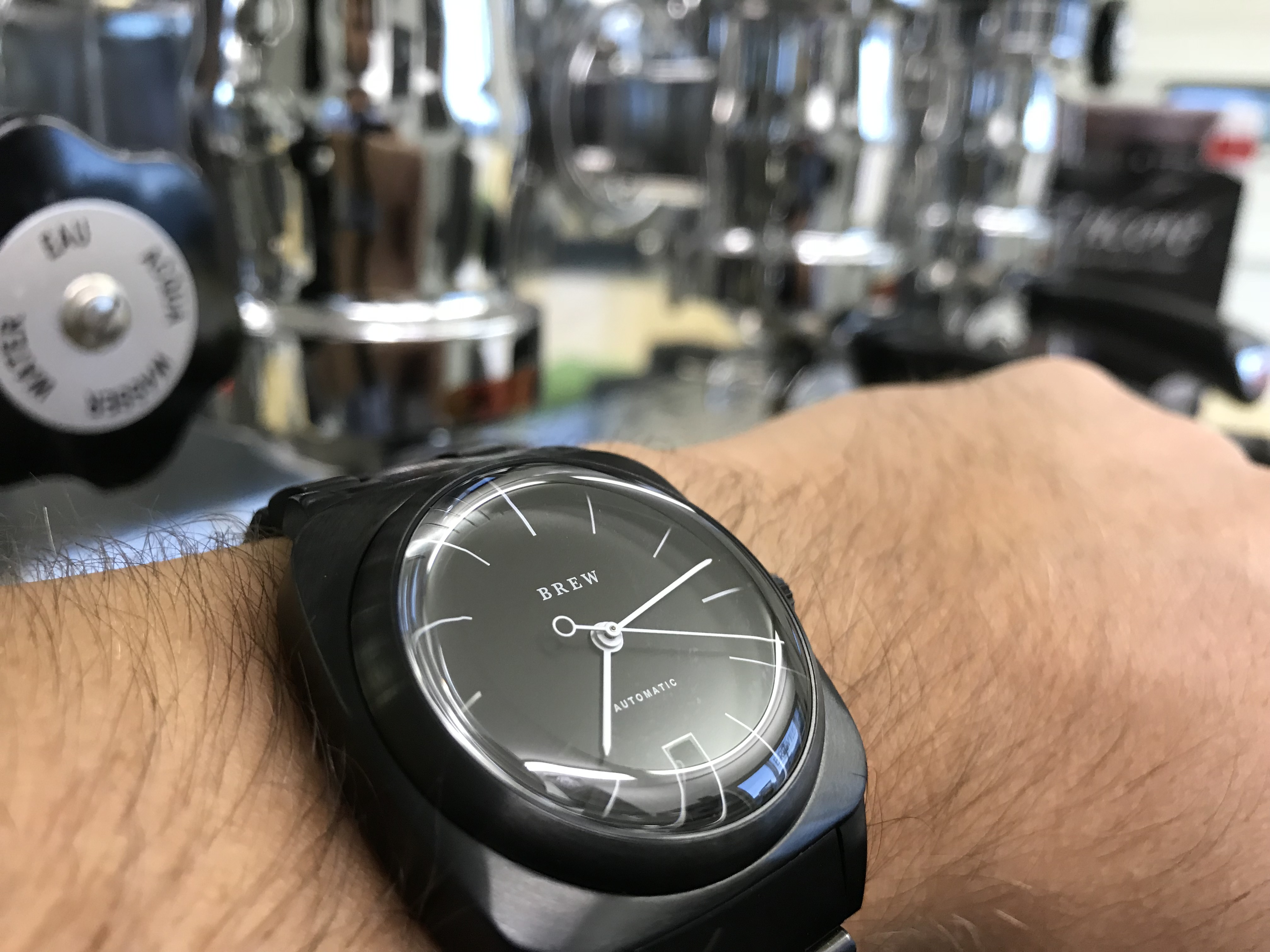
The bezel is smooth and tapers up to blend into the domed sapphire glass crystal. This is where the magic starts to happen. The combination of the domed sapphire combined with the Brew Watches’ sloped dial suck you in and won’t let you go. There is this really neat design trick that builds the bezel sidewall up and then slopes it away under the glass. The result is a distortion effect that lies in the edge of the glass over the dial. If you take the watch from a 45 angle, the glass seems to rise out of the case.
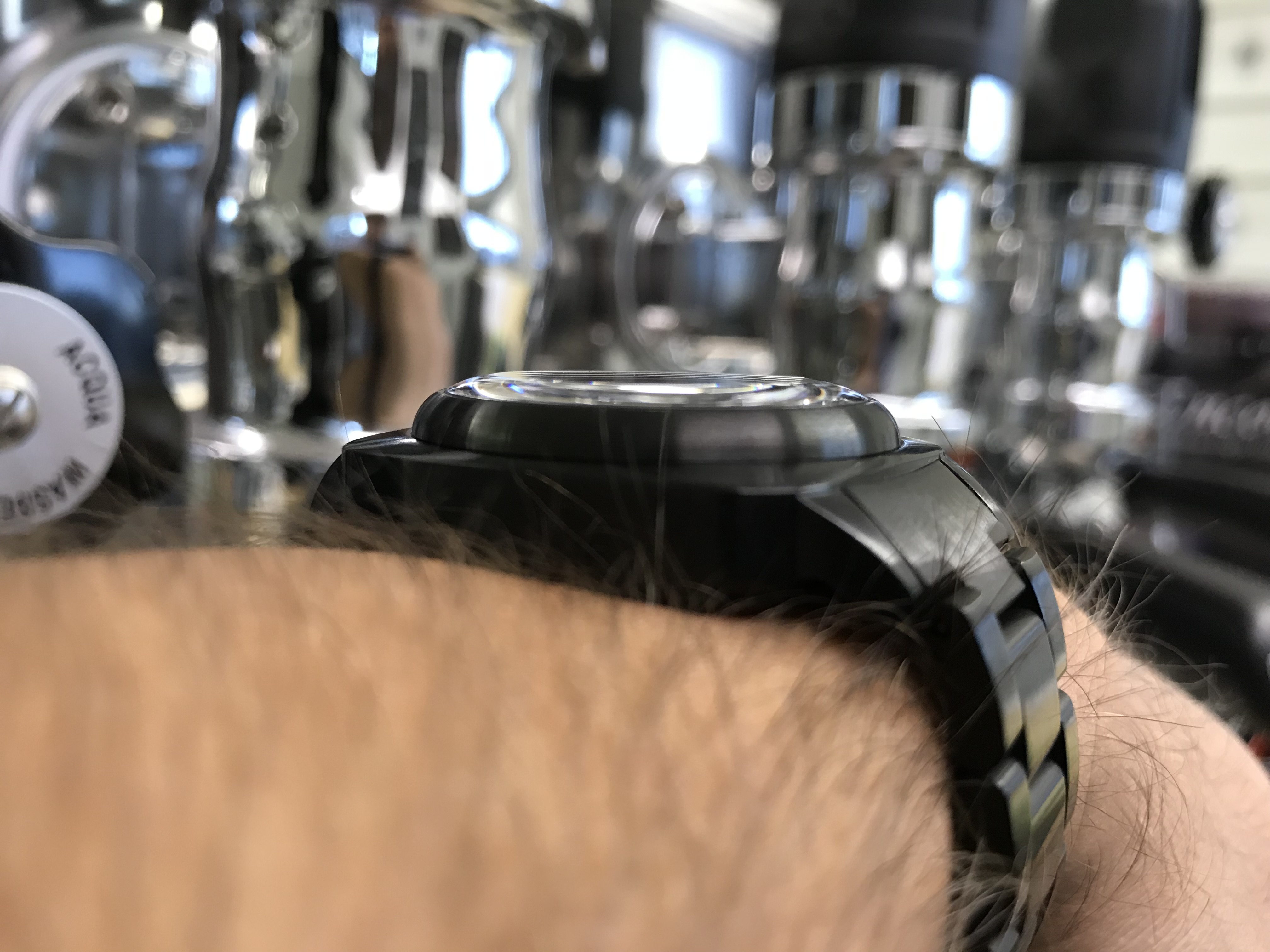
From a profile view, the HP-1’s crystal is barely visible. The height morphs back to a normal 13mm thickness. The smooth lines allow it easily to glide effortlessly under the cuff.
The Dial:
The execution of the Brew Watches HP-1 dial should be used as an example in design school. The balance and proportions are just right. The matte black of the Darkbrew HP-1 blends seamlessly into the bezel and case. The contrast of the slender white hands against the black dial is easy to read. They reminded me of how legible the Speedmaster Professional is with the same colors palate and slender hands. Forget about the lume. There isn’t any.
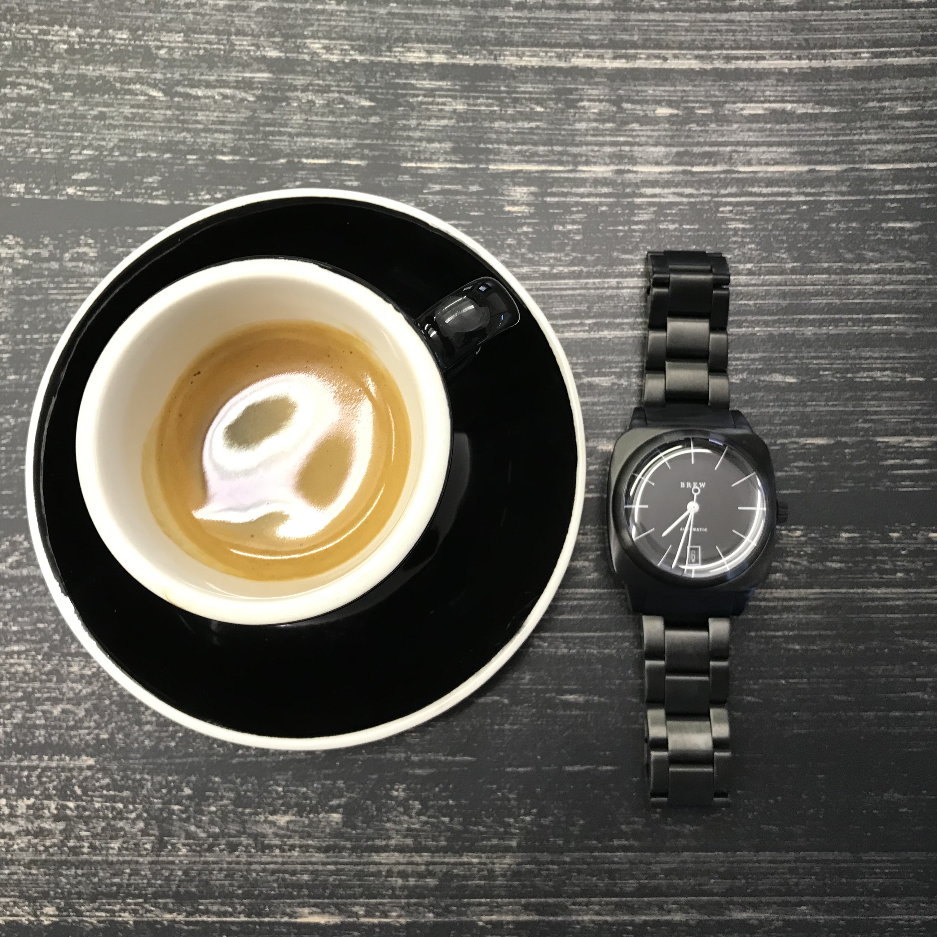
The dial itself is sloped (More beautiful Brew Watches magic happening here). The slope enhances the bubble effect, adding further dimension. Check out the Instagram video I made below showing the dial/glass relationship. Truth be told though, it’s something that you really need to see in person.
View this post on Instagram
Every great design comes with sacrifice. The dial of the Brew HP-1 is no exception. The sloped dial and glass make the date window almost illegible. The sloped dial means that the date window has to be set low to allow for the contour. The date also gets distorted by the domed glass unless you look straight down.
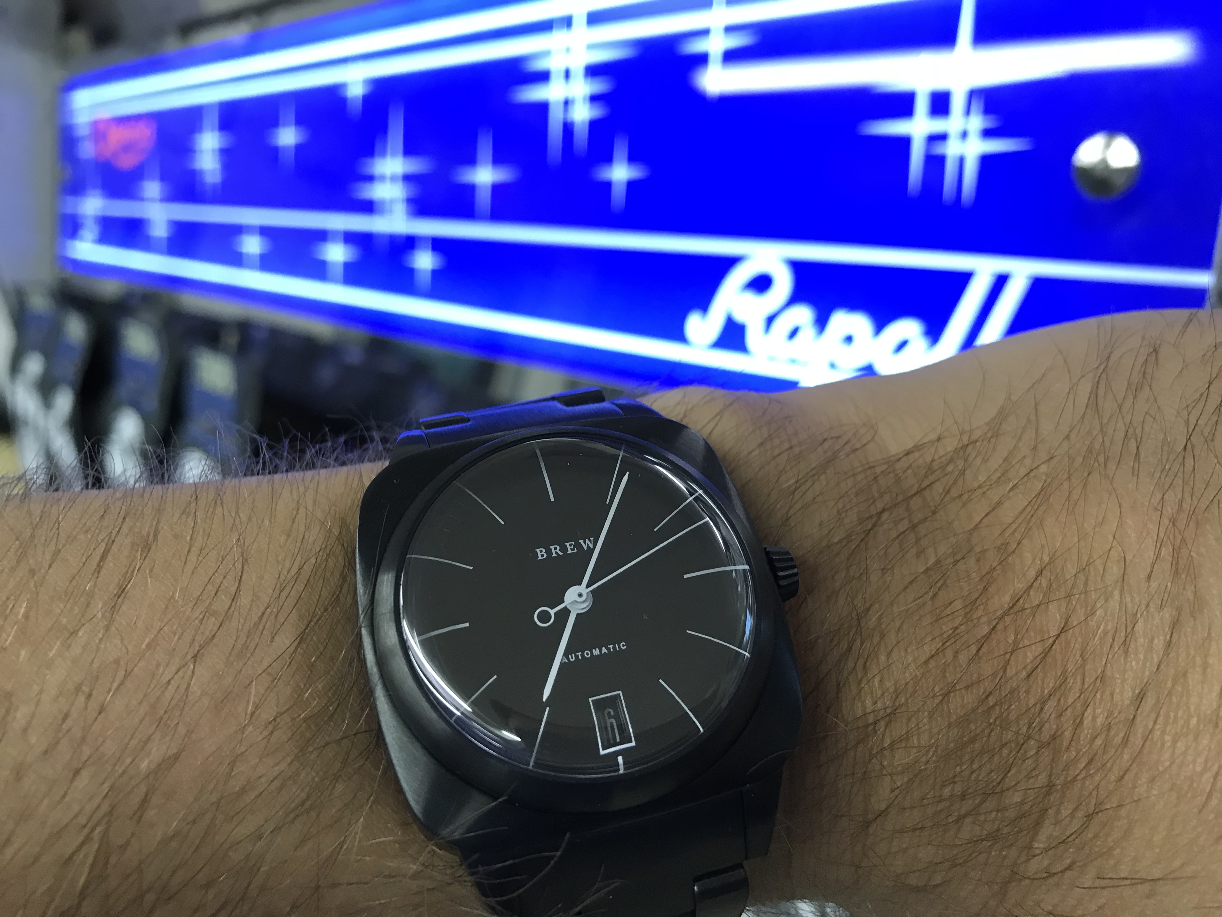
This problem is not as pronounced on the “Proto” (silver) version because the date wheel features black numbers on a white wheel.
The Movement:
The NH35A movement is no stranger to the value-driven side of the #watchfam. It’s tried and true at a tremendous value. It’s my favorite Seiko movement for many reasons. It’s rugged. It hacks. You get the satisfaction of the manual wind. It also winds automatically. It has a 41-hour power reserve. Never mind servicing it. It’s so cheap to replace.
One drawback to the movement is the accuracy rating. The manufacturer’s spec is -20 ~ +40 seconds per day. In reality that is very conservative. Every watch with an NH35A movement that I’ve owned has been more like -15 ~ +5 seconds per day. We sometimes complain that too many brands use the NH35A movement. It’s a silly complaint based on the value to performance scale. I’m glad the Brew Watches chose it for the HP-1. I would have been disappointed if they didn’t.
The Bracelet:
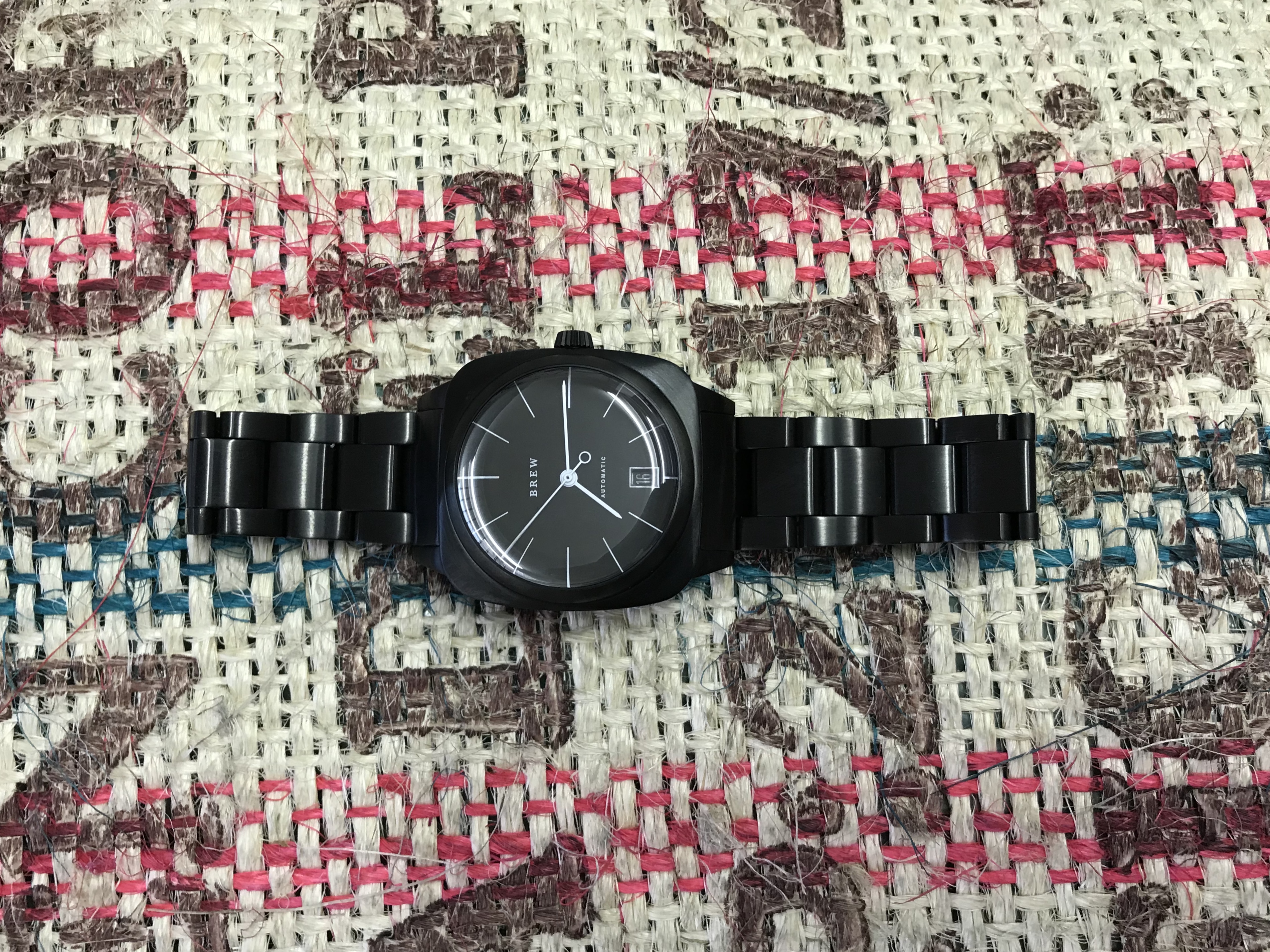
Three things stood out to me while wearing the Brew Watches HP-1 bracelet. The first thing was how comfortable it was. The PVD black oyster style links taper from 20mm at the lugs to 18mm at the butterfly clasp. The second was how well the endlinks integrated into the case in both form and function. You could put it on a leather strap, but you wouldn’t want to. Stick with the stock bracelet for the HP-1.
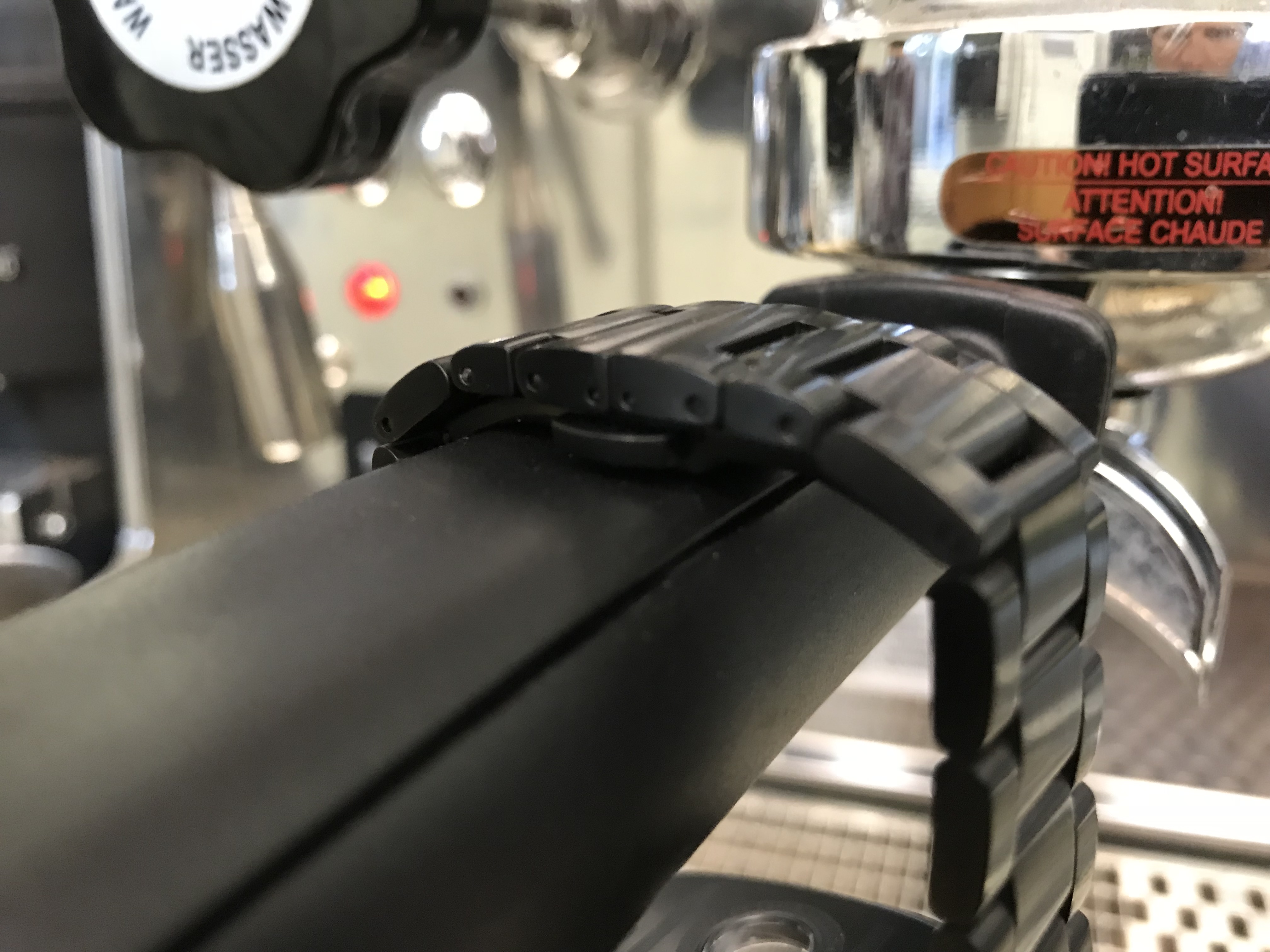
The third thing is the difficulty of adjustability. With most metal bracelets we expect some sort of clasp and lock. This bracelet has a butterfly clasp instead. While there is minimal disruption to the flow of the links under the wrist, it lacks micro adjustments. The bracelet links are also removed with pins instead of screws. According to designer Jonathan Ferrer choice to use pins was for practicality.
He explained, “Designs that I had used in the past used screw-in pins, but I experienced many people stripping the screws… and running their bracelets” – it’s not a deal breaker, just something to be aware of.

Final Thoughts:
Does it easily tell time? Yes
Would I #watchfast it? No
5 Things that I love
-
-
- The magic dome effect
- The white hands over the black dial
- The versatility
- The comfort
- It wasn’t another tool watch
-
5 Things that I hate
-
-
- The deep date window
- The lack of a screw down crown
- The push pins for the removable links
- The height – could it have been slimmer?
- The lack of micro adjustments
-
The thing that surprised me most about the Brew Watches HP-1 Darkbrew was its versatility. The first that I tried to do was classify it. I couldn’t, and that turned out to be a good thing. I was easily able to wear it to work with a dress shirt or on the weekend with a t-shirt. It didn’t matter, it fits right in. I do a lot of water related actives. This is the only thing that would prevent me from doing a #watchfast with the HP-1. If you’re a landlubber, go for it.
The HP-1 is available directly from the Brew Watches website for $495 (although the Stainless Steel Proto (listed for $525) and Rosegold Joy are currently sold out). I would recommend the Darkbrew as the perfect milestone gift for a young person that doesn’t feel the need to be like everyone else. The Brew HP-1 is a great example of “bringing a minimalist design directly to the consumer”. Brew didn’t have to say it, even though that’s exactly what they did. It’s not mentioned once on their website or in their marketing material. Instead, they just made a great design and let the watch do the talking.
Please contact me on Instagram (watch_gb) for any additional questions or comments about the Brew HP-1.

Greg is a long-time watch lover based in upstate New York. Greg is a supply chain professional by day and private watch consultant by night. Greg brings his own style to the TBWS website as a contributor by blending bits of humor into technical assessments. You can follow his cycling and snowboarding adventures on Instagram as he pursues the perfect 3-watch collection.
I don’t much care for the design, especially for $495. The dial is minimalist to the point of ugliness ,the date window is badly placed , implying sloppy design, and the square case with the round face seems pointless
Thanks for reading. The date window is much more legible on the other colors. I don’t think the design is sloppy overall. Check out the video in the article, is shows how the dome effect is great design.
What do you think is a better value at $495?
What’s better value? That is subjective ,but for me : 4 Orients or Seikos